


Elefantlab Technology brand identity concept
Elefantlab is a self-initiated technology brand identity concept by Sparkline Studio. Built around a geometric elephant symbol representing strength and strategic thinking, it explores how a creative lab for digital innovation can feel confident, intelligent and modern, through a bold colour system, considered typography and a wide range of brand applications.
The ElefantLab Brand Film
A visual expression of the ElefantLab brand identity.
A 52-second silent brand film for ElefantLab, playing on a loop. It moves through the geometric elephant symbol and the elefant.lab wordmark, the lavender, lemony and red-orange colour palette, a halftone pattern and concept mockups including a cap, a phone, a smartwatch, a sweatshirt and a water bottle, and ends on the elefant.lab logo.
Designing a technology lab with character
The concept starts with a question set by the studio itself: how can a technology brand feel intelligent and modern without becoming cold or generic? Elefantlab, positioned as a creative lab for digital innovation, became the vehicle for exploring that balance between technical credibility and a more expressive, human personality.
An approach built on strength and strategy
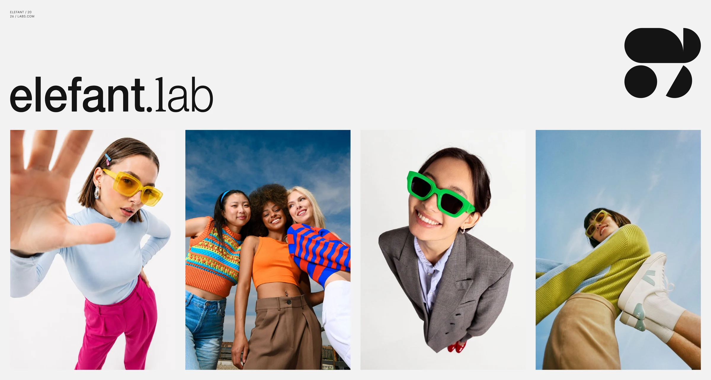
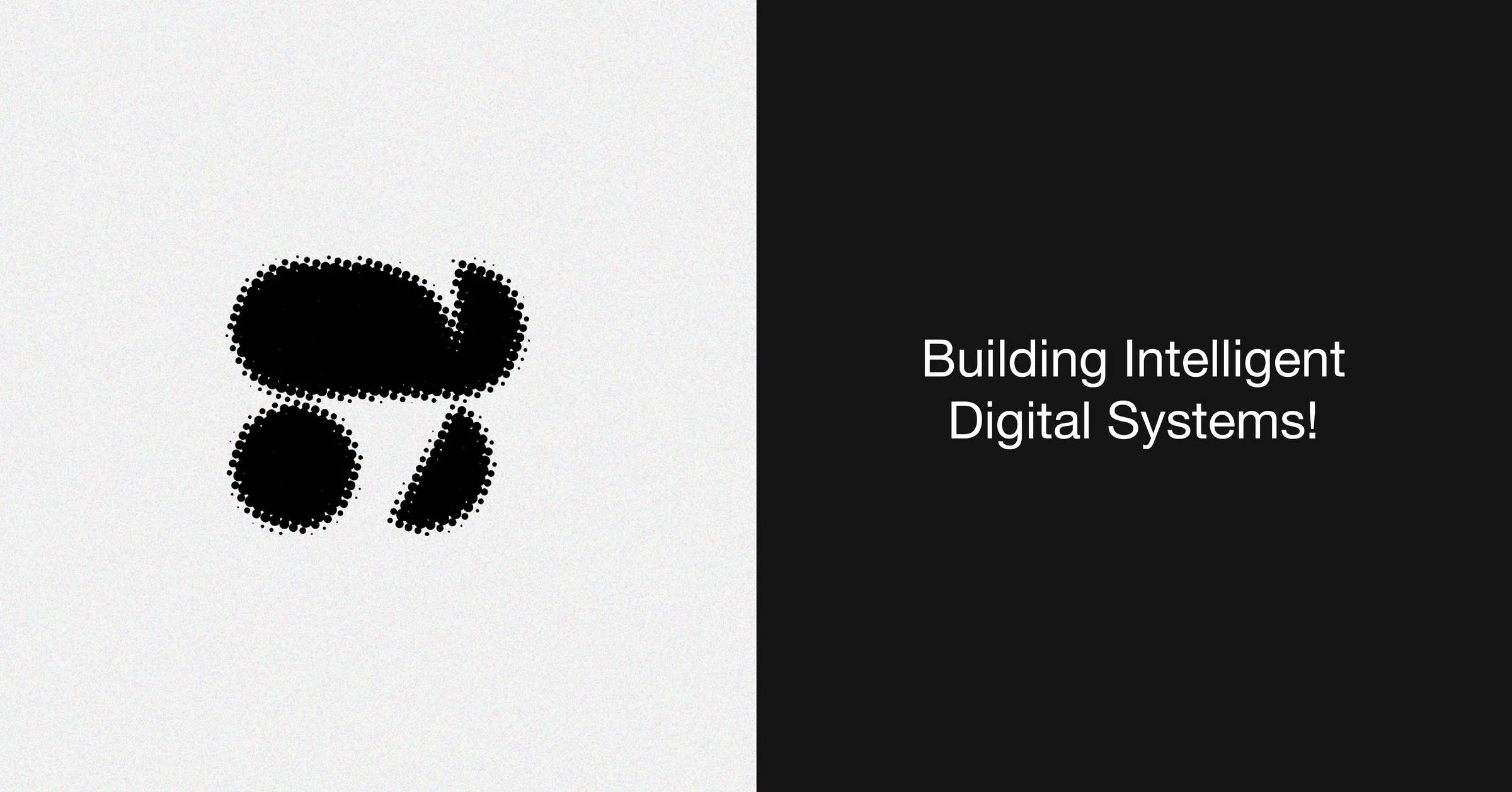
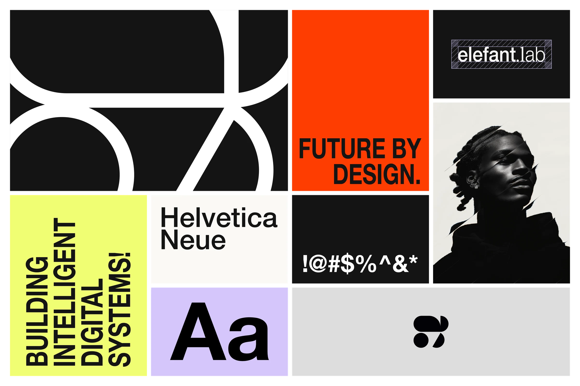
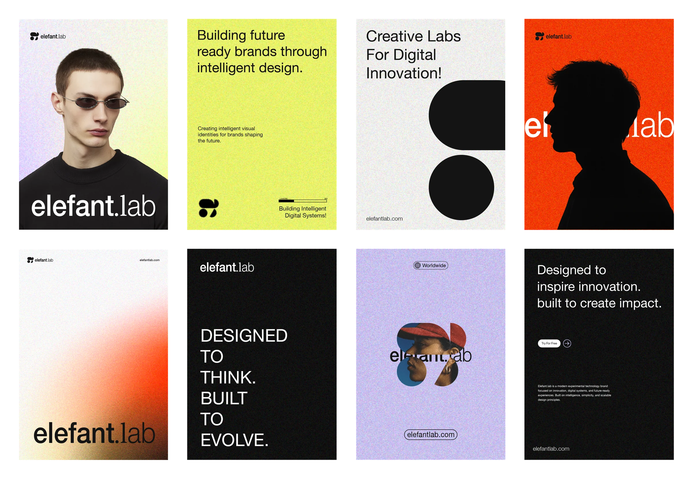
The elephant, associated with strength and strategic thinking, anchors the concept. Around it, the identity keeps a clear, confident tone: a lowercase wordmark with a dot, short lines such as Building Intelligent Digital Systems, and photography that keeps people at the centre of the technology story.
A geometric elephant symbol
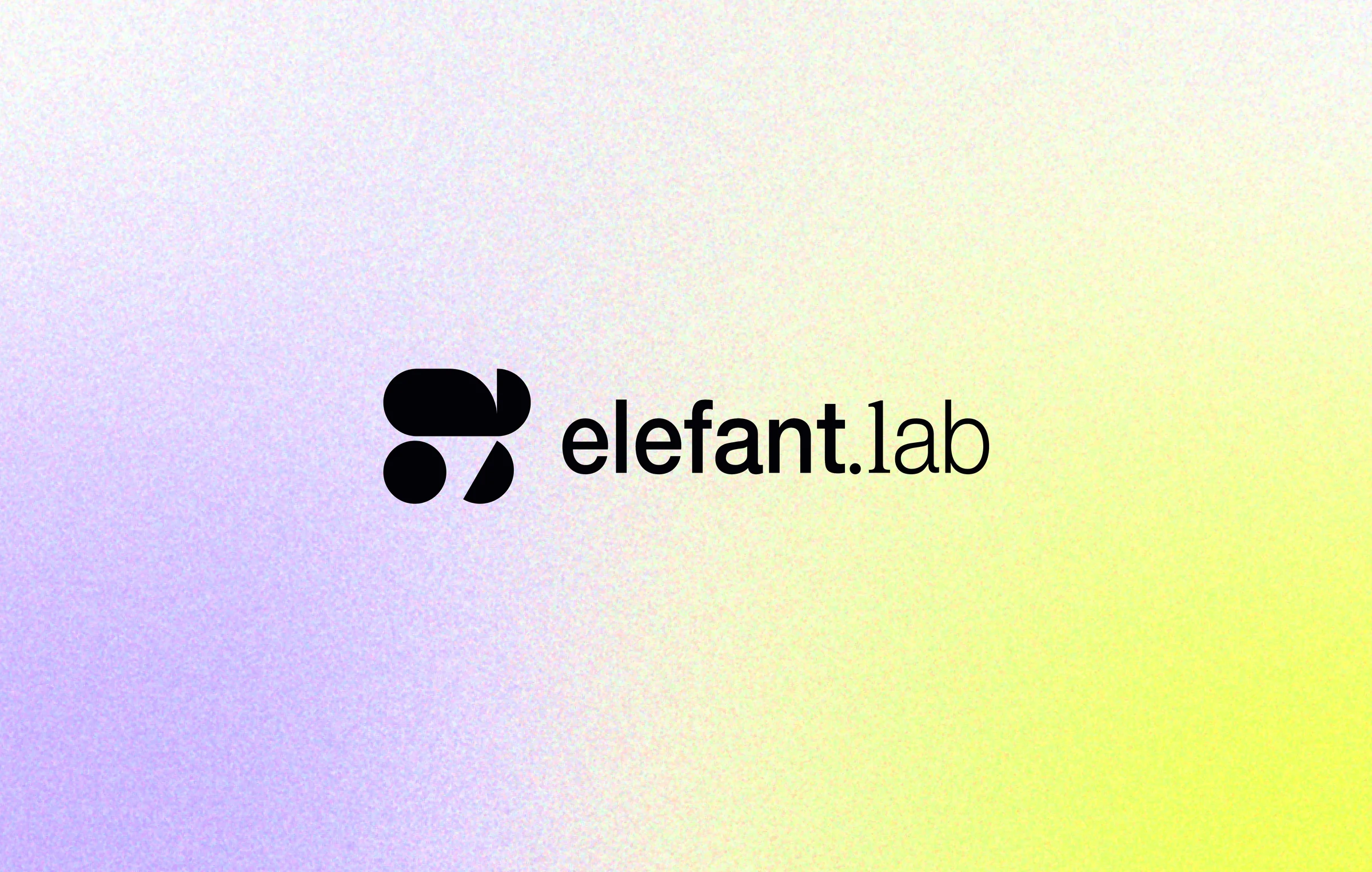
The symbol reduces an elephant to simple geometric forms: a rounded mass, a circle and a half-circle. Its bold, solid shapes stay recognisable at small sizes, work as an app icon, and translate into halftone, outline and gradient treatments across the identity, keeping one idea consistent from logo to pattern.
A bold colour system with a human touch
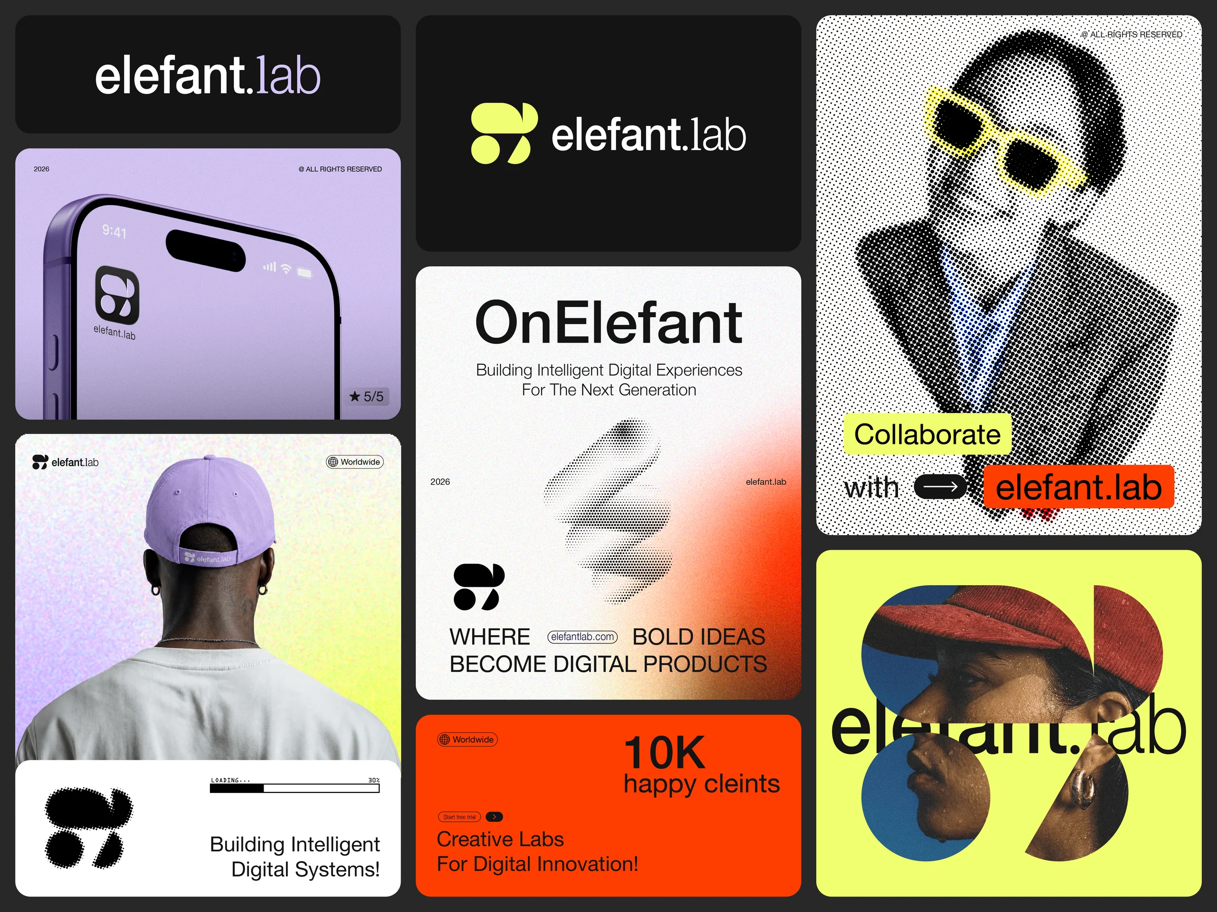
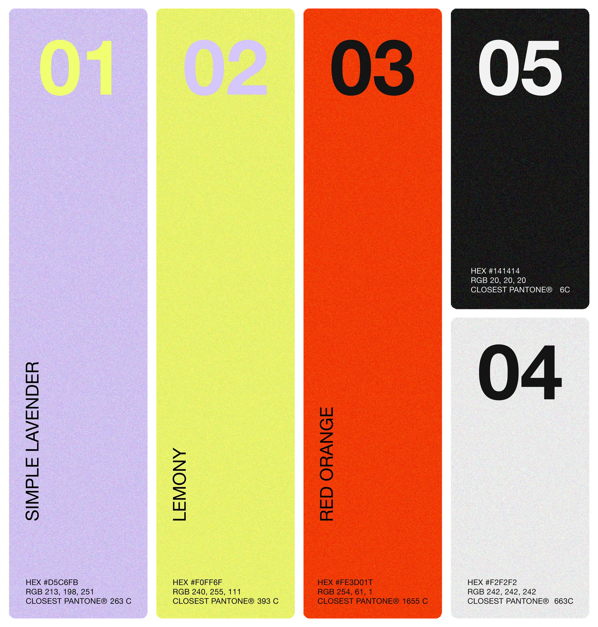
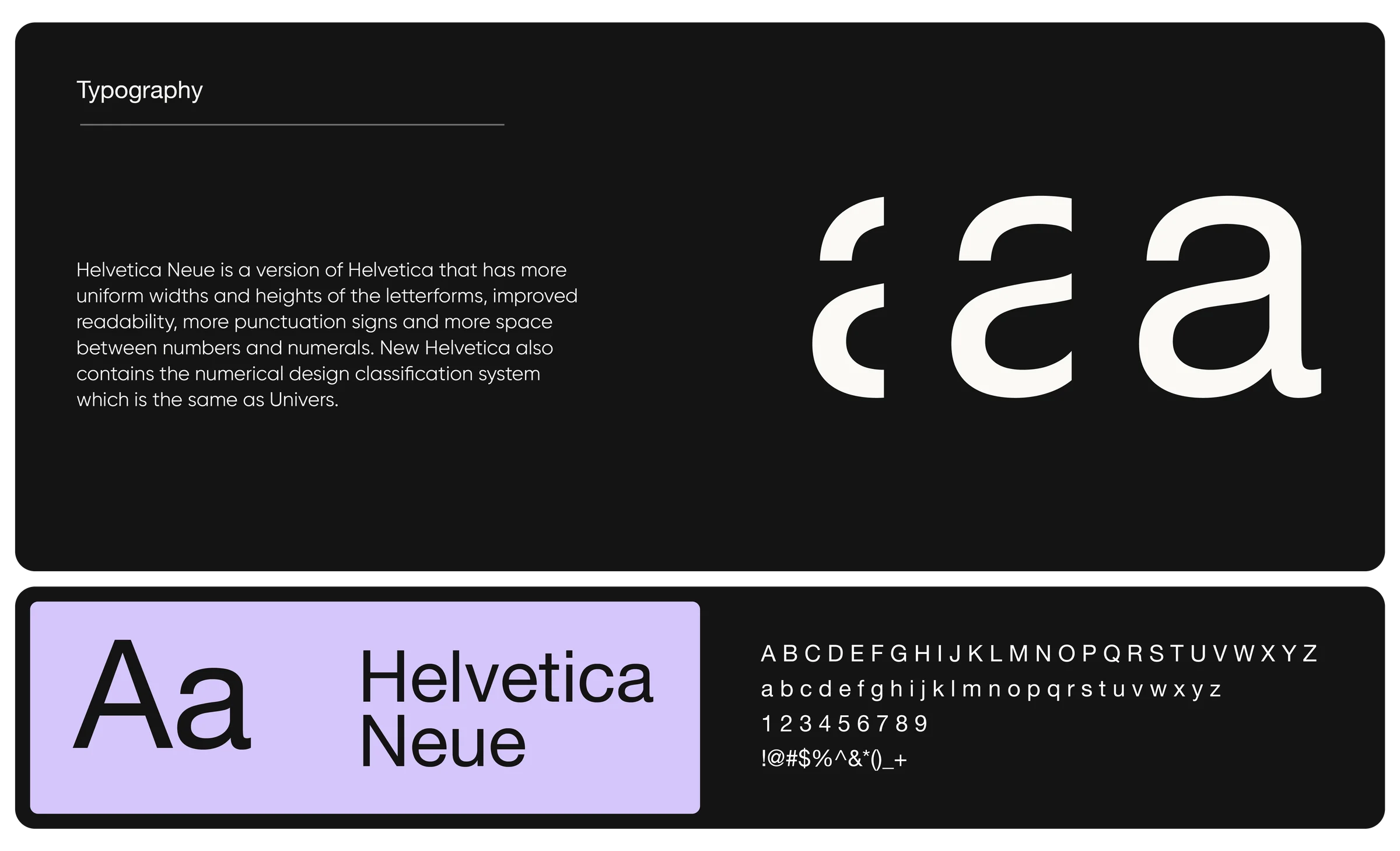
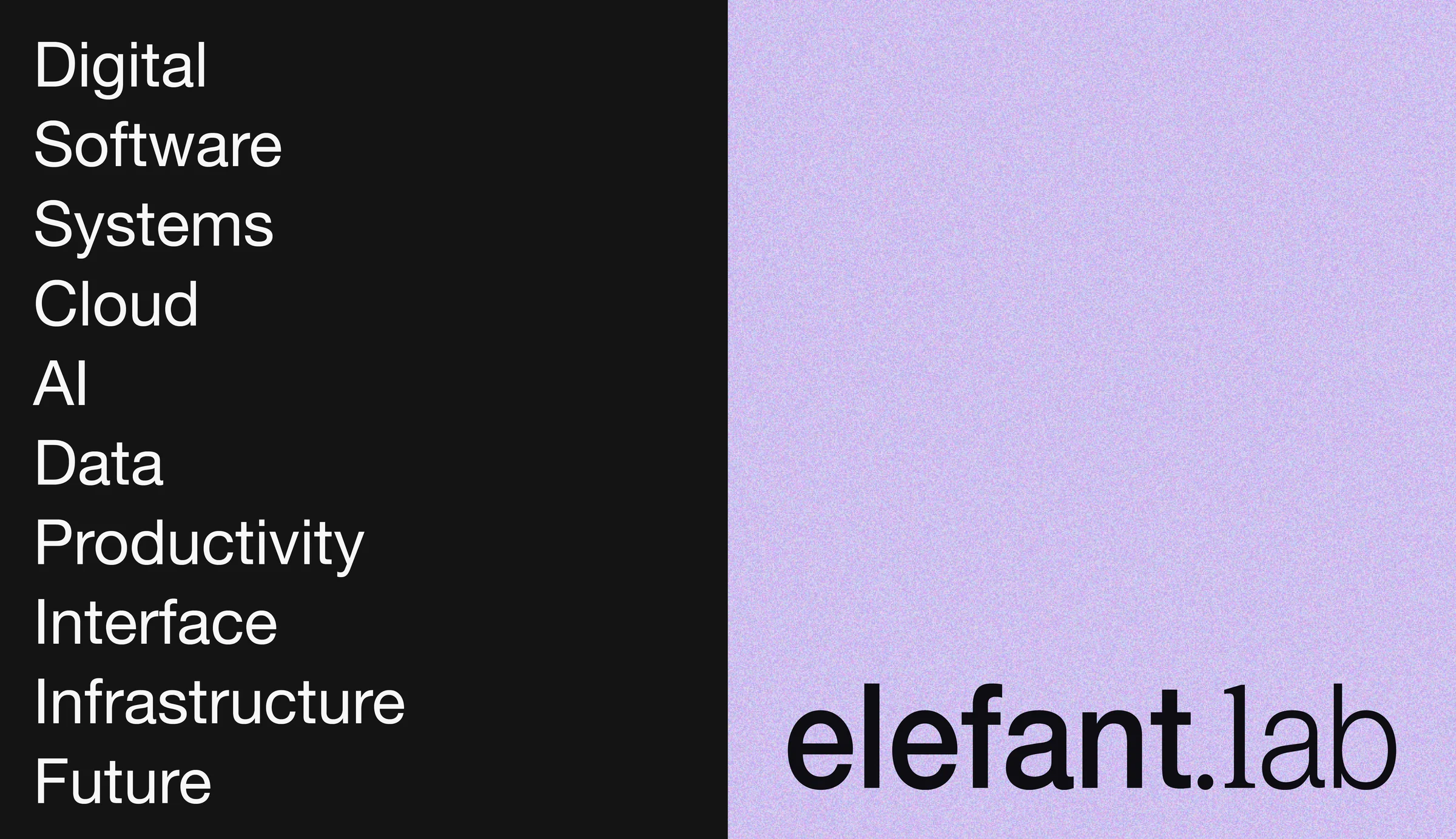
Simple Lavender, Lemony and Red Orange bring energy against black and light grey, often softened with grain and gradients. Halftone adds a printed, tactile quality, while clean sans-serif typography keeps layouts clear and direct. Keywords such as Software, Cloud, Data and Infrastructure shape a vocabulary for the technology the brand speaks to.

Brand applications, digital and physical
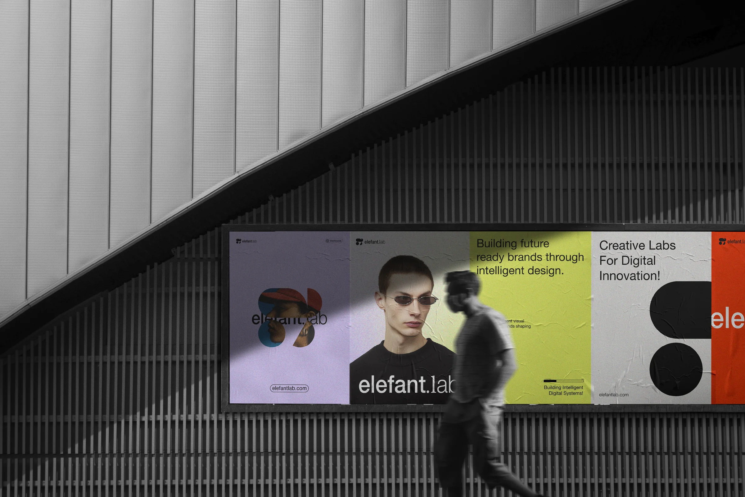
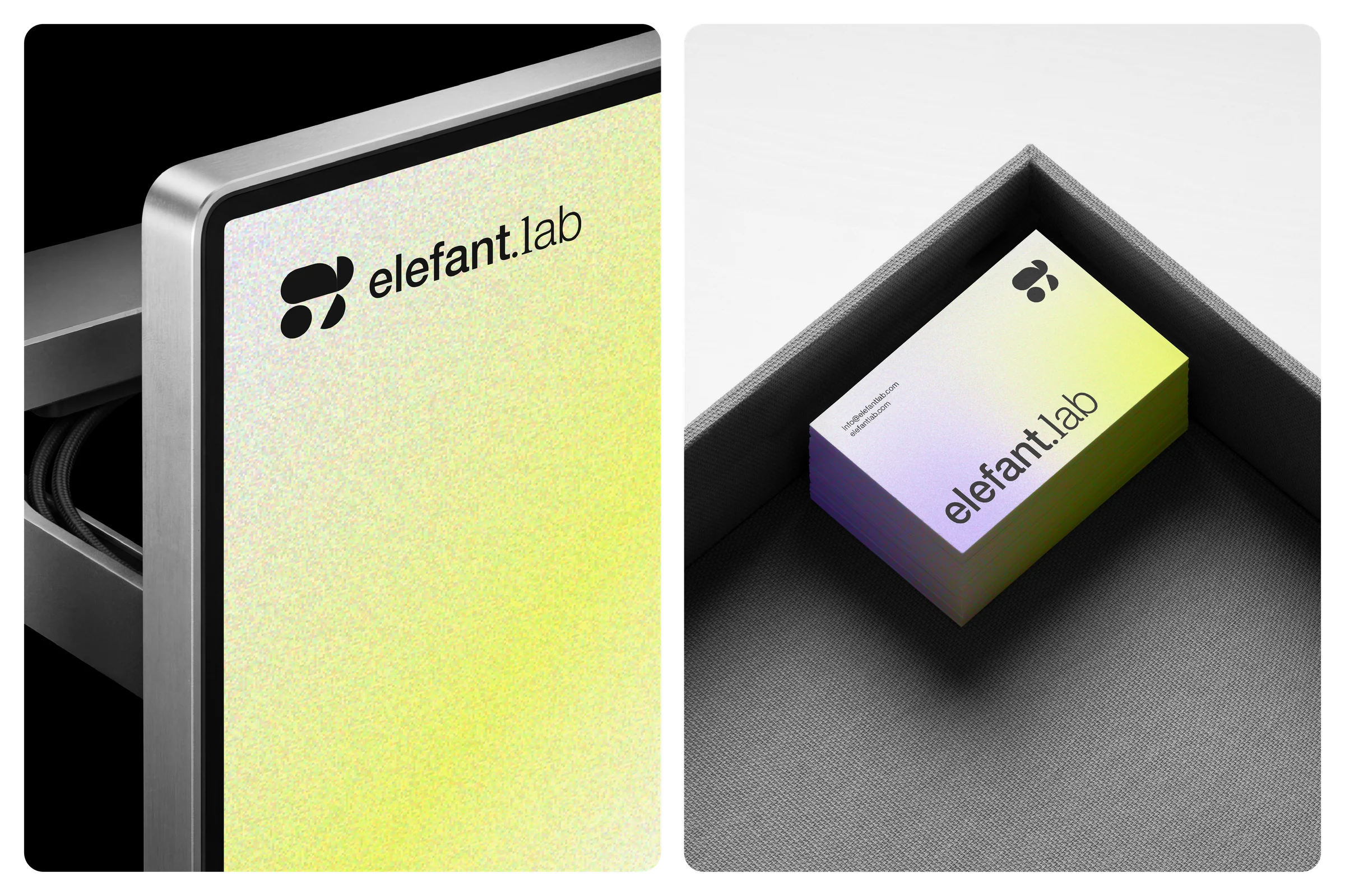
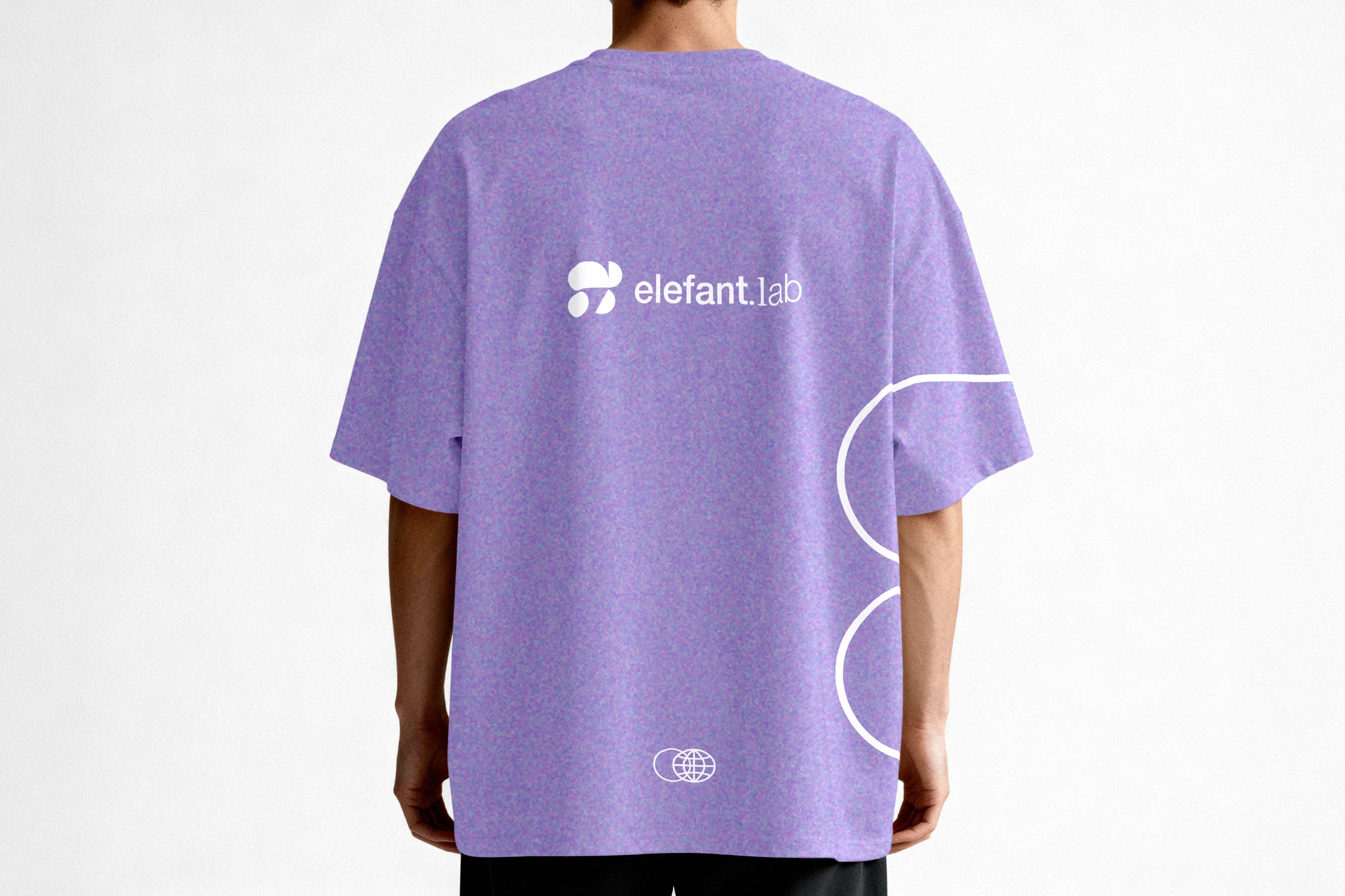
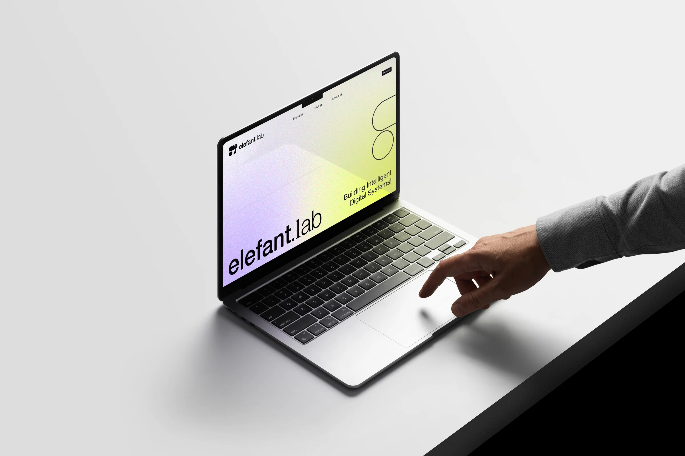
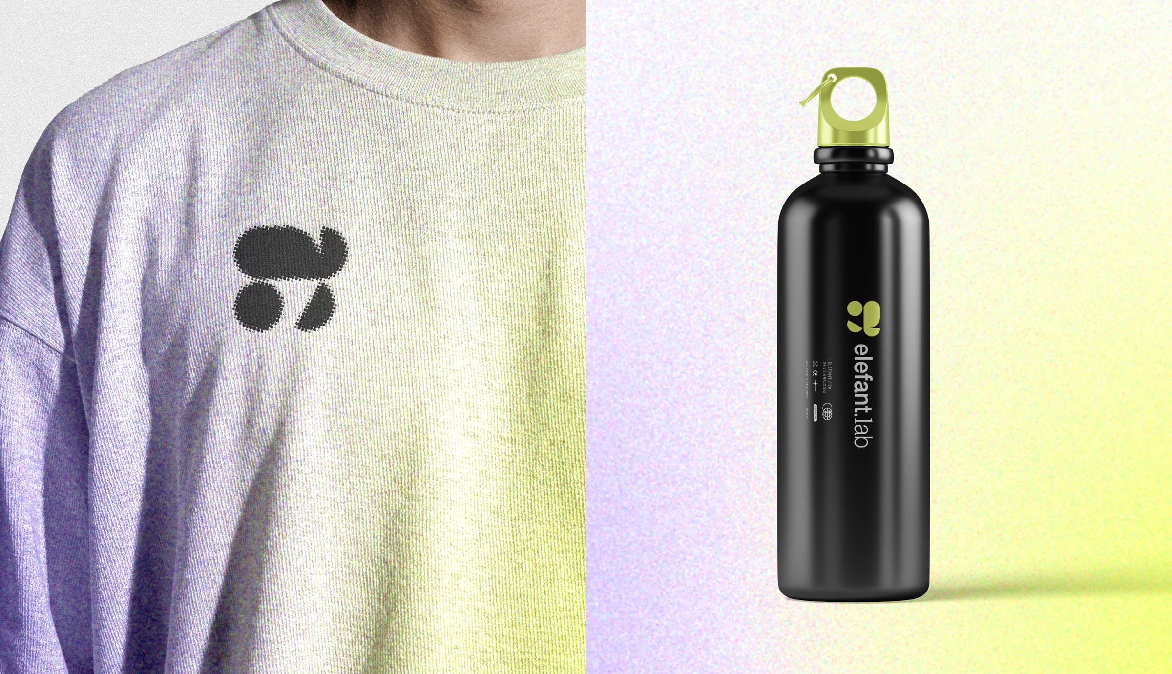
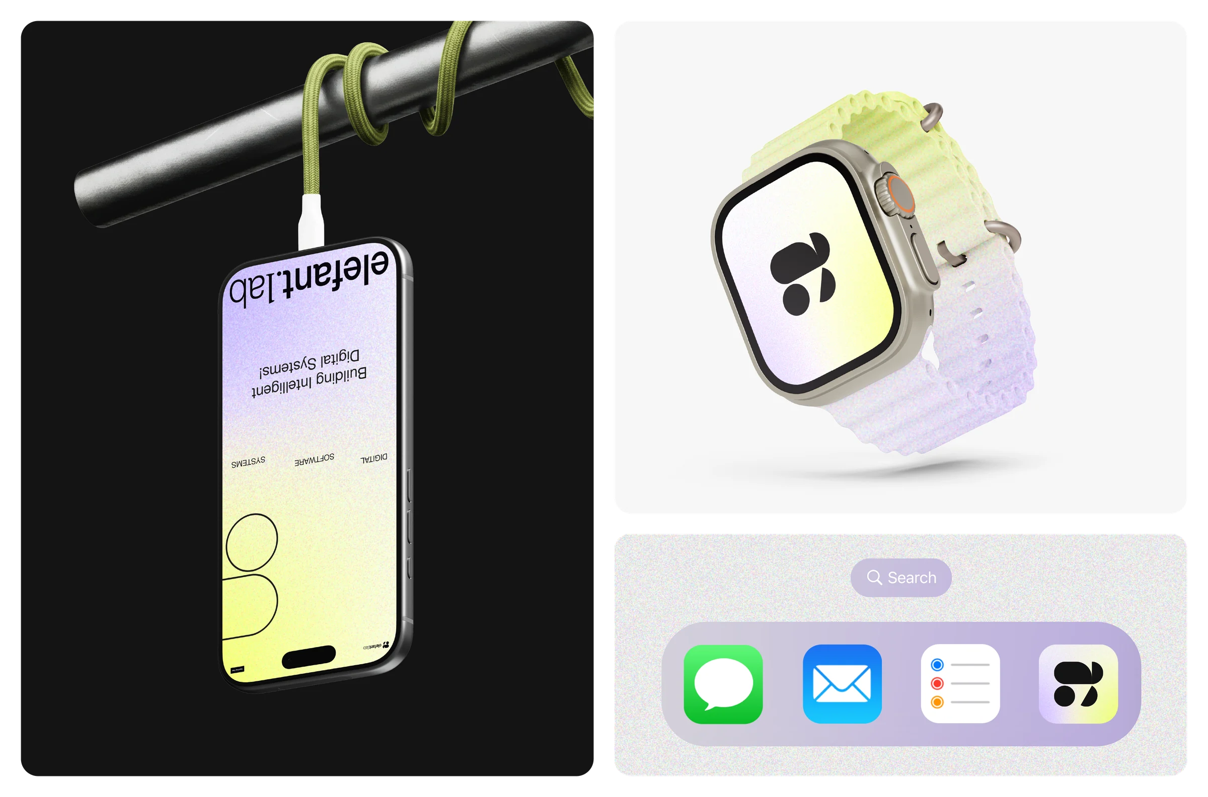
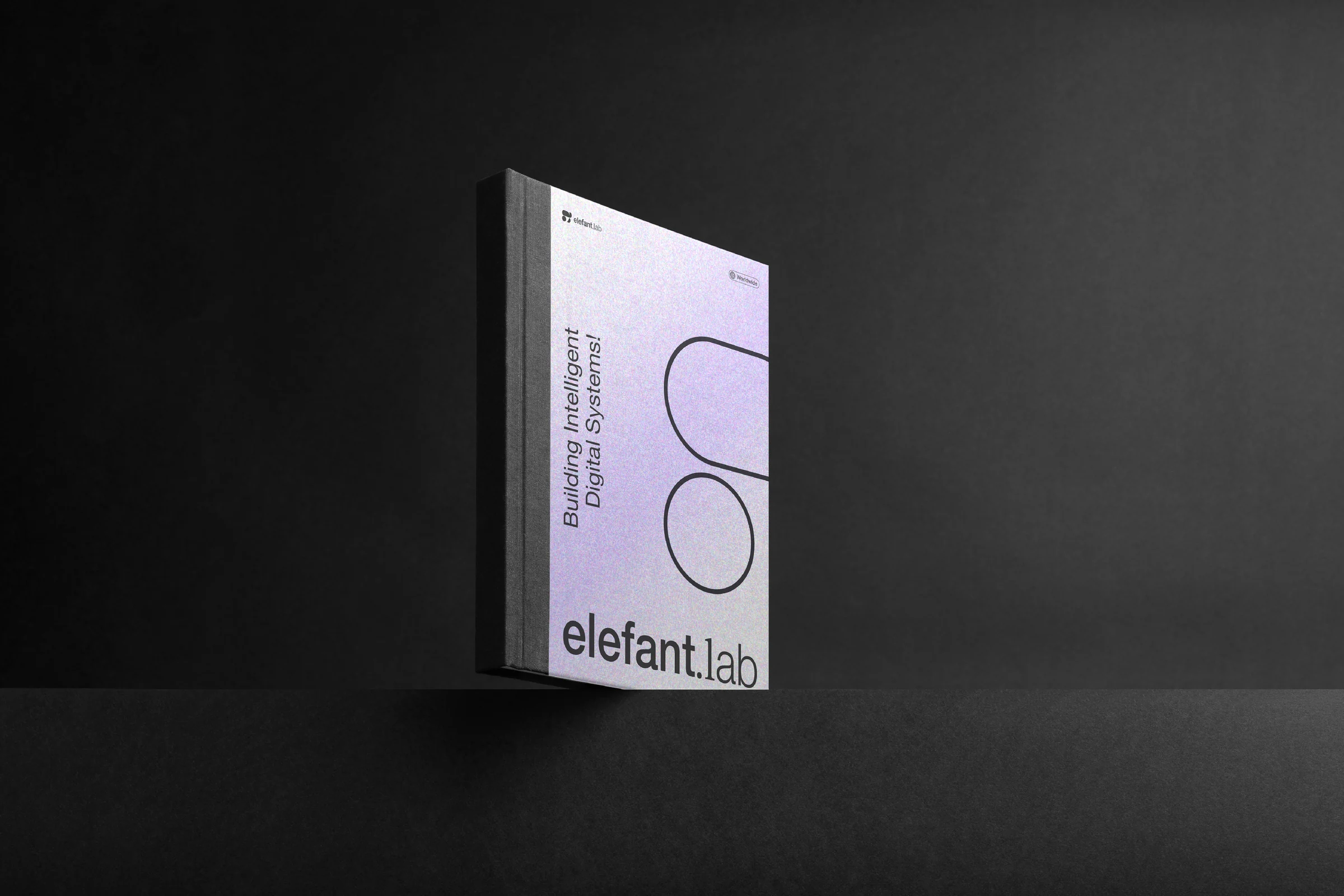
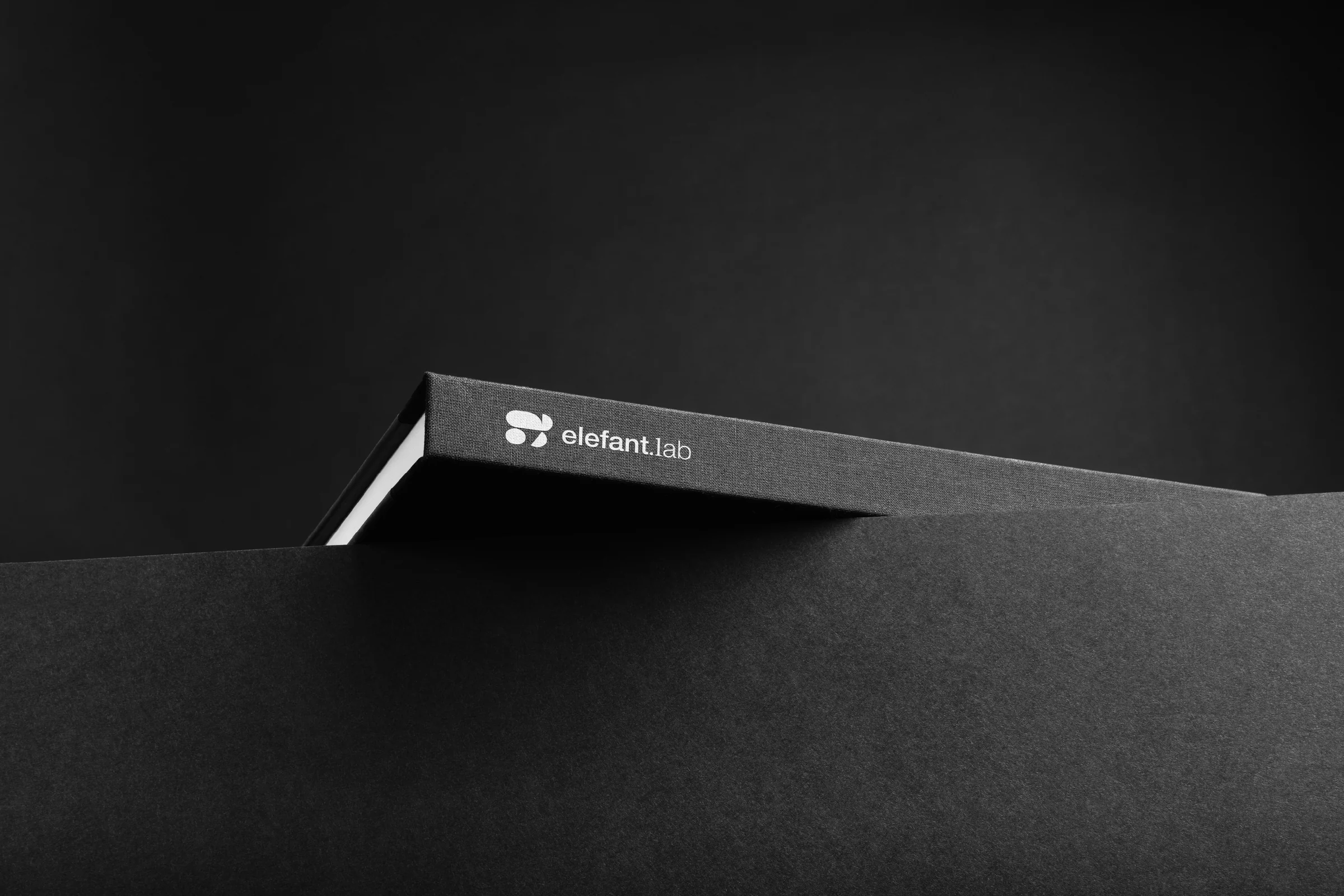
The identity is tested through concept mockups: a billboard, posters, a cap, apparel, a monitor, business cards, a laptop website, a phone, a smartwatch, an app icon, a water bottle and a hardcover book. The symbol and gradients adapt to each surface, staying recognisable from large formats to small interfaces.
Designed to think. Built to evolve.
A considered identity system for a technology brand concept, designed to feel strong, strategic and modern. It shows how Sparkline Studio develops a simple symbol into a flexible visual identity that carries from a single mark to posters, products and print. Explore more brand identity projects by Sparkline Studio.
Looking for a technology brand identity? Start a project with Sparkline Studio.
Start a project