
Omniora AI brand identity concept
Omniora is a fictional, self-initiated AI brand identity concept by Sparkline Studio, created in 2026 for portfolio presentation. Built around connected intelligence, it brings together a looping symbol, a refined wordmark and a blue and navy colour palette, balancing technological precision with a more human character.

A visual language for connected intelligence
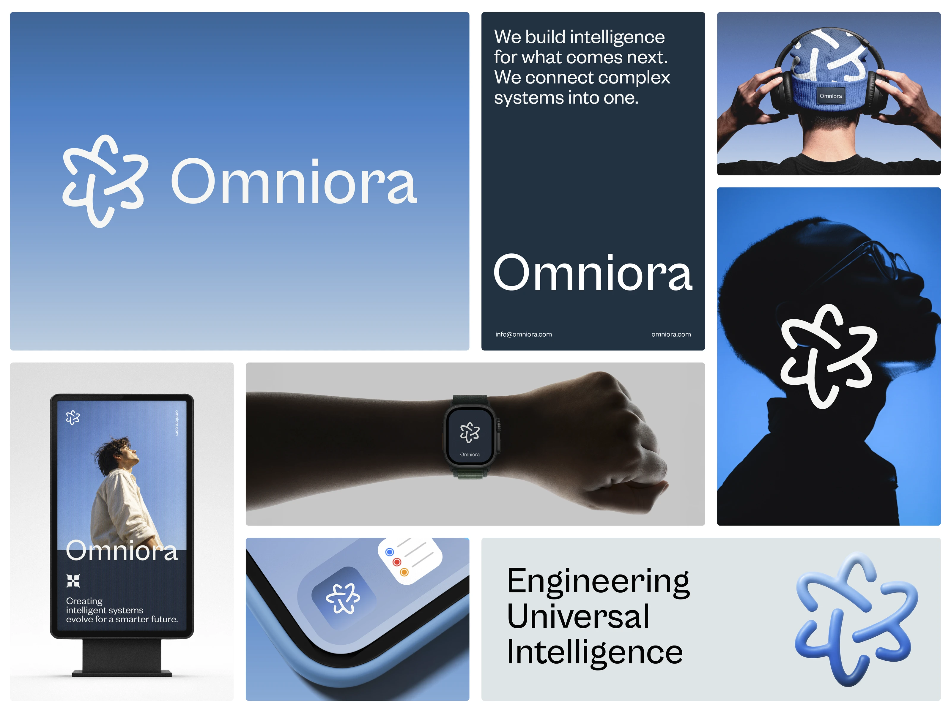
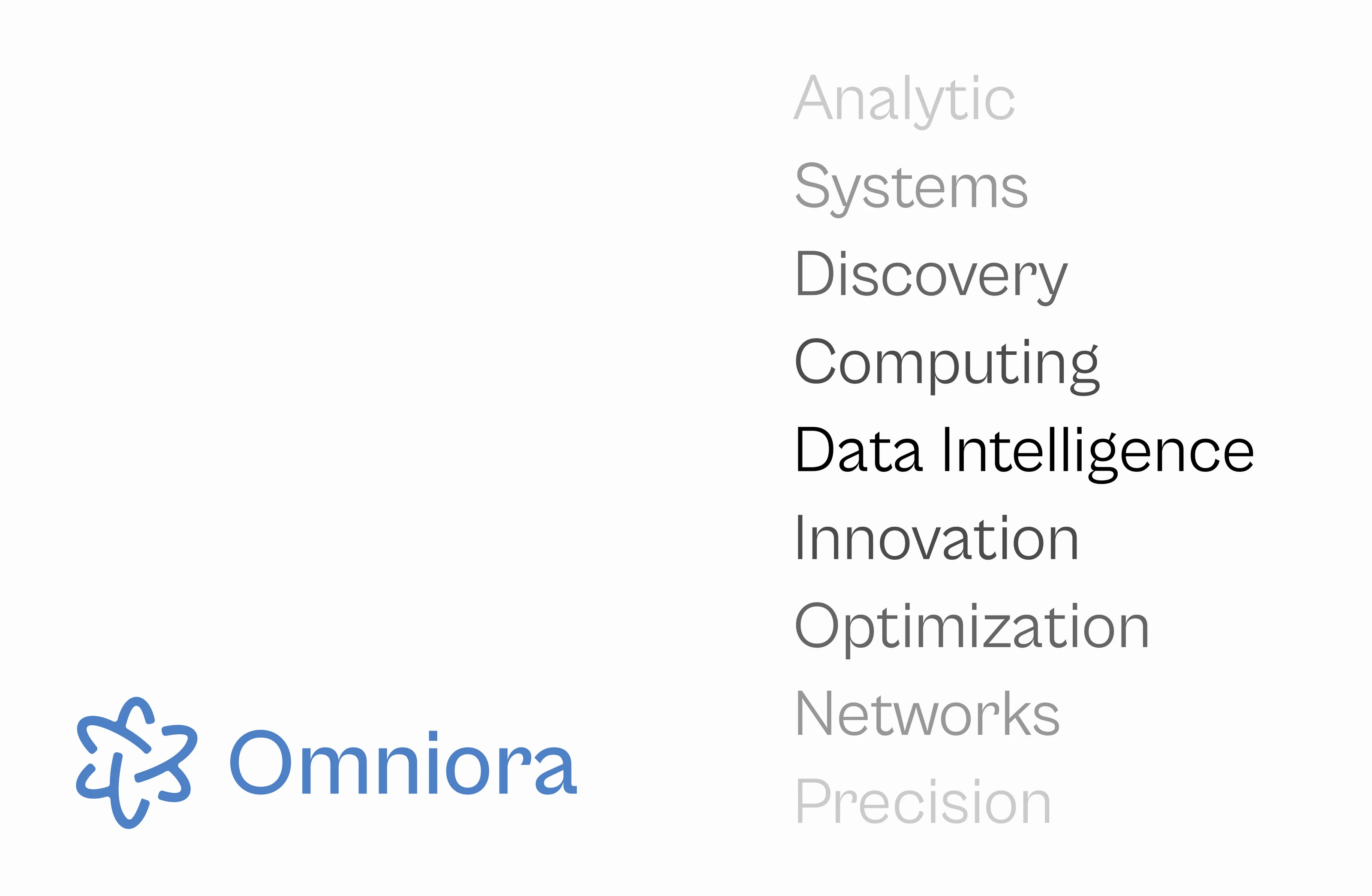
Omniora explores a visual direction for an intelligence-driven world, built on the idea of connection between systems. Engineering Universal Intelligence anchors the concept. The identity aims to turn complex technology into something clear, cohesive and recognisable, using space, restrained type and a soft blue gradient in place of circuit boards, robots or glowing brains.

A symbol for connected systems
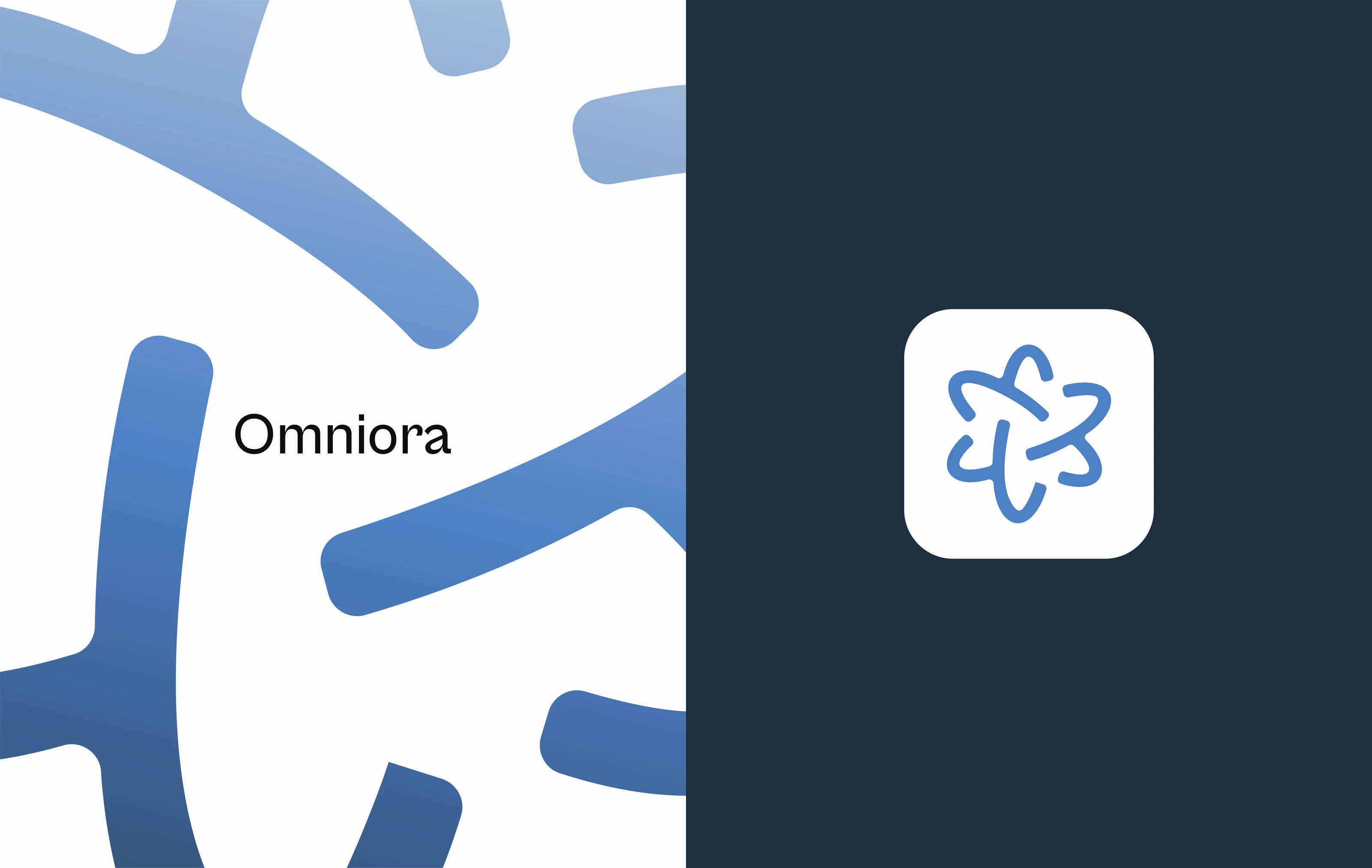
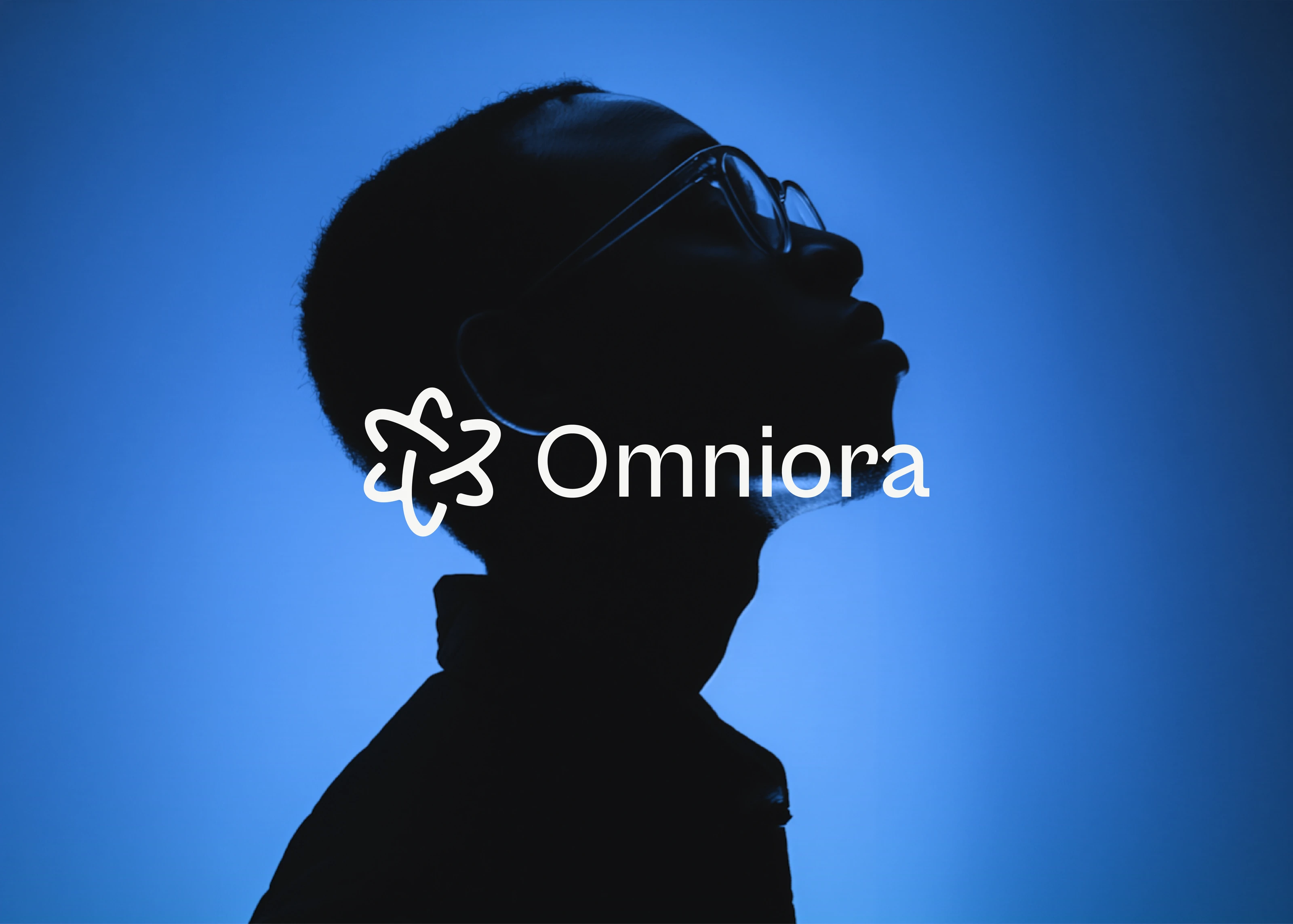
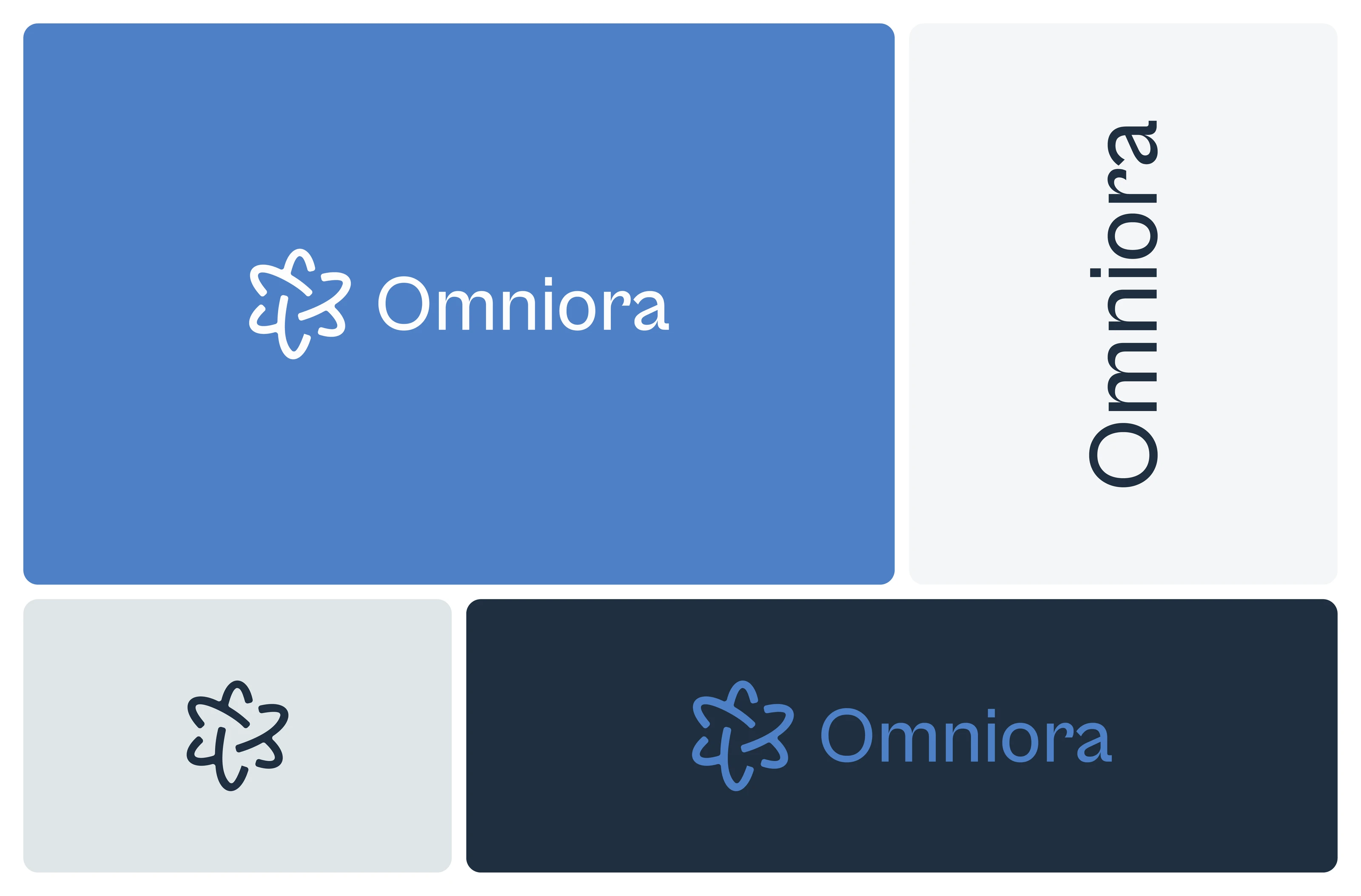
The symbol is a single looping line with five lobes, representing connection between systems. Its rounded, continuous stroke stays clear at small sizes, including app icons, and sits comfortably beside a clean sentence-case wordmark. Together they form the core of the logo system, explored across the slides that follow.
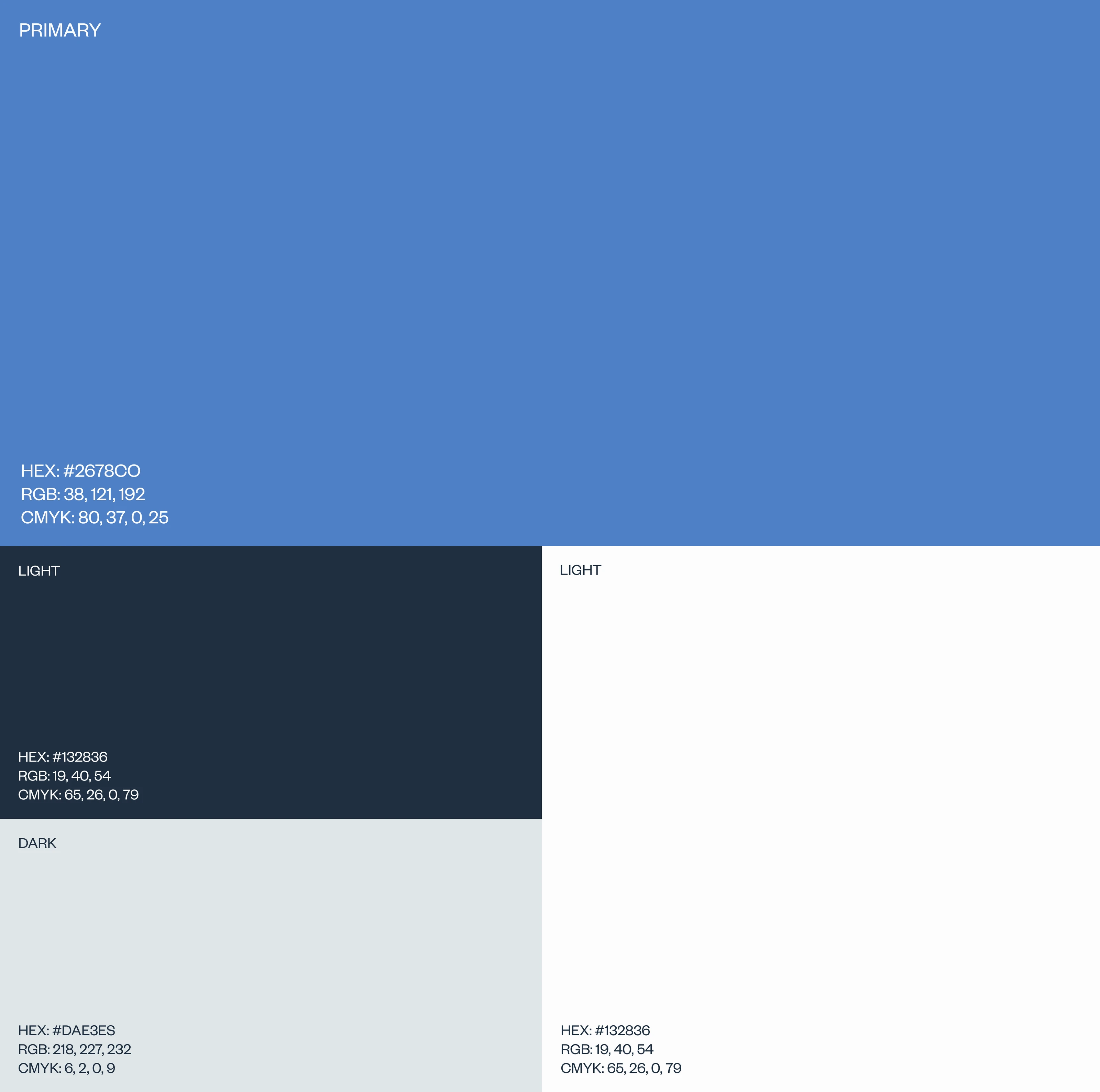
A restrained blue and navy colour system
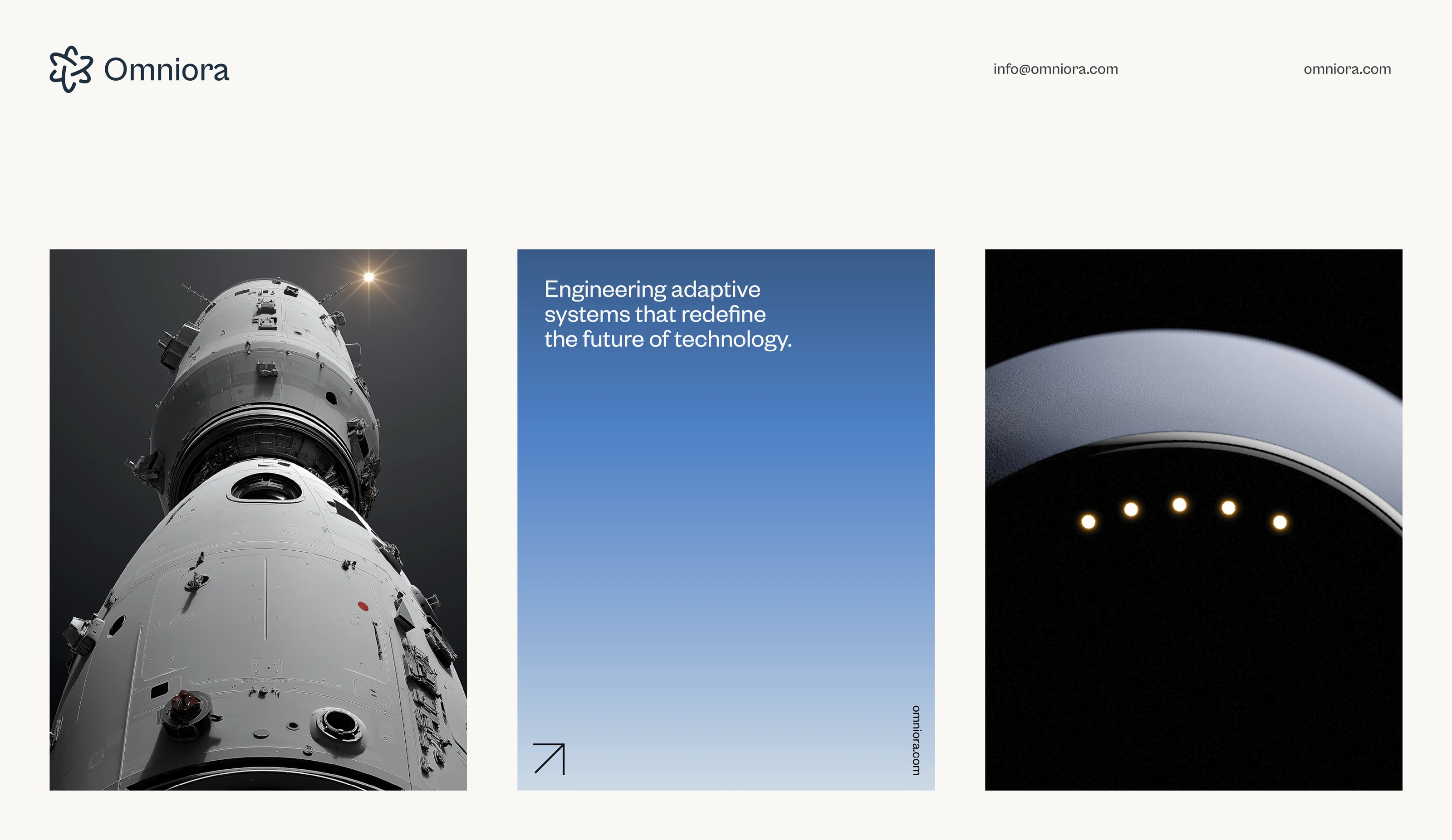
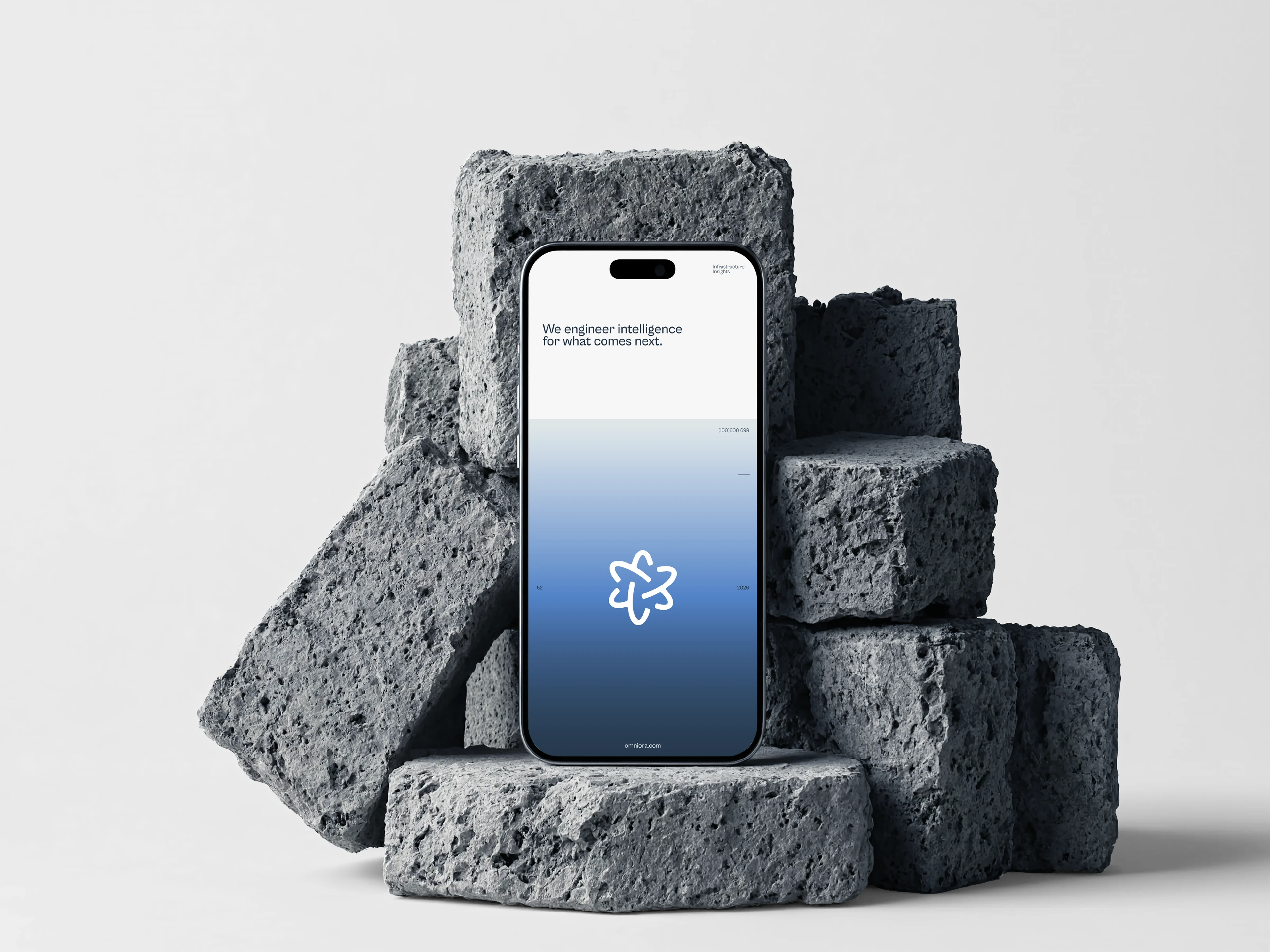
Blue leads the palette, supported by a deep navy, a pale grey-blue and white. A soft gradient from blue to light connects the screens, print and photography, while navy grounds the wordmark and interface applications. The restraint keeps the identity calm, credible and focused on the symbol.
A refined wordmark
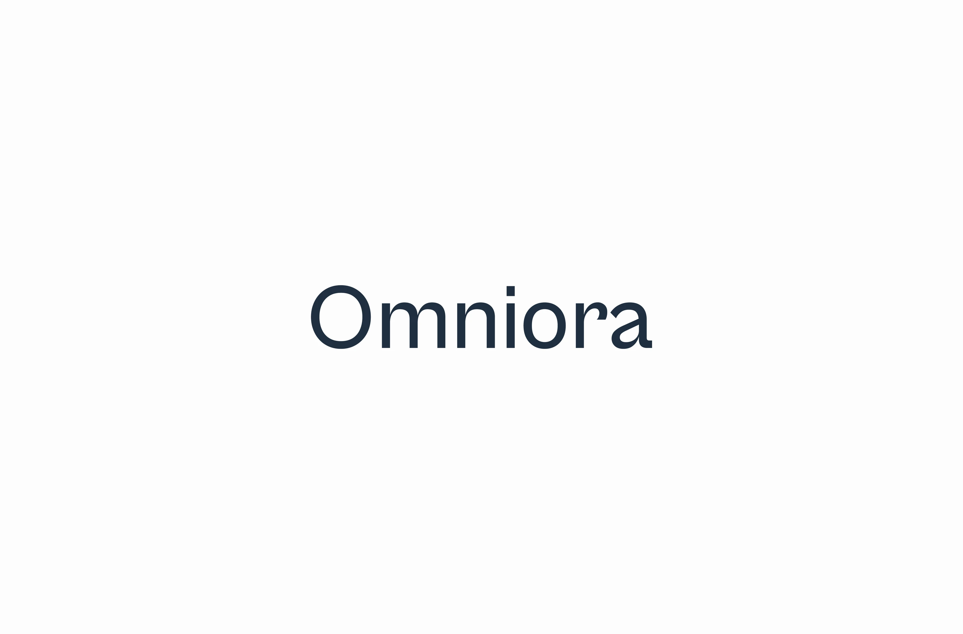
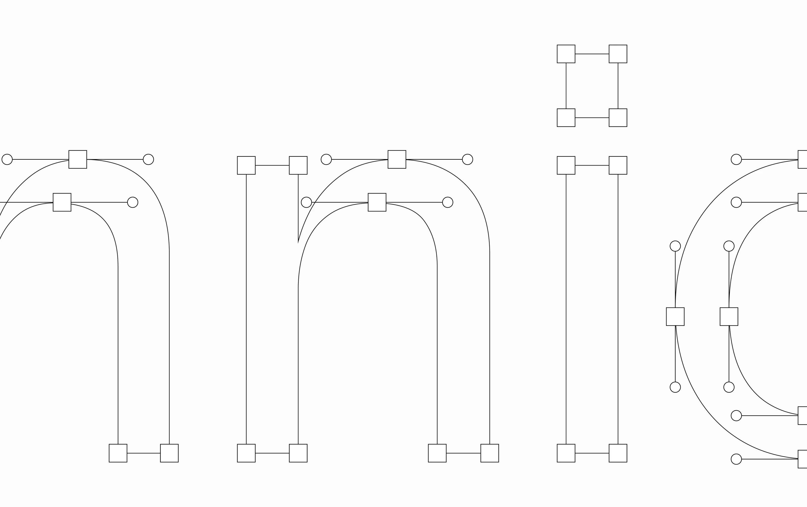
The wordmark uses open, rounded letterforms in sentence case, set to sit alongside the symbol without competing with it. The outline view shows the curves and anchor points behind each letter, bringing the construction of the identity into the story alongside the finished mark.
From symbol to graphic language
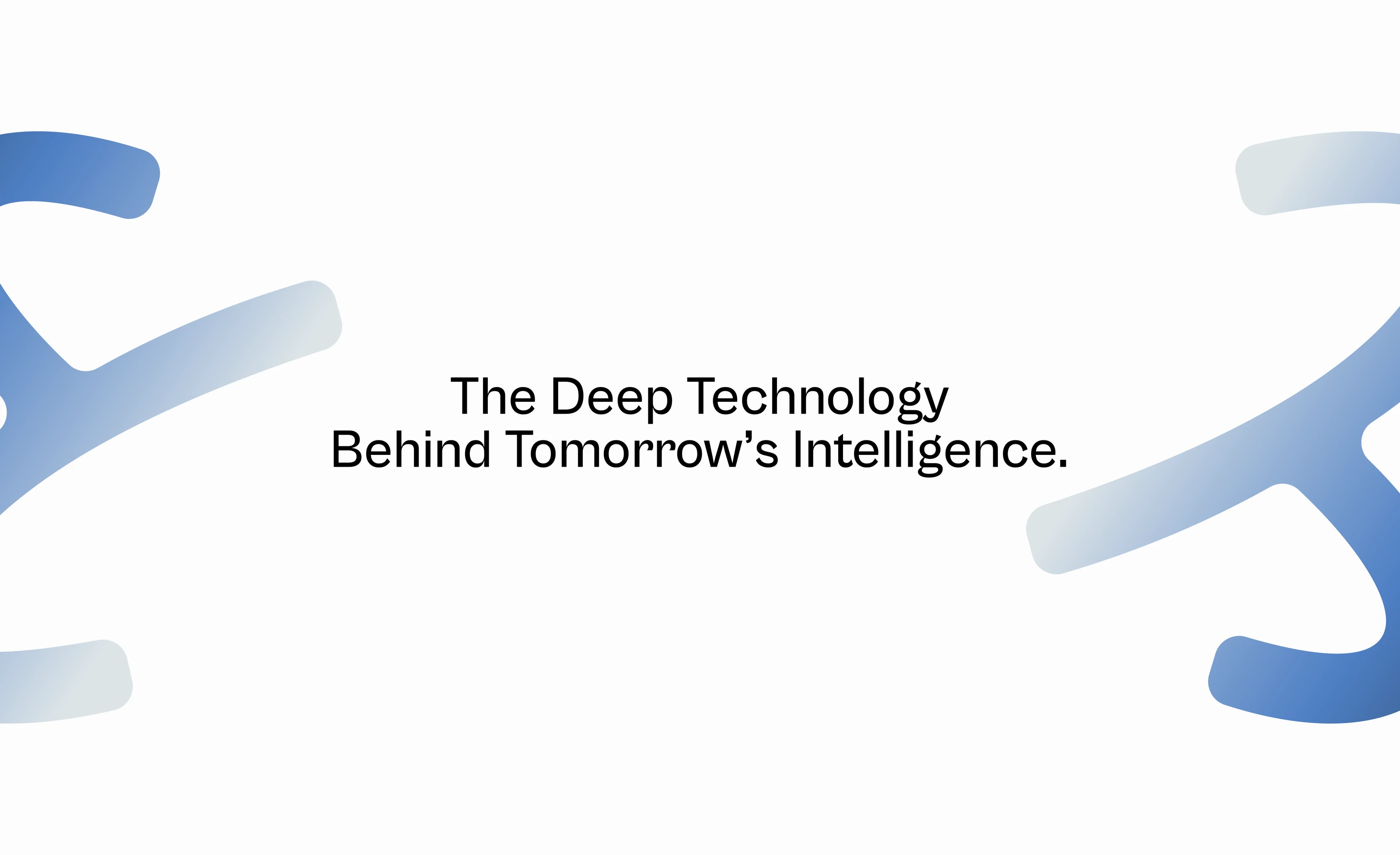
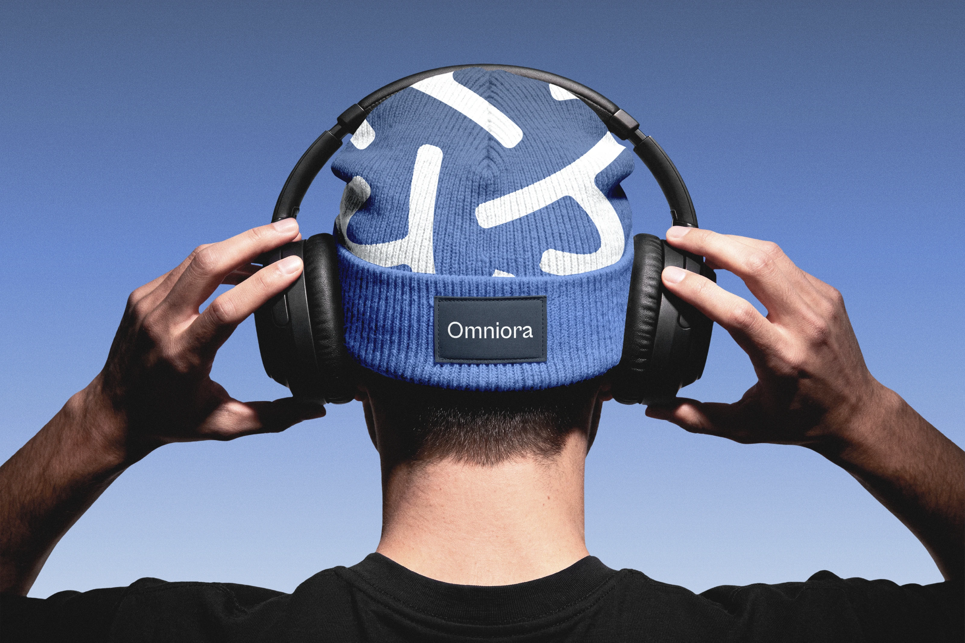
Enlarged, cropped fragments of the symbol become a supporting pattern. They fill backgrounds, frame statements and wrap around objects, so the brand stays recognisable even when the full logo is not shown. The fragments keep the symbol's blue gradient and rounded terminals, extending one idea across the whole system.
Brand applications, digital and physical
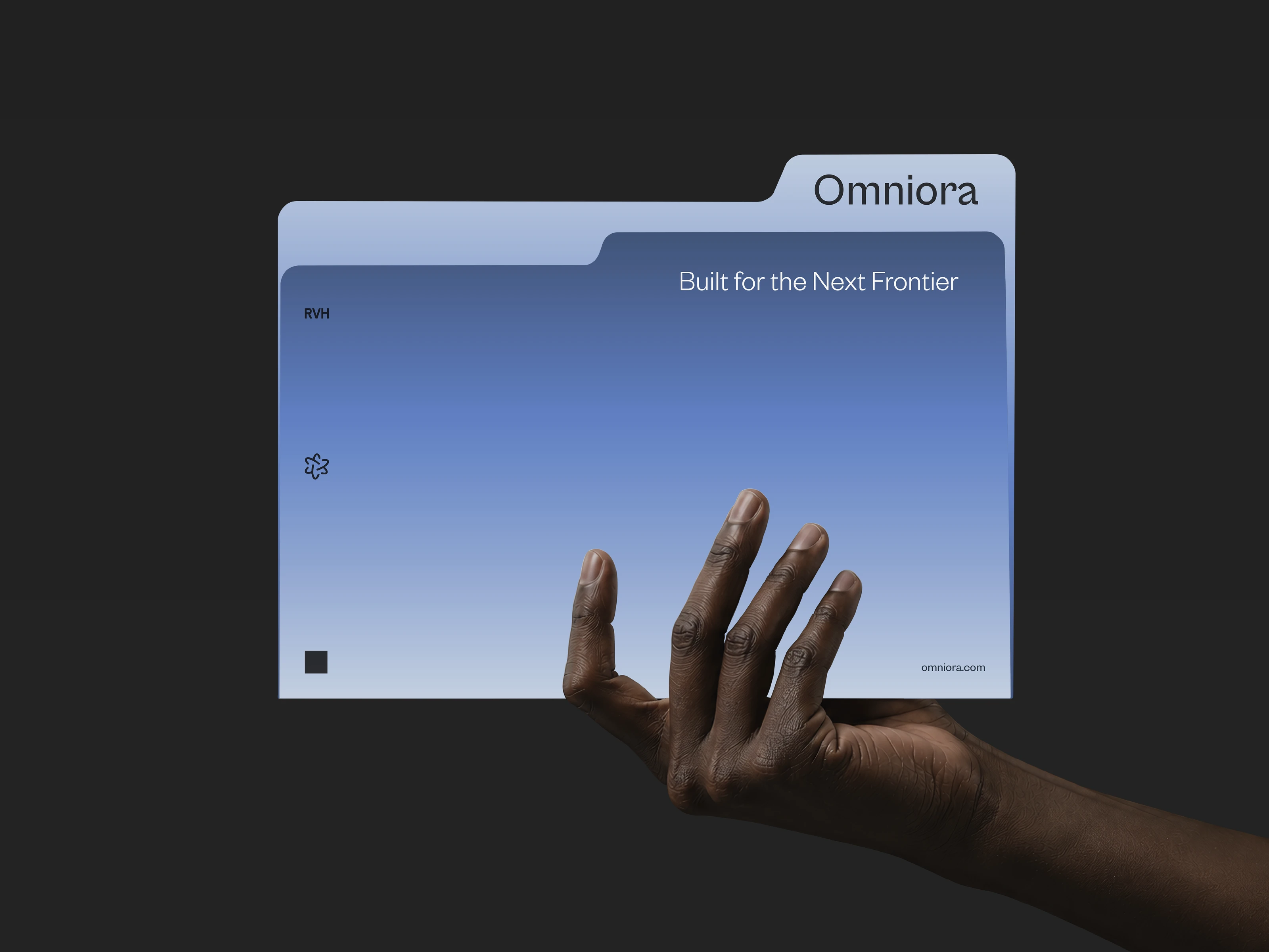
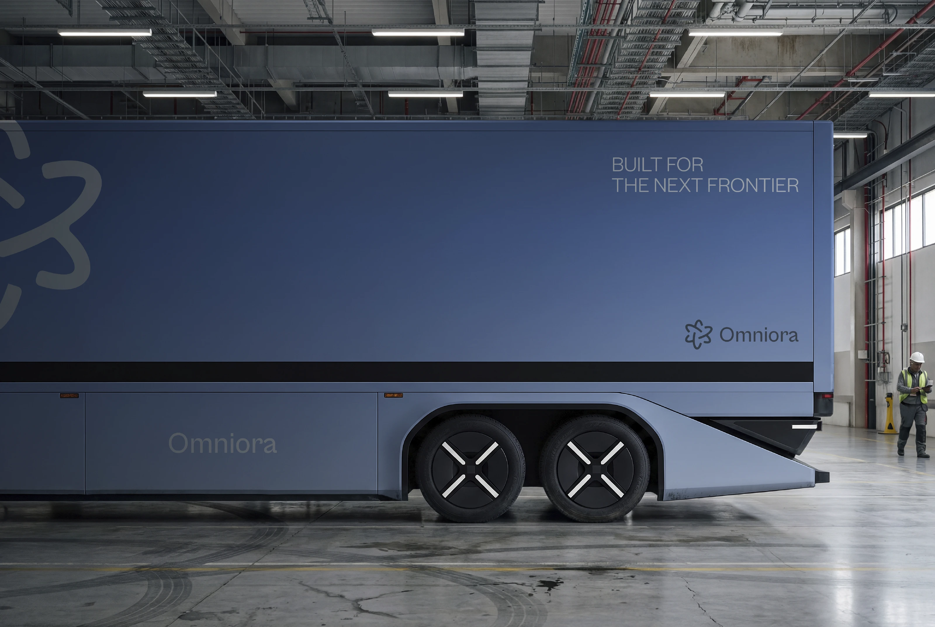
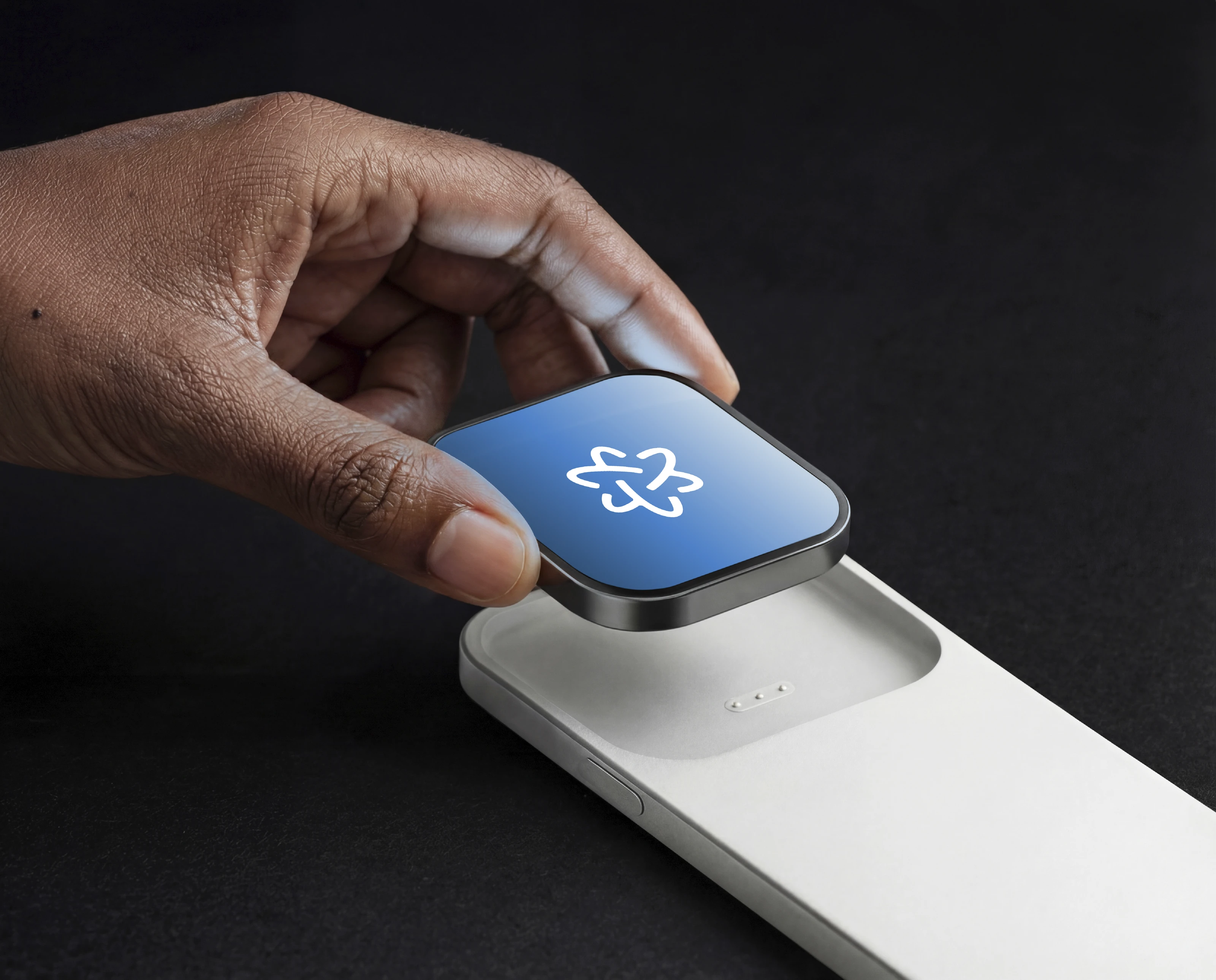
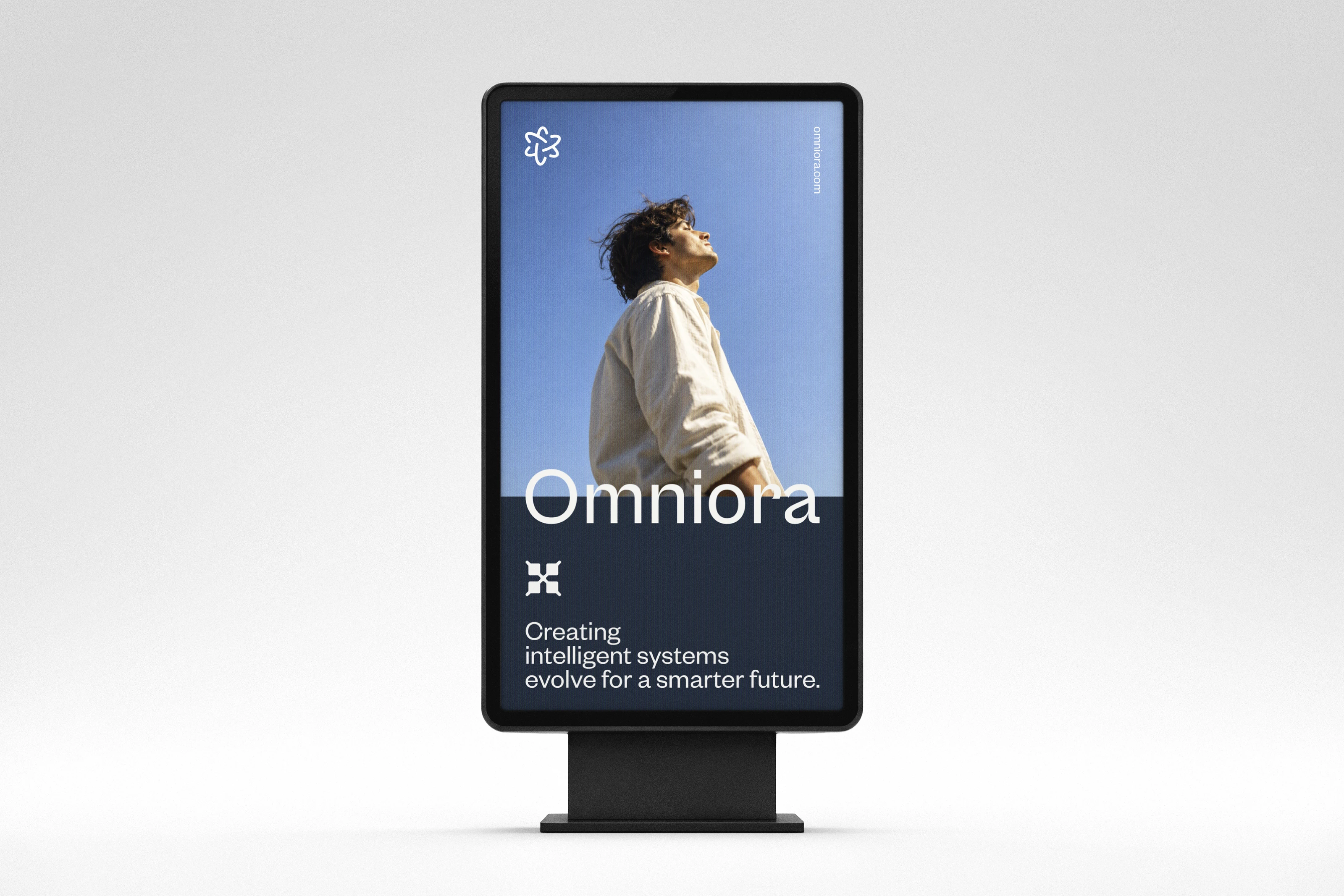
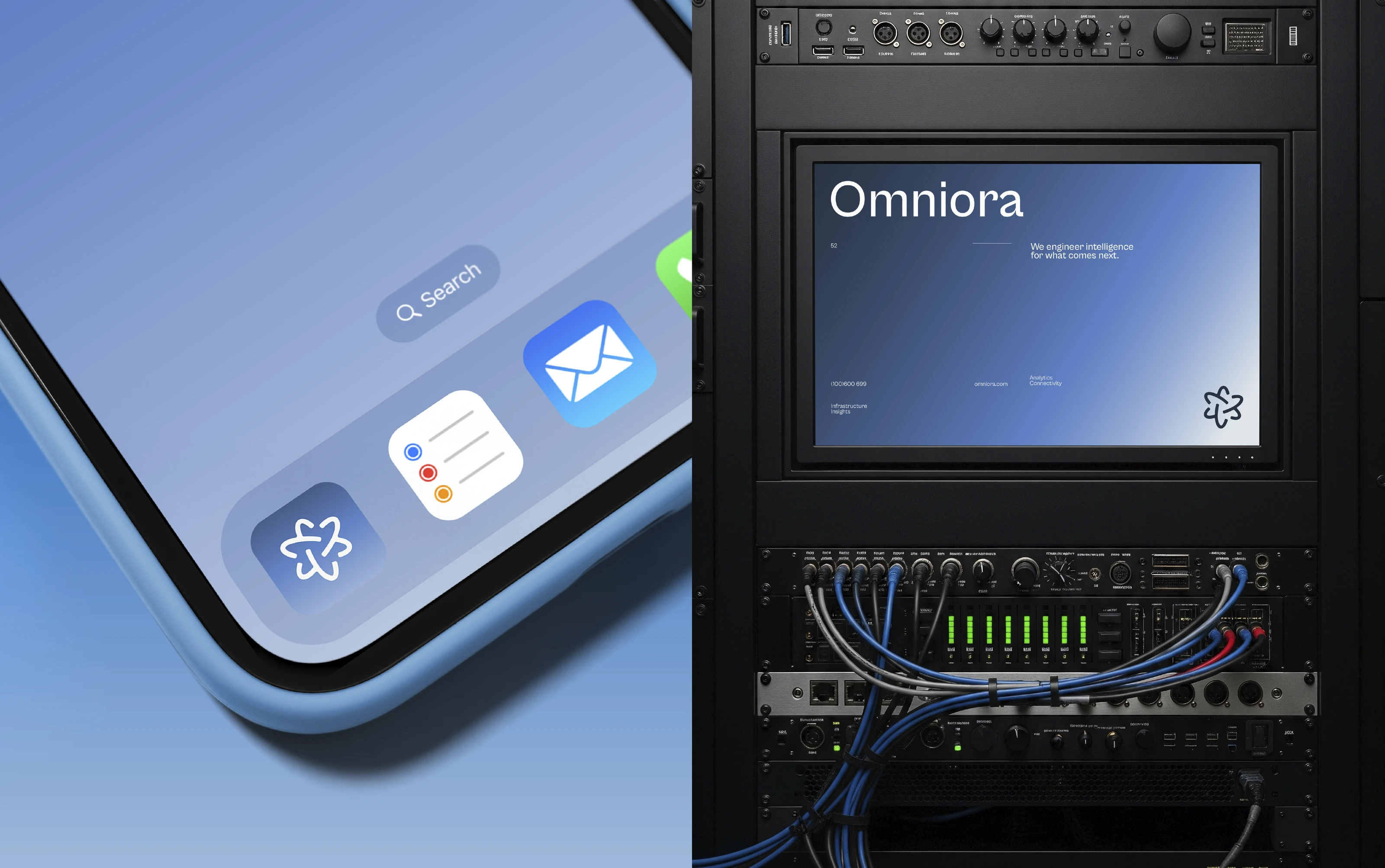
The identity is carried across concept mockups for an app icon, phone and device screens, an outdoor display, a rack-mounted screen, a folder, a beanie and a delivery truck. Supporting lines such as "Built for the Next Frontier" and "We engineer intelligence for what comes next" give the system a consistent voice.
Built for what comes next
A considered identity system for a concept rooted in connected intelligence, designed to bring clarity, consistency and character to the world of advanced technology. It shows how Sparkline Studio develops a logo into a complete, cohesive visual identity, from first mark to final application.
Looking for an AI or deep technology brand identity? Start a project with Sparkline Studio.
Start a project