
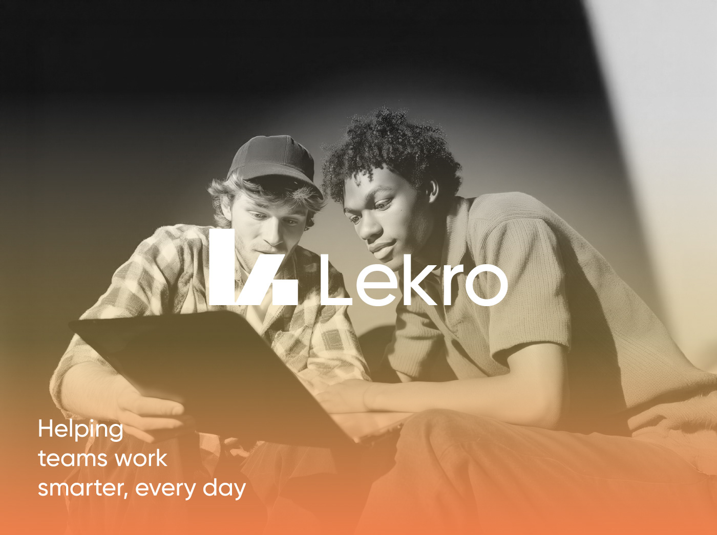
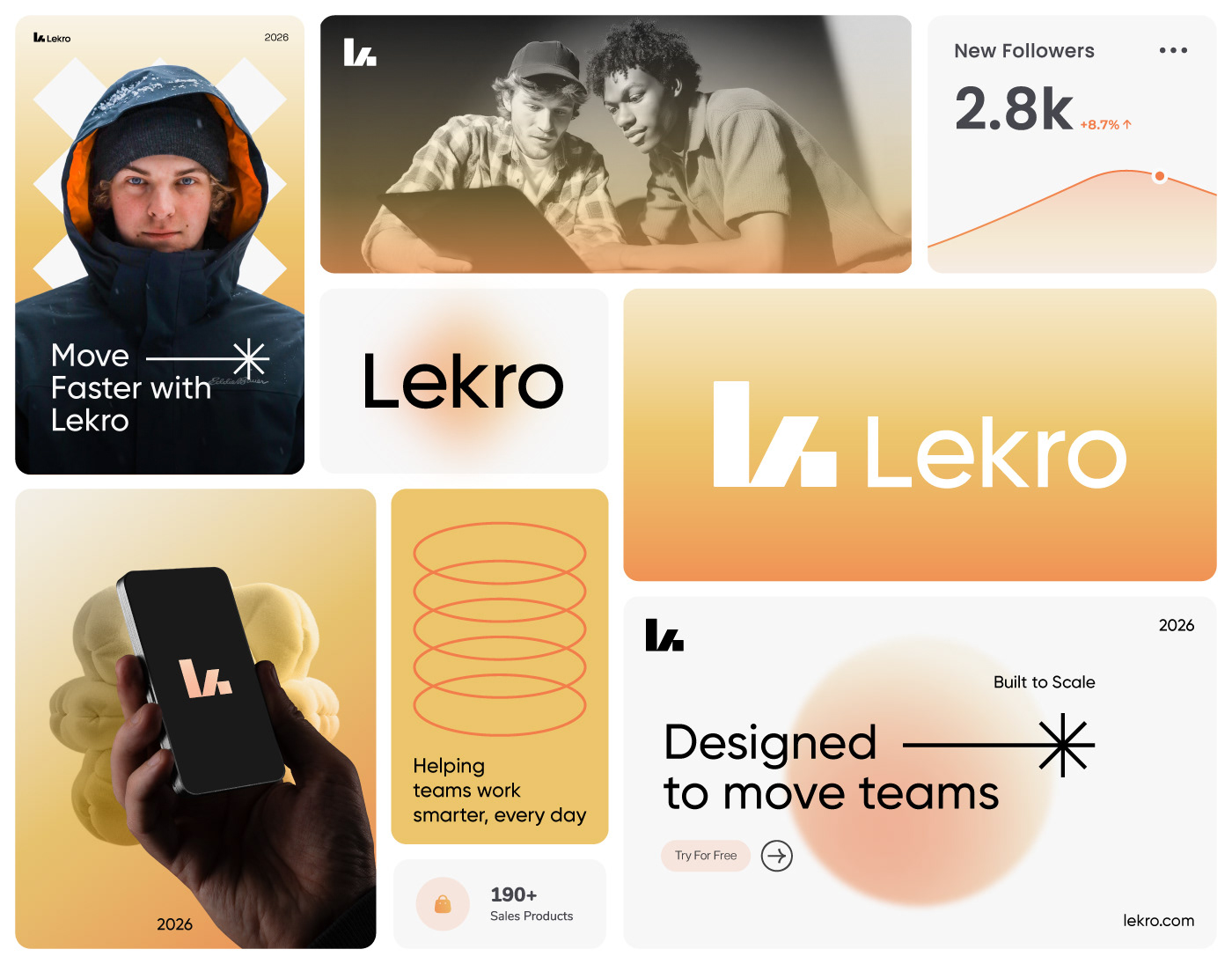
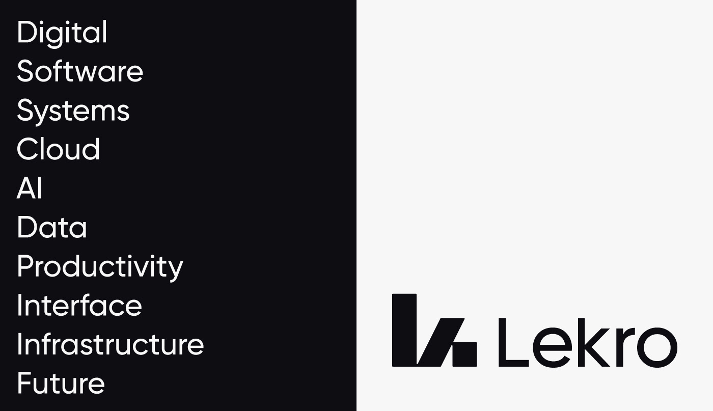
Lekro - Brand Identity
Lekro is a modern SaaS brand designed to simplify complex workflows and help teams move with clarity and momentum.
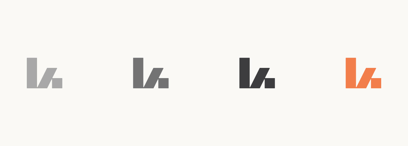
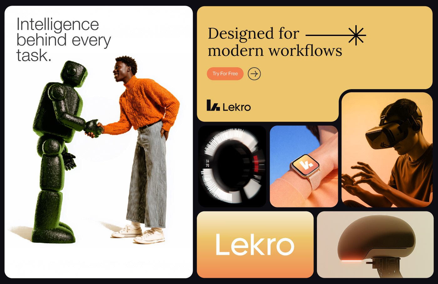
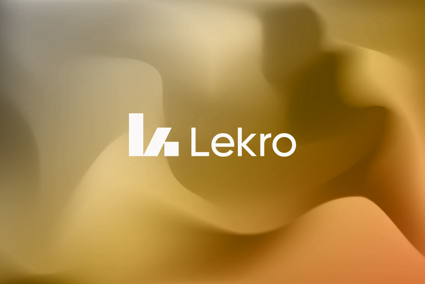
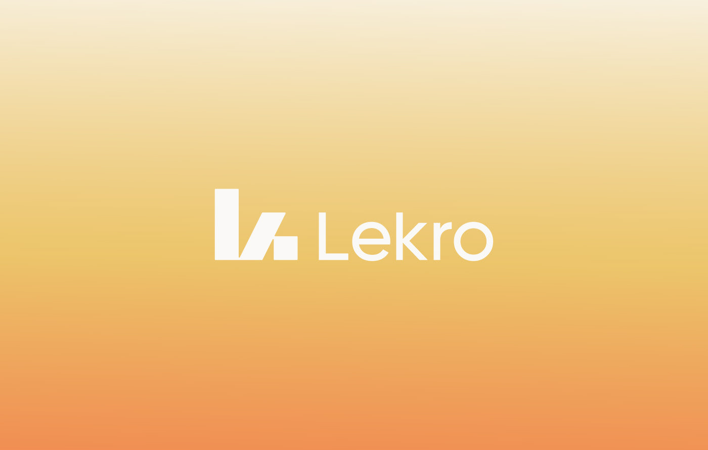
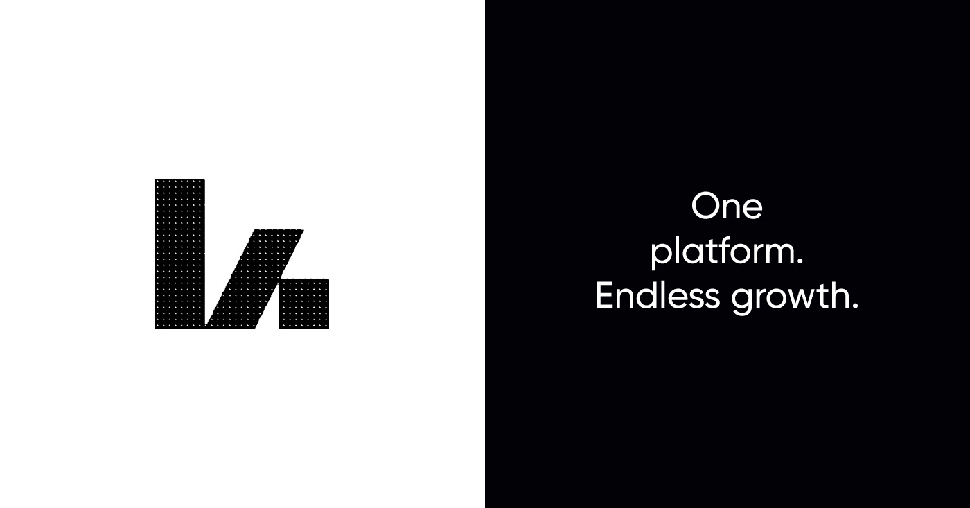
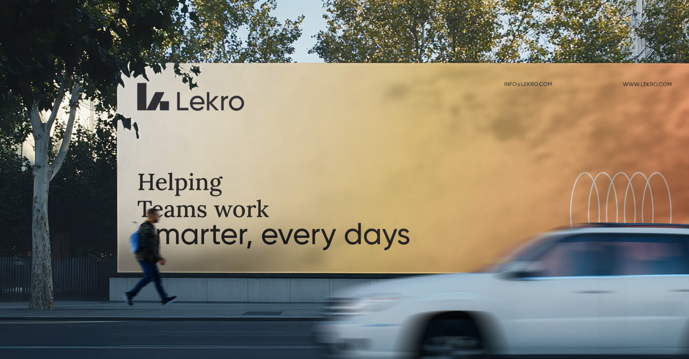
This project explores a complete visual identity system built around structure, scalability, and forward motion. The core symbol combines the letters L and K into a unified form, representing both stability and progress.
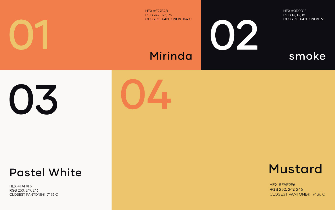
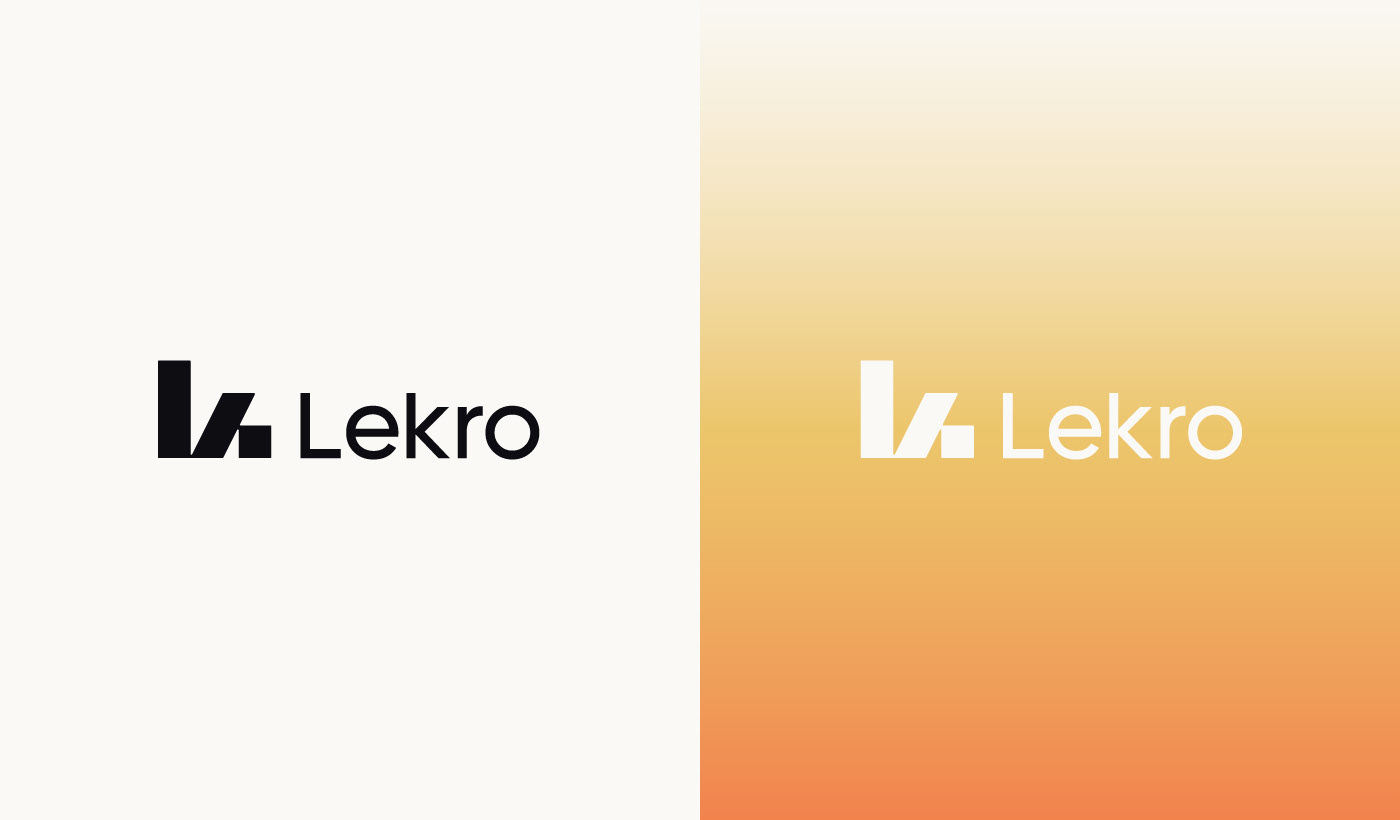
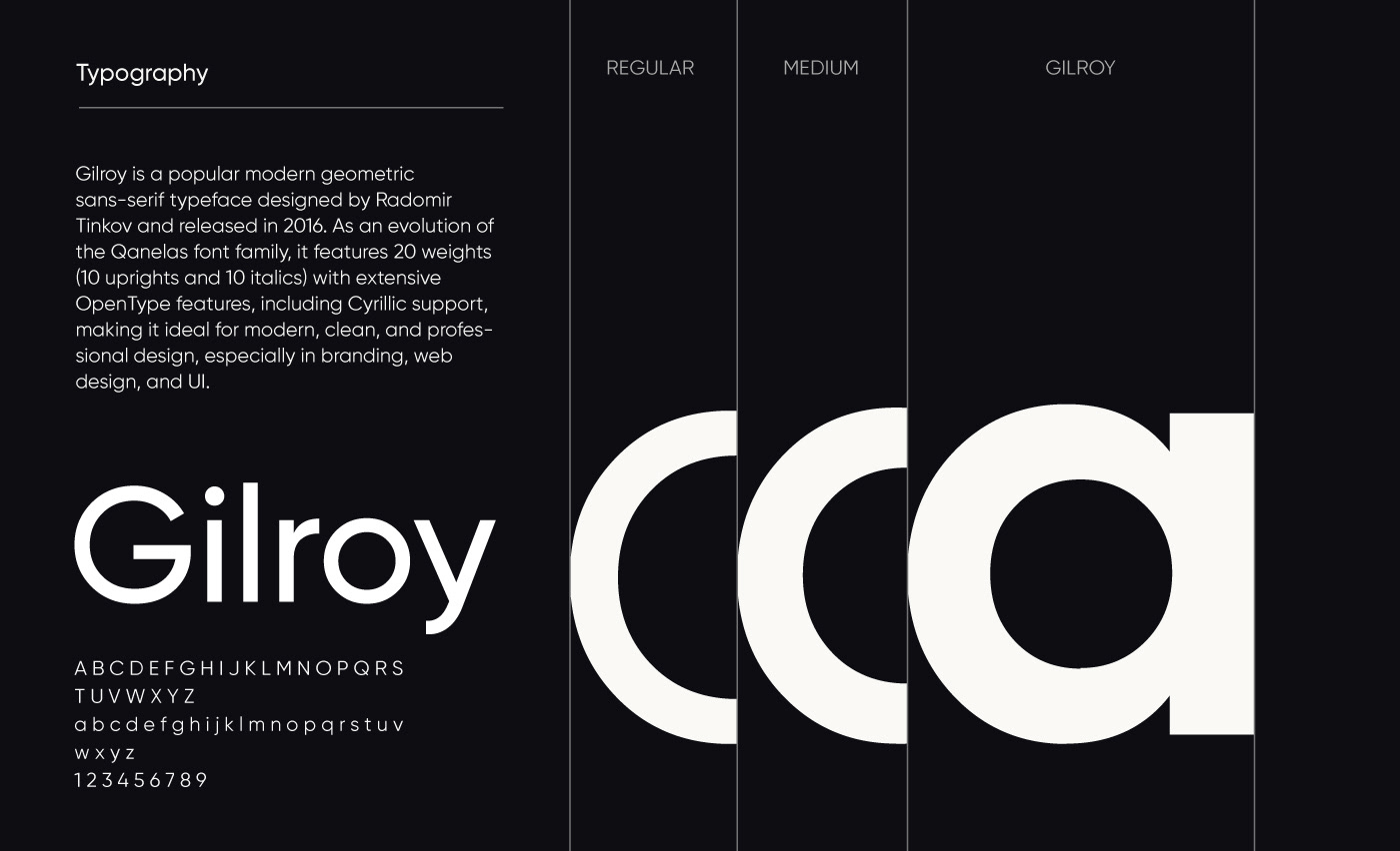
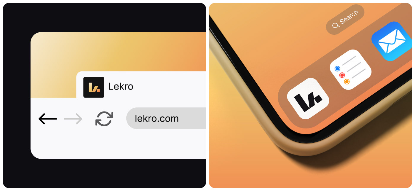
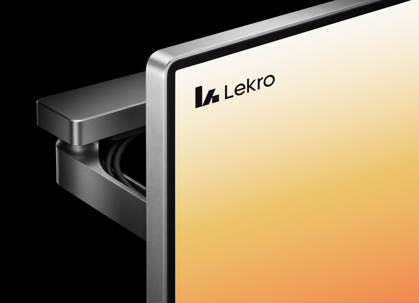
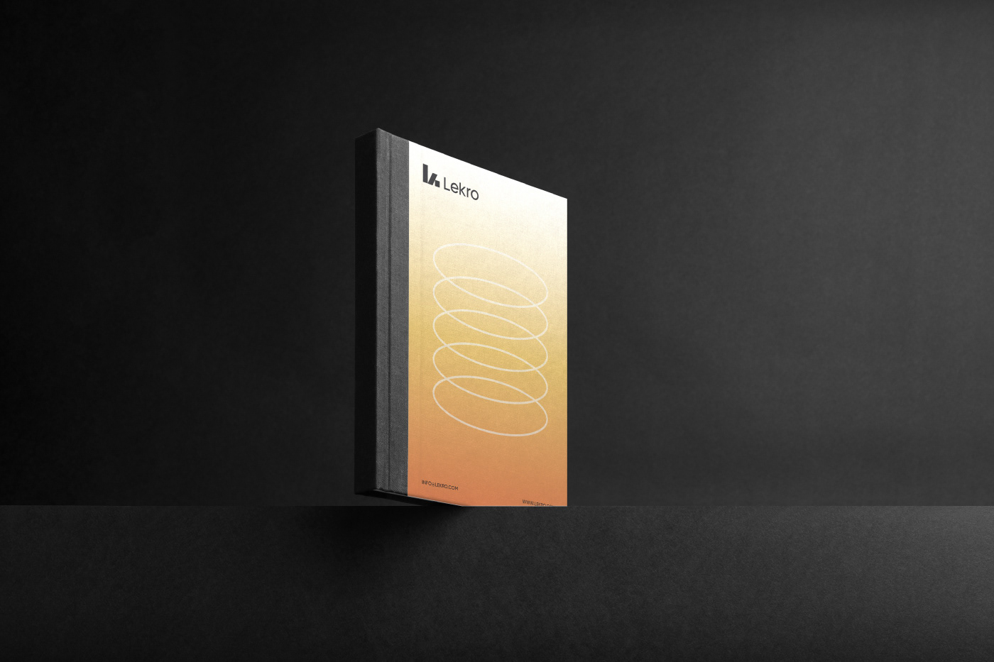
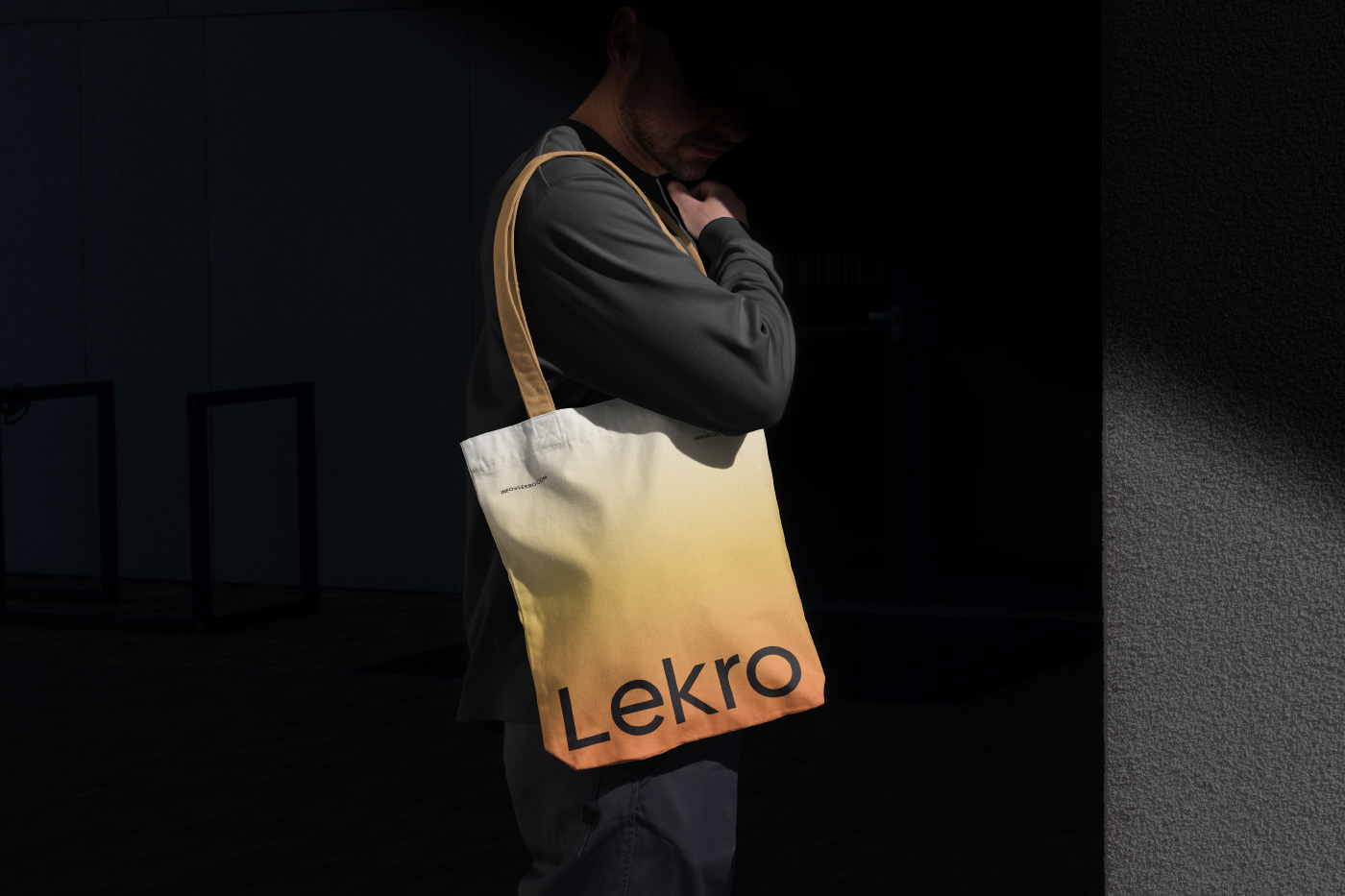
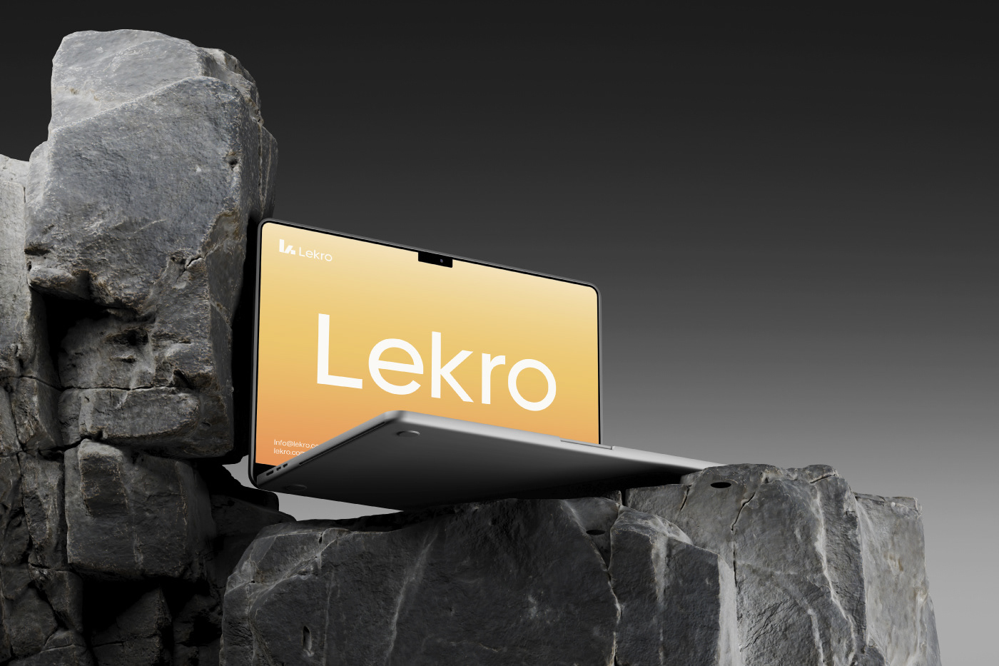
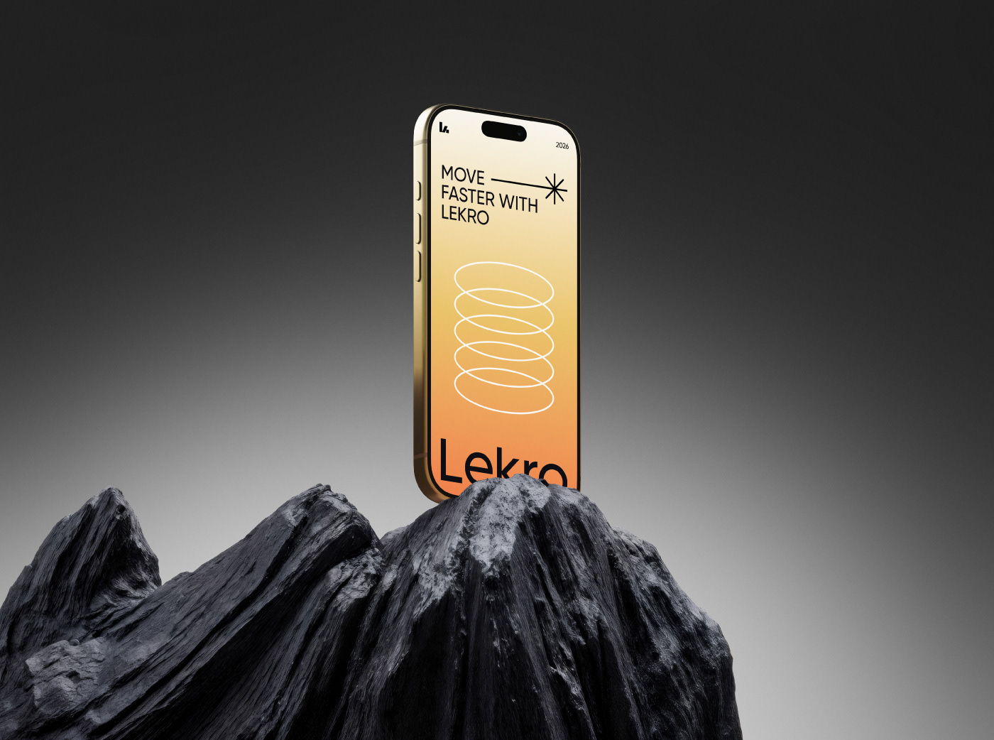
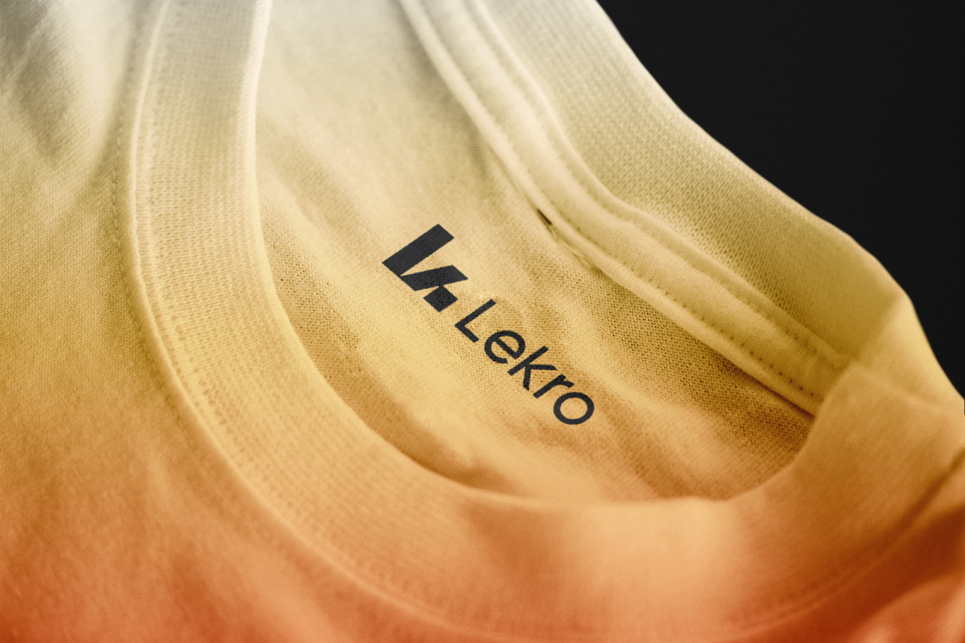
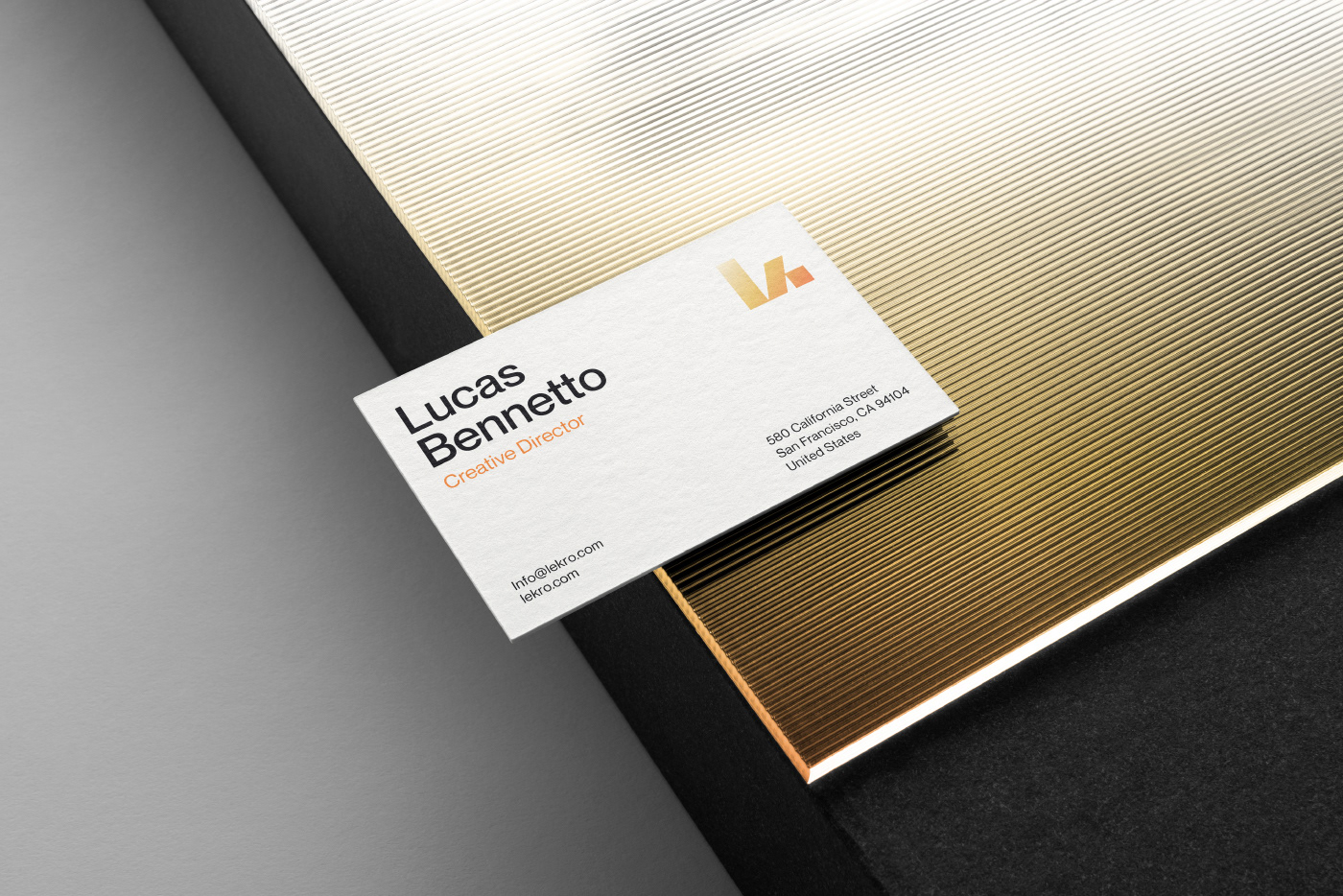
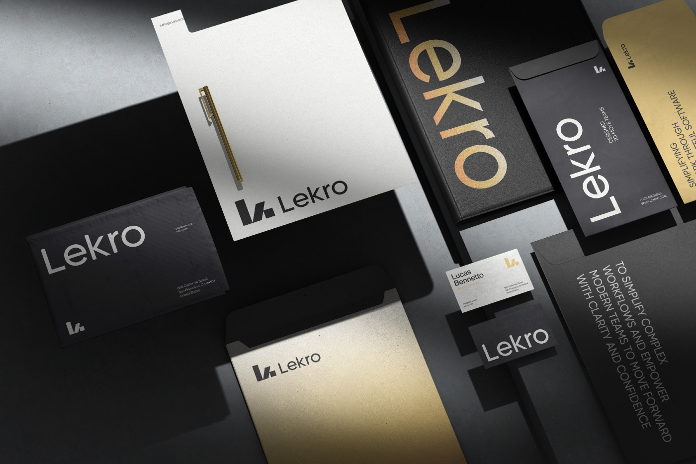
The visual language balances clean typography, warm gradients, and motion-inspired elements to create a system that feels both professional and human. Every component is designed to work seamlessly across product interfaces, web experiences, and brand communications.
Lekro represents a new approach to SaaS branding—
Simple, Scalable, and built to move forward.
Simple, Scalable, and built to move forward.
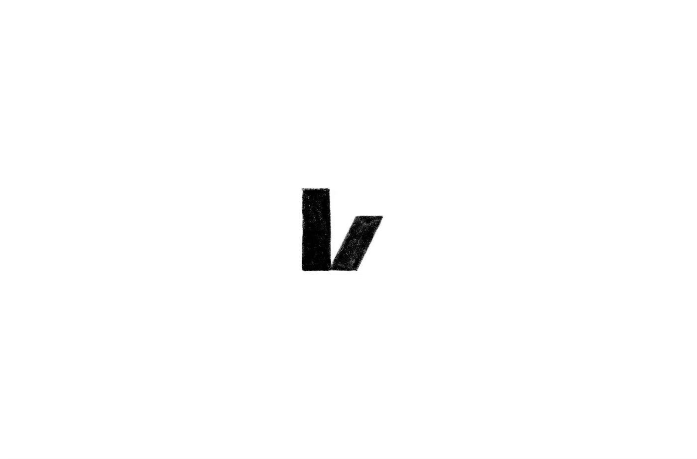
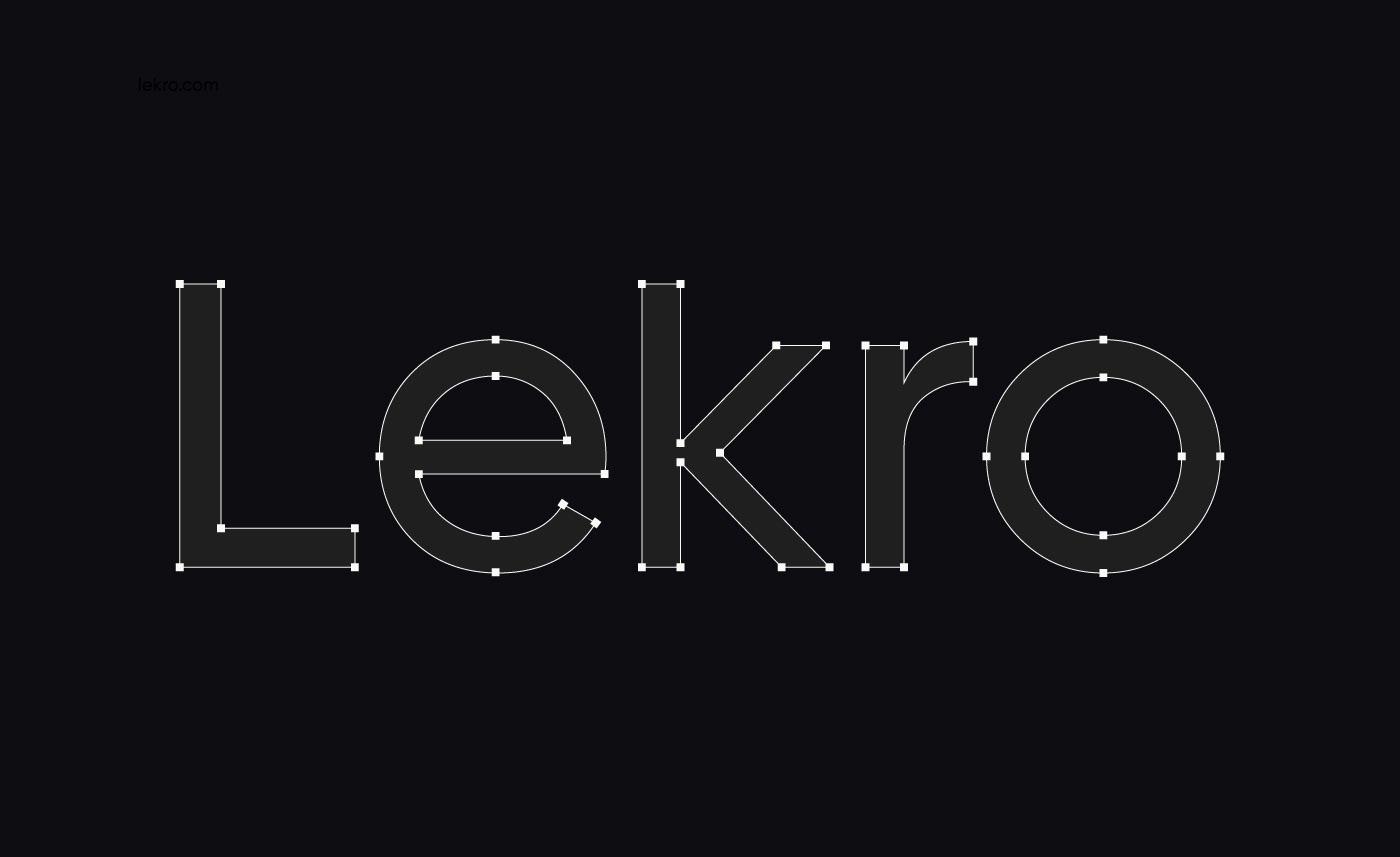
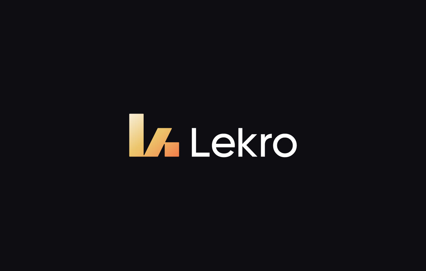
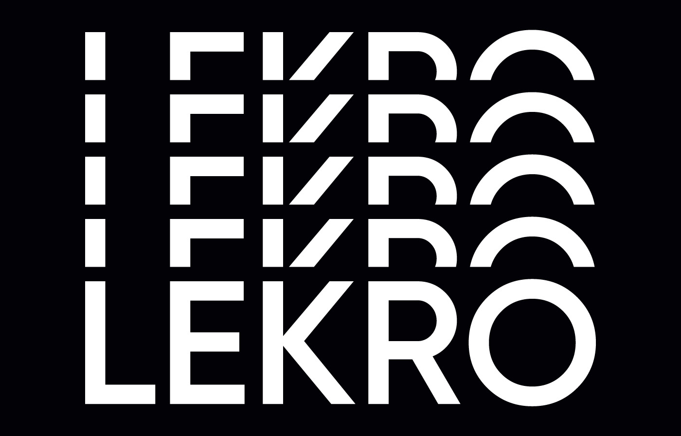
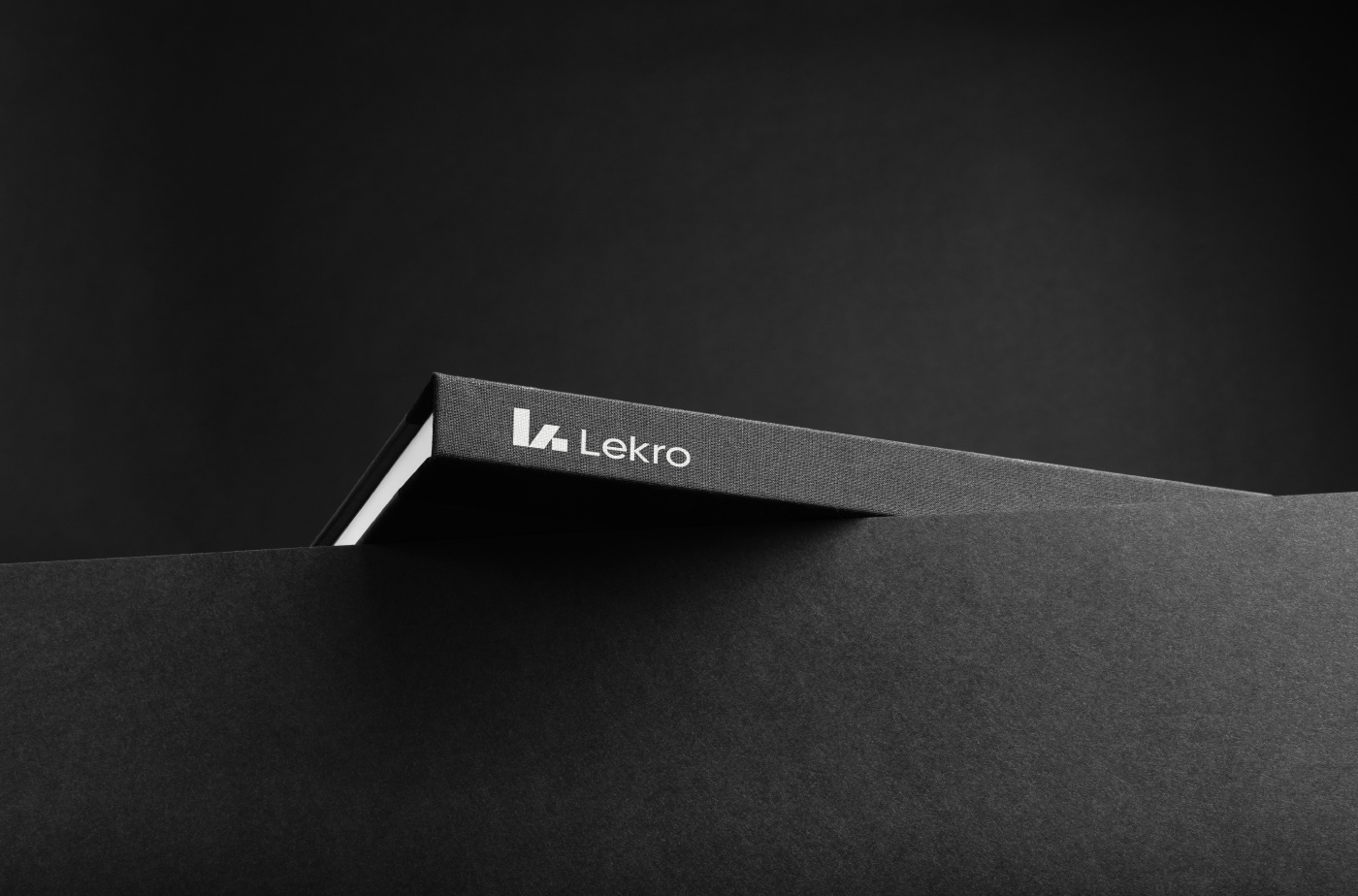
Logo Concept
The logomark is a custom, geometric wordmark designed to feel precise and forward-moving.
Sharp cuts and balanced proportions communicate efficiency, while subtle softness keeps the brand approachable.
Sharp cuts and balanced proportions communicate efficiency, while subtle softness keeps the brand approachable.
Final Thought
This project explores how visual clarity and momentum can transform complex software into an experience that feels intuitive, focused, and alive.
Credits
Branding & Visual Identity: Mehedi.H
Project Type: Concept / SaaS Branding
Year: 2026
Project Type: Concept / SaaS Branding
Year: 2026


Thank you for viewing my project!
If you enjoyed it, please consider clicking the Like button, leaving an appreciation, and following me for more work.
E-mail | Md.mehedihasan55330@gmail.com
WhatsApp For Inquiry: +8801624596892
Website: ⚡️ Sparkline Studio
© 2025 Mehedi Hasan