
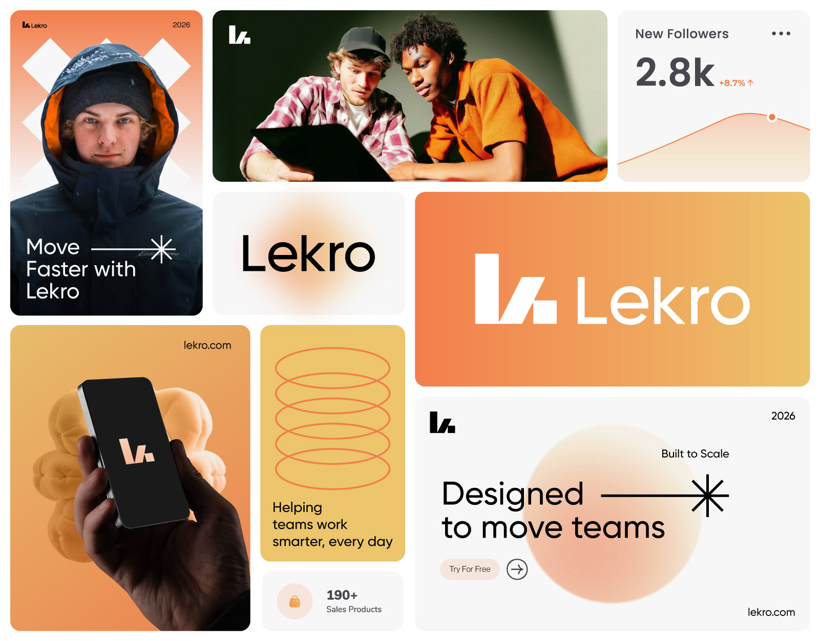
Lekro — SaaS Visual Identity System
Momentum, Made Simple.
Project Overview
Lekro is a modern SaaS platform designed to help teams work smarter and move faster.
The goal of this project was to create a scalable visual identity that balances clarity, warmth, and momentum—reflecting how modern teams collaborate, build, and grow.
The goal of this project was to create a scalable visual identity that balances clarity, warmth, and momentum—reflecting how modern teams collaborate, build, and grow.
The identity needed to feel:
◉ Digital-first
◉ Human-centered
◉ Confident yet approachable
◉ Flexible across product, marketing, and motion
The Challenge
Many SaaS products struggle with visual noise—complex interfaces, cold branding, and disconnected systems.
Lekro needed an identity that simplified complexity without feeling generic, while remaining adaptable across web, mobile, and growth touchpoints.
Lekro needed an identity that simplified complexity without feeling generic, while remaining adaptable across web, mobile, and growth touchpoints.
Key challenges:
◉ Stand out in a saturated SaaS market
◉ Balance performance with friendliness
◉ Design for scale without losing personality
The Solution
The Lekro identity is built around the idea of momentum—how work moves, flows, and evolves.
Every visual decision supports speed, clarity, and continuity across the product ecosystem.
Every visual decision supports speed, clarity, and continuity across the product ecosystem.
The result is a clean yet expressive system that feels alive in motion and stable in structure.
Logo Concept
The logomark is a custom, geometric wordmark designed to feel precise and forward-moving.
Sharp cuts and balanced proportions communicate efficiency, while subtle softness keeps the brand approachable.
Sharp cuts and balanced proportions communicate efficiency, while subtle softness keeps the brand approachable.
Design Logic
The symbol is constructed from the letters L and K, combined into a single forward-moving form.
◉ L represents foundation, structure, and stability
◉ K introduces direction, action, and growth
The angled cut between the forms creates a subtle forward arrow, symbolizing momentum, progress, and continuous movement—core values of a modern SaaS platform.
This logic reinforces Lekro’s promise: Momentum, Made Simple.
Final Thought
This project explores how visual clarity and momentum can transform complex software into an experience that feels intuitive, focused, and alive.
Credits
Branding & Visual Identity: Mehedi.H
Project Type: Concept / SaaS Branding
Year: 2026
Project Type: Concept / SaaS Branding
Year: 2026