
Solara — Solar Energy Brand Identity
Overview
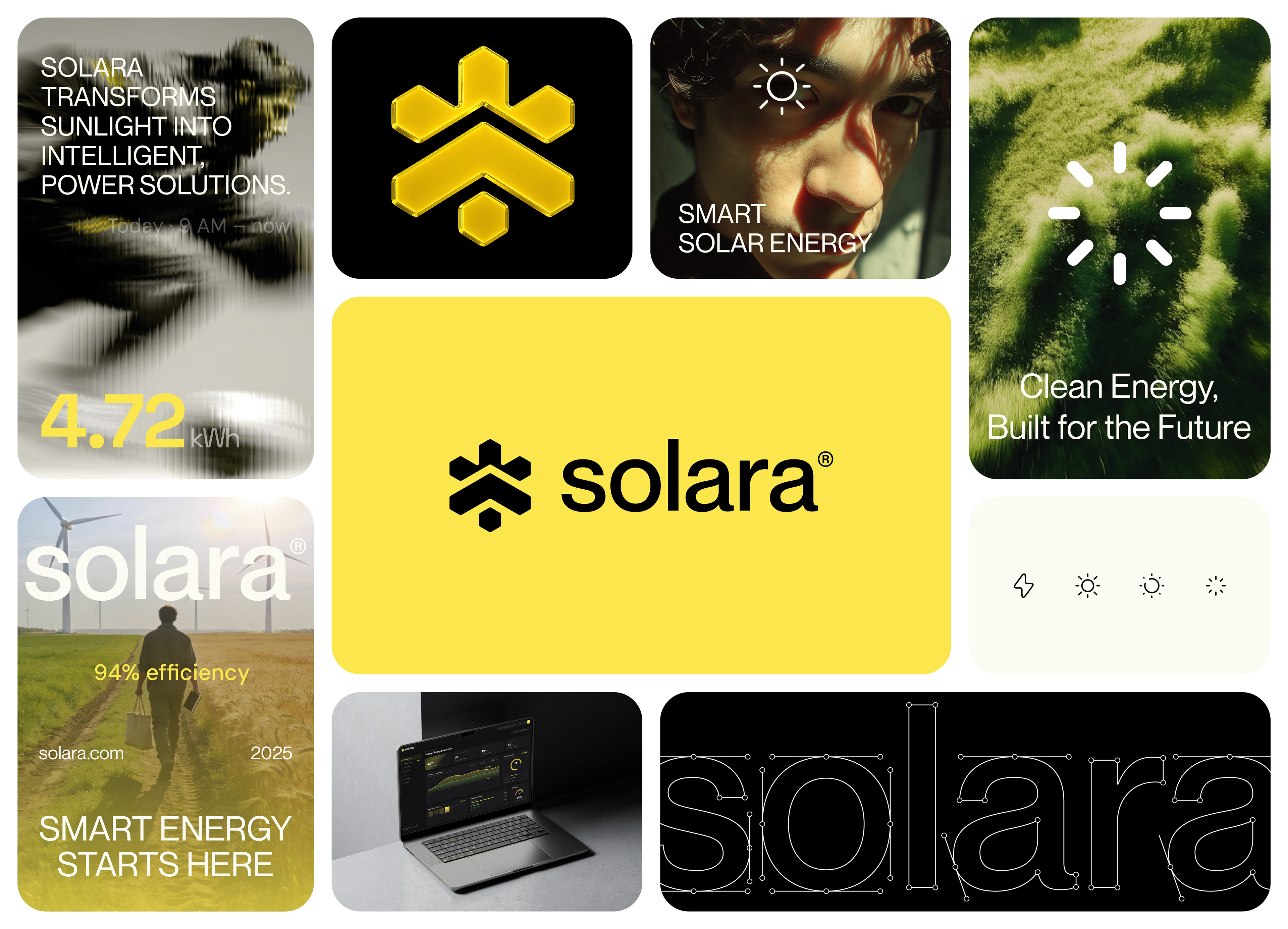
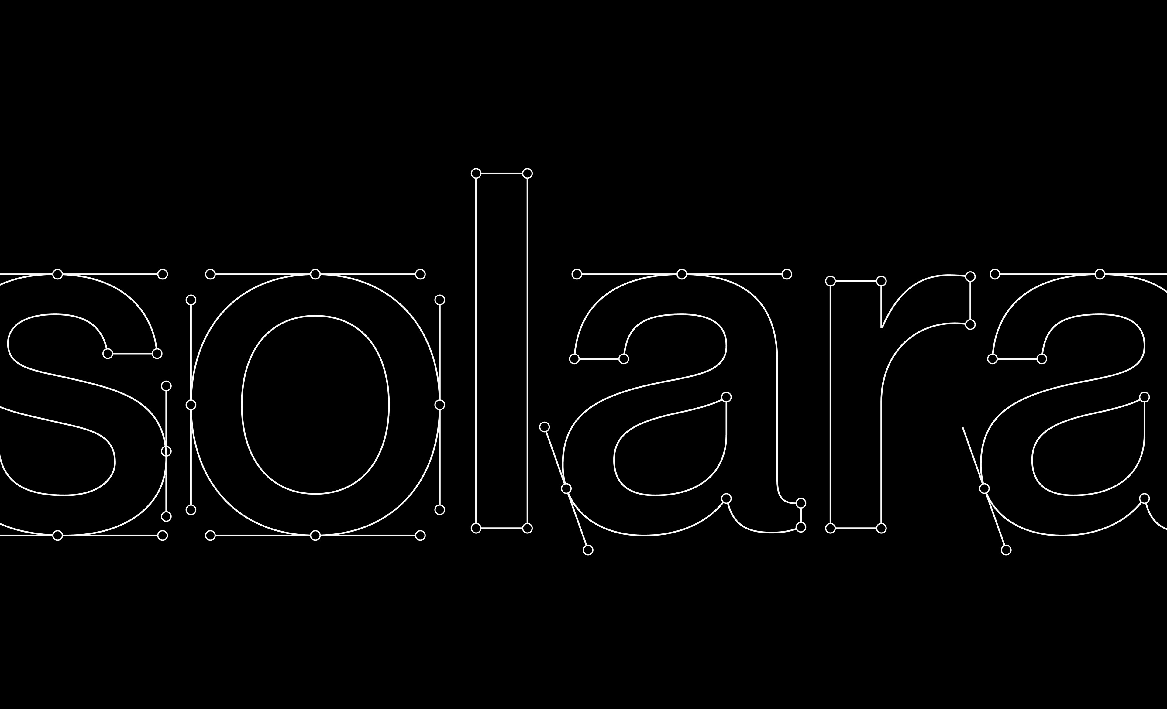
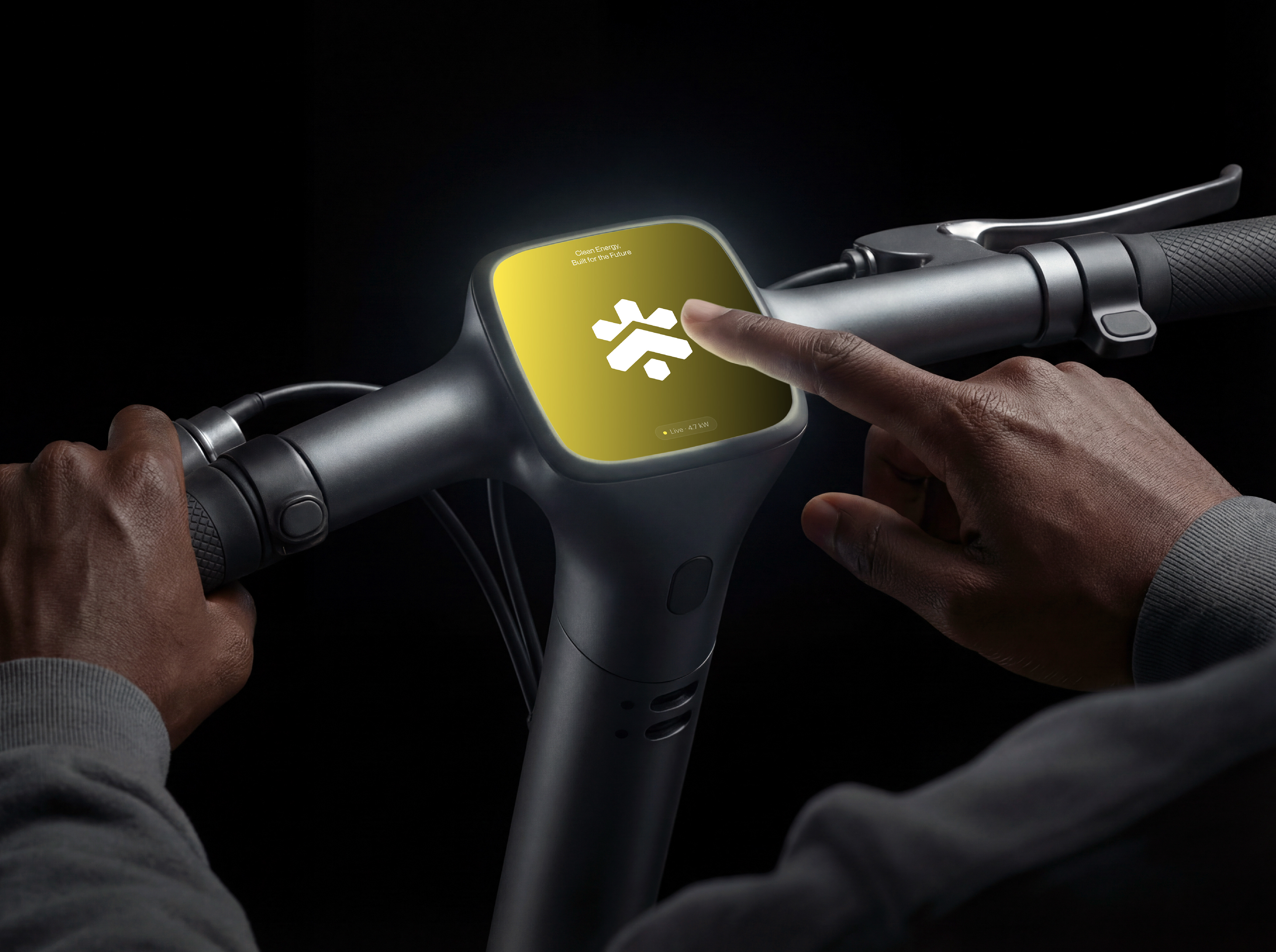
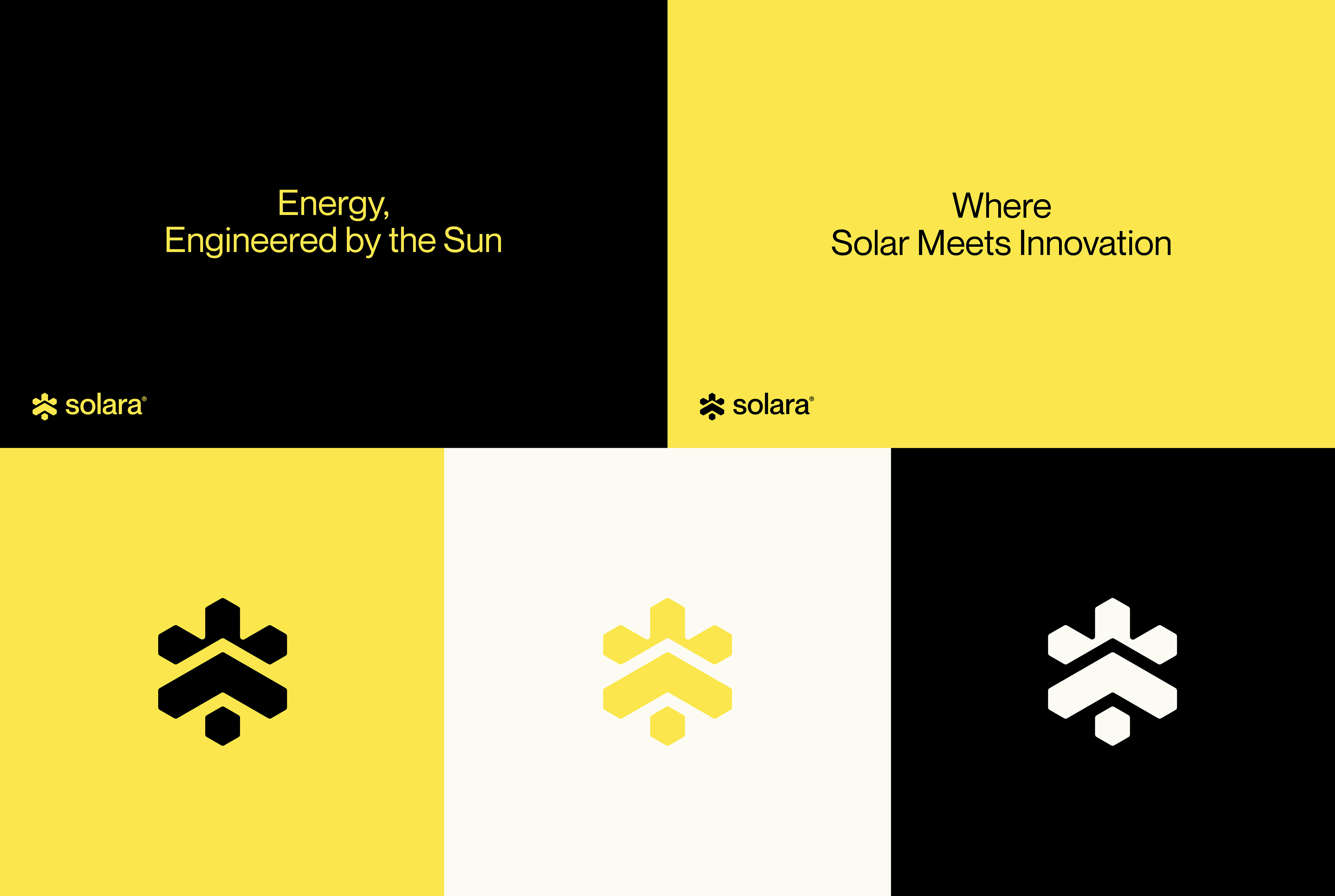
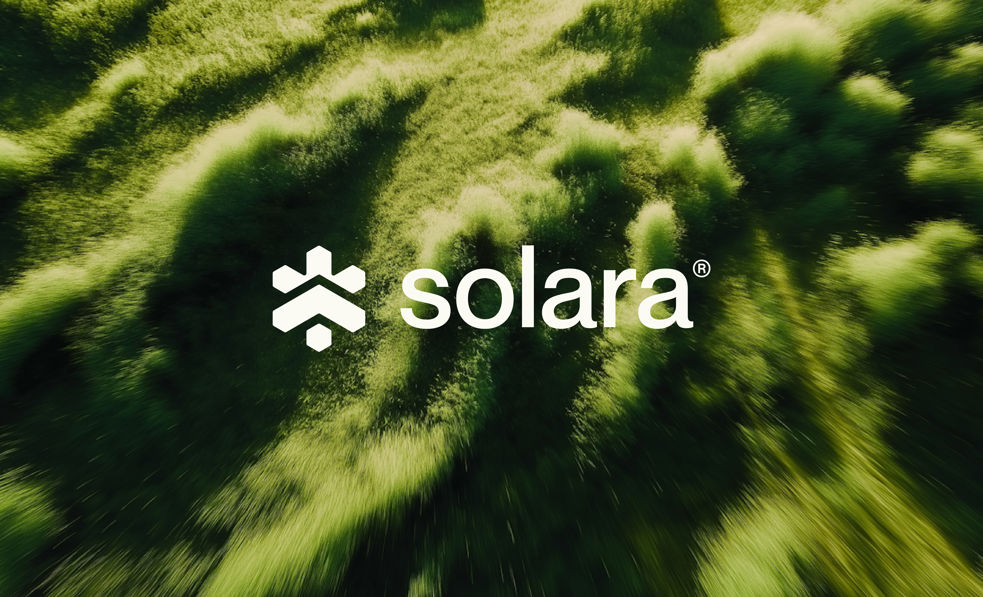
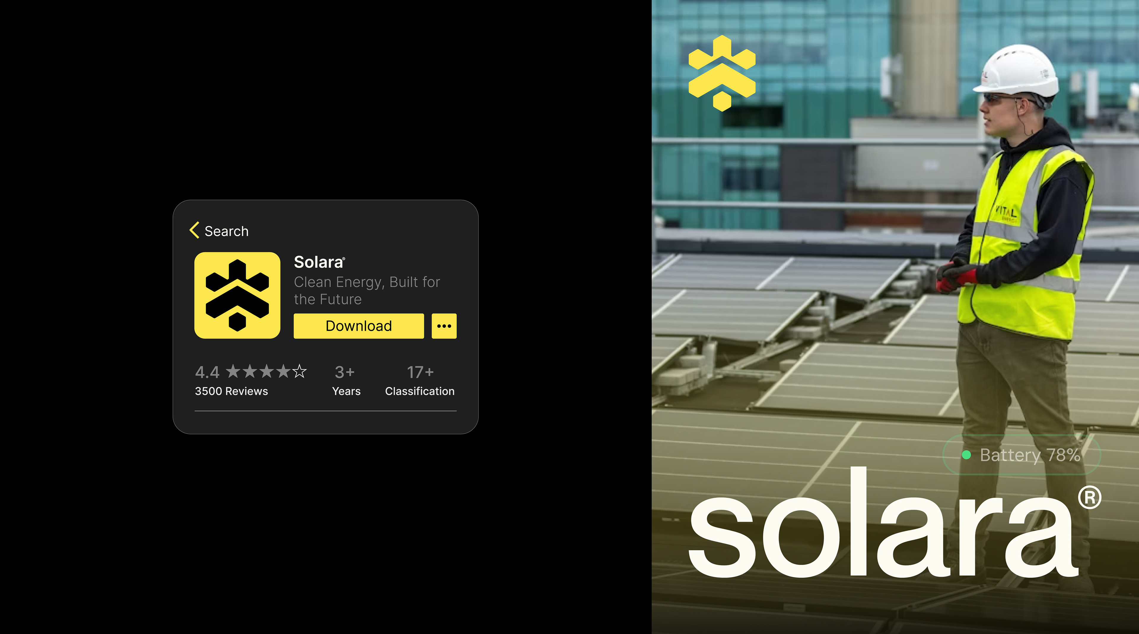
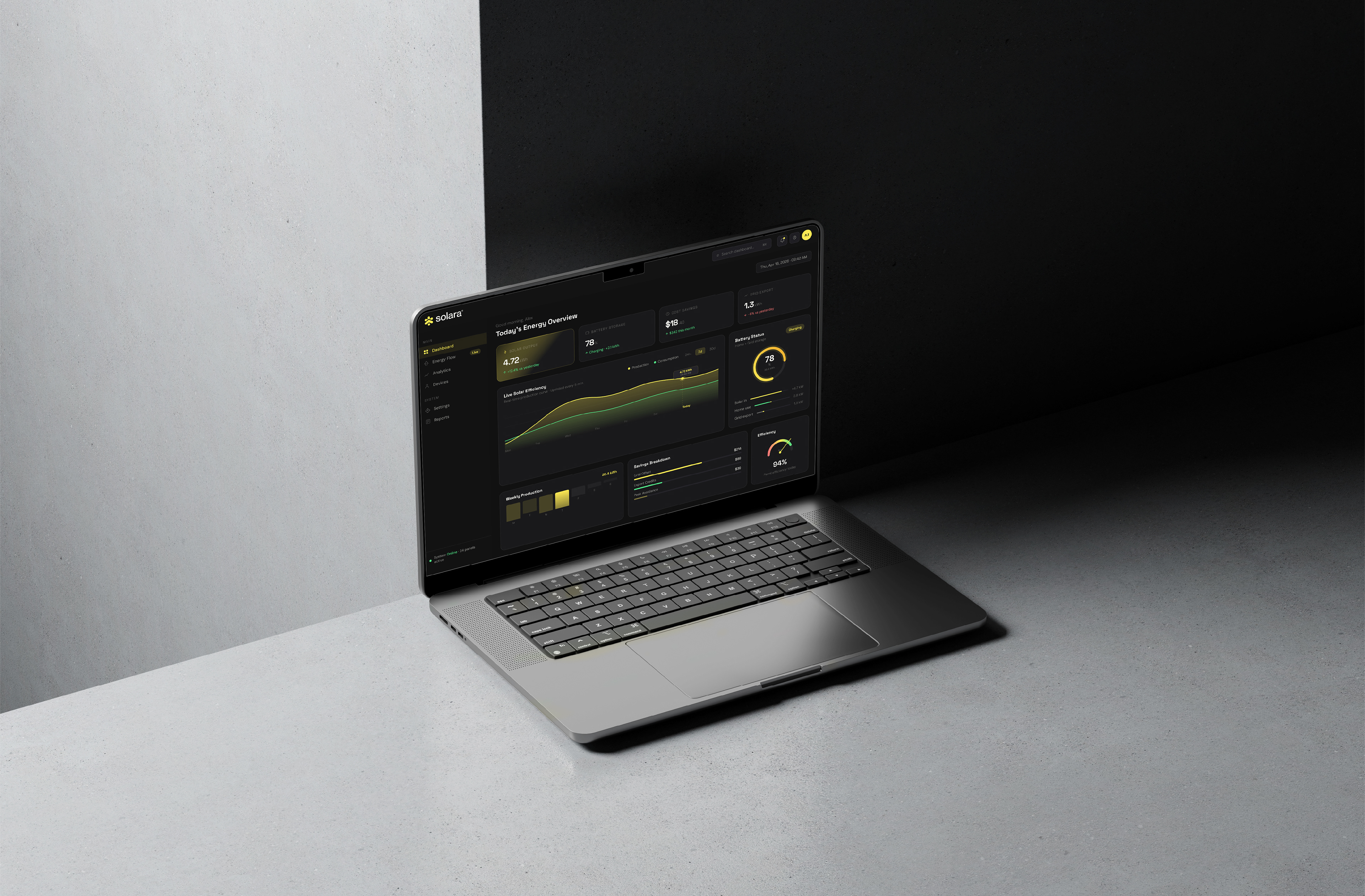
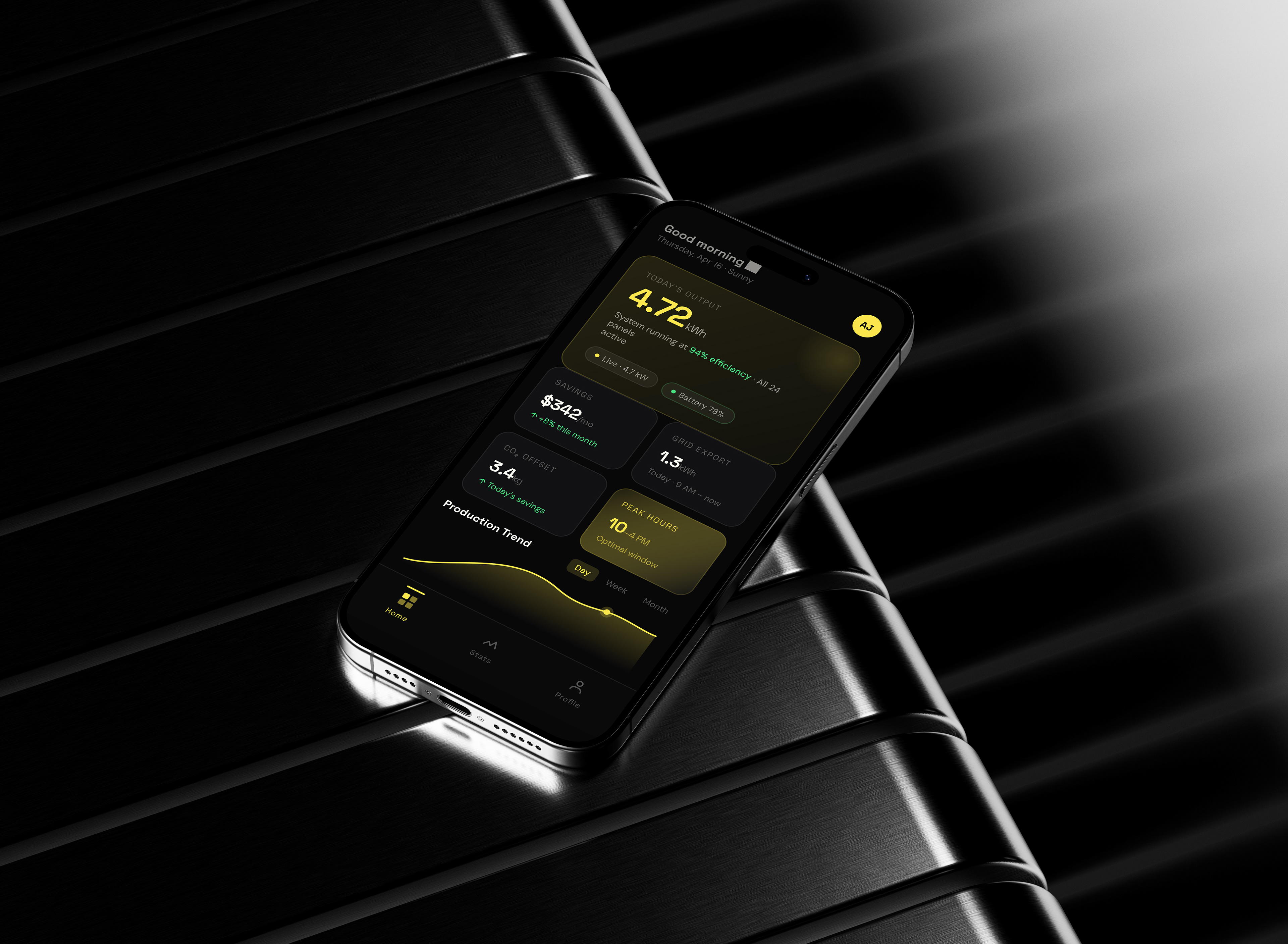
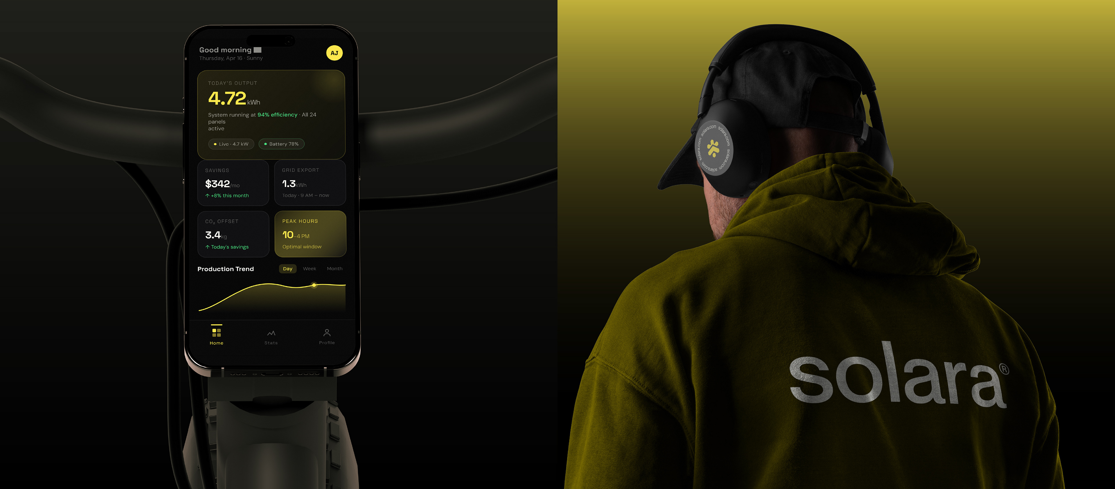
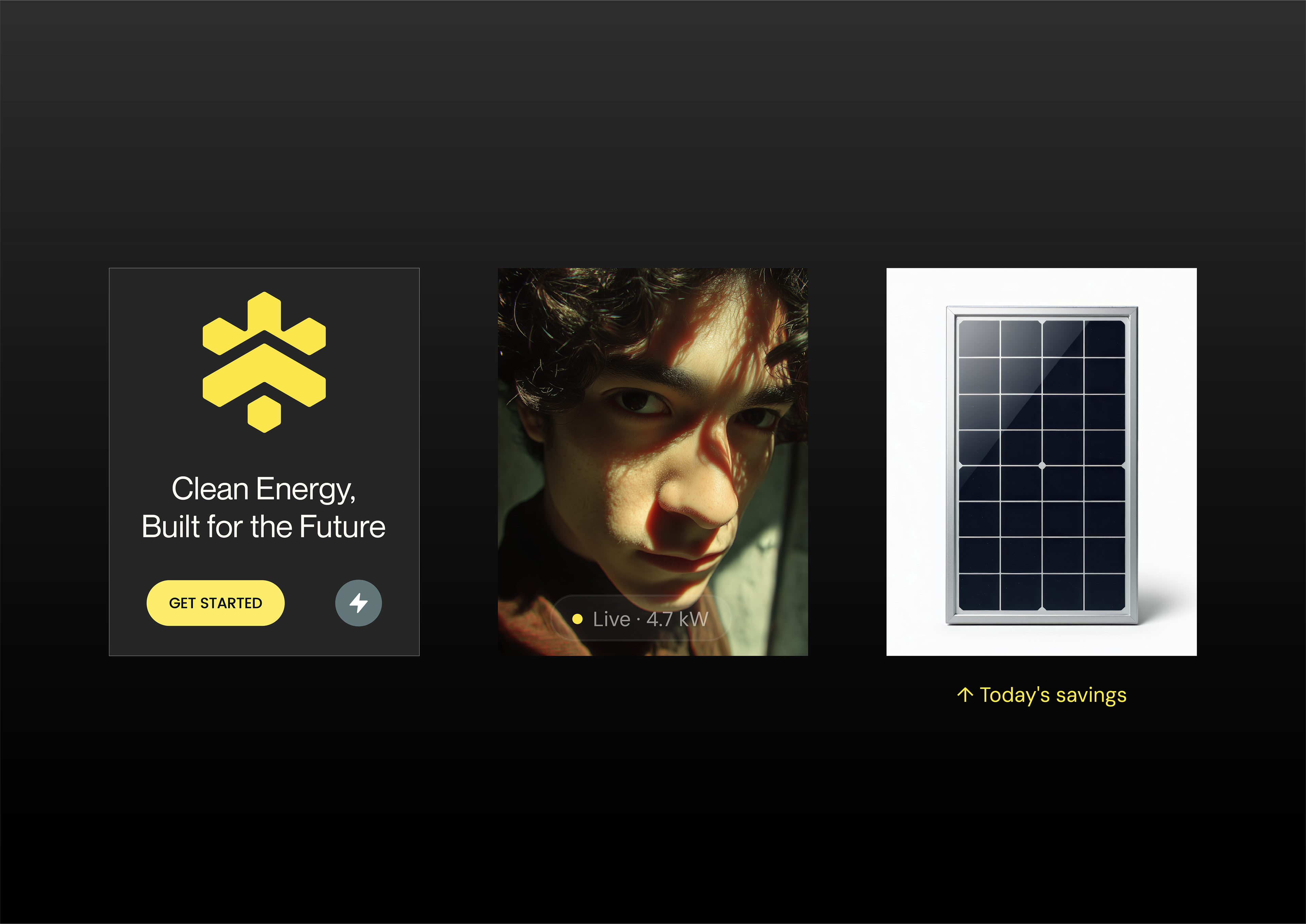
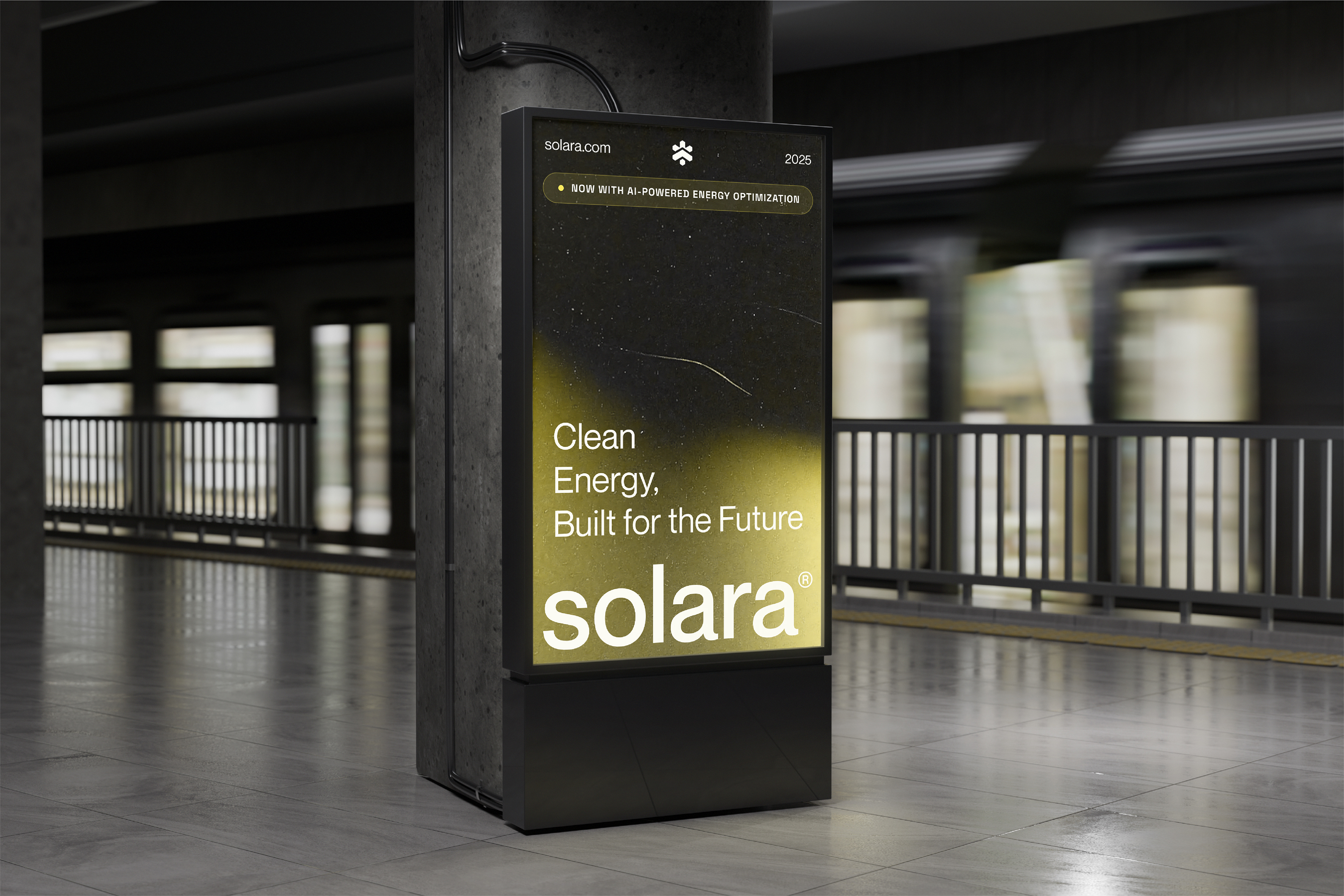
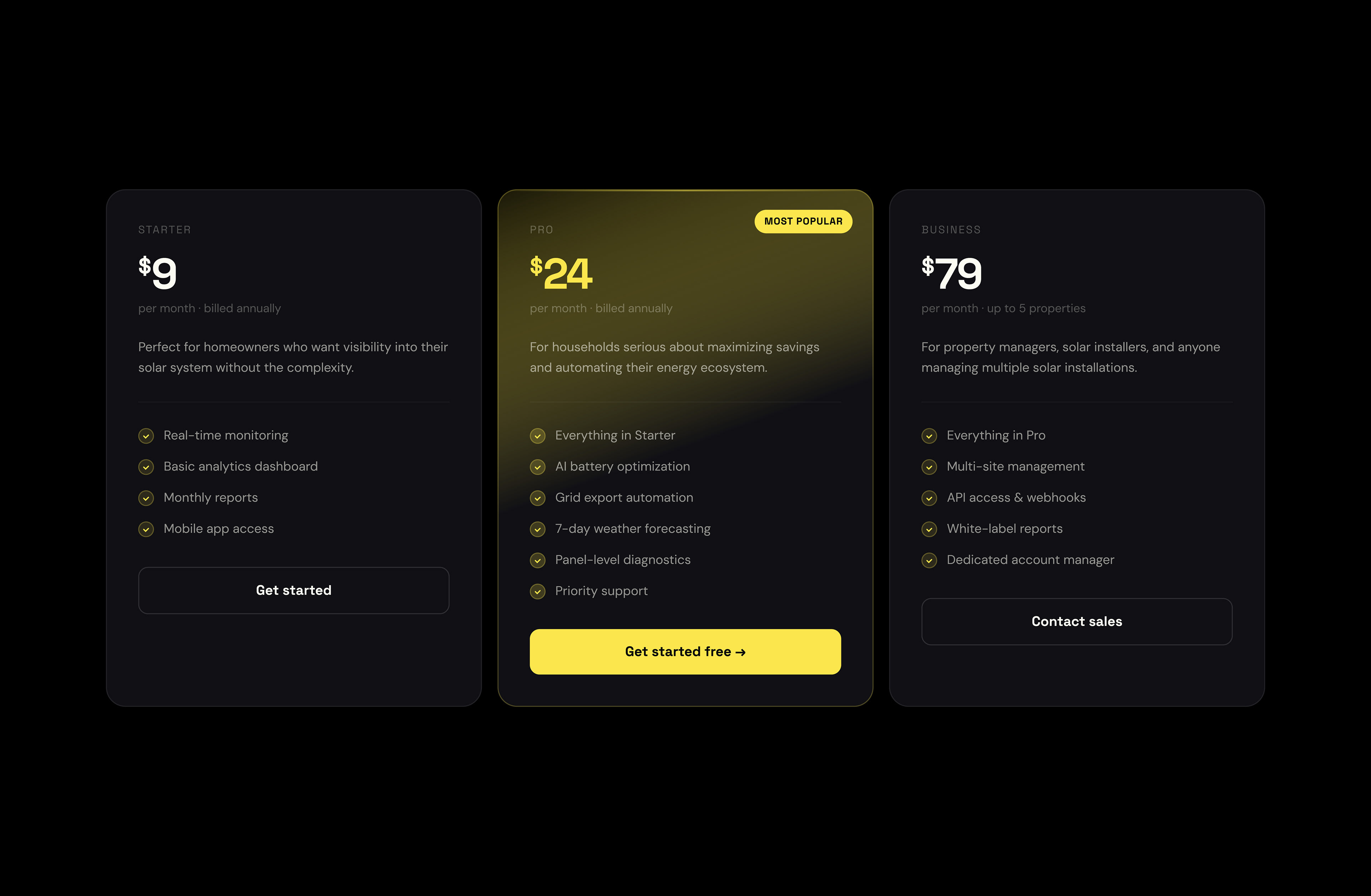
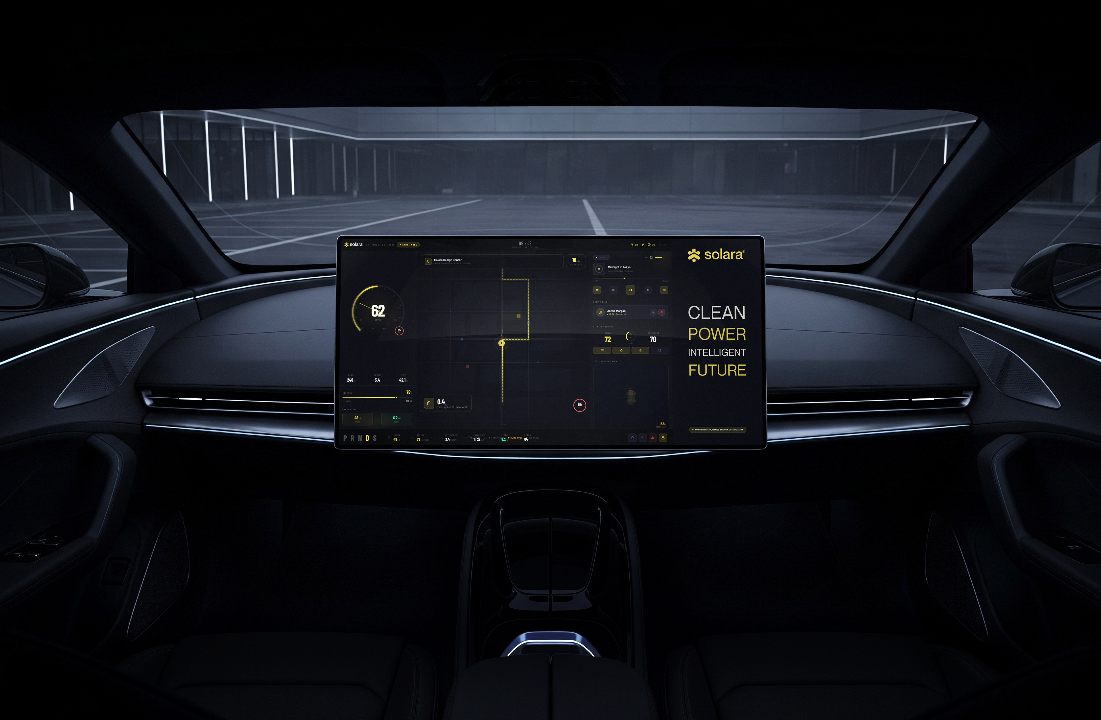
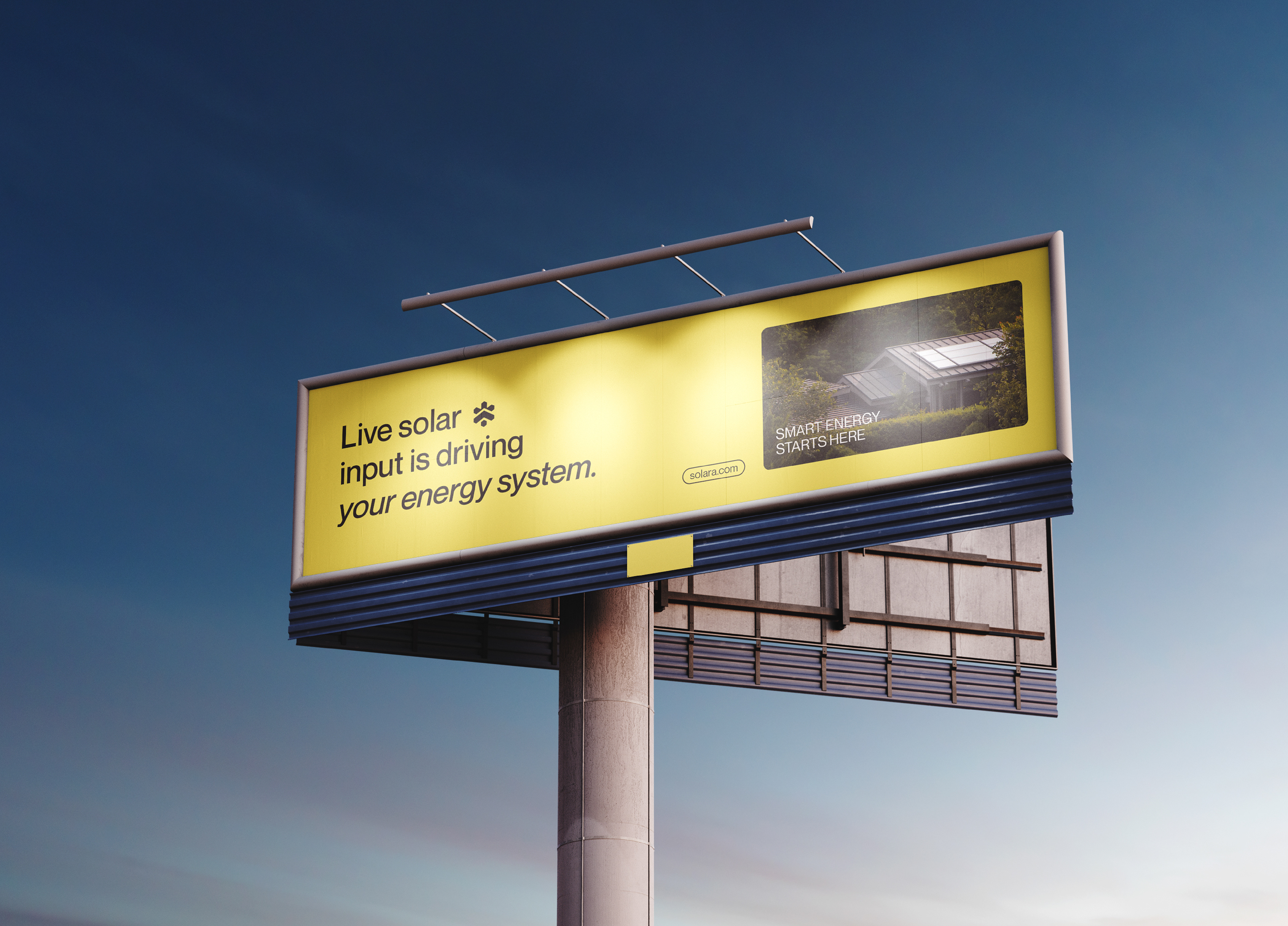
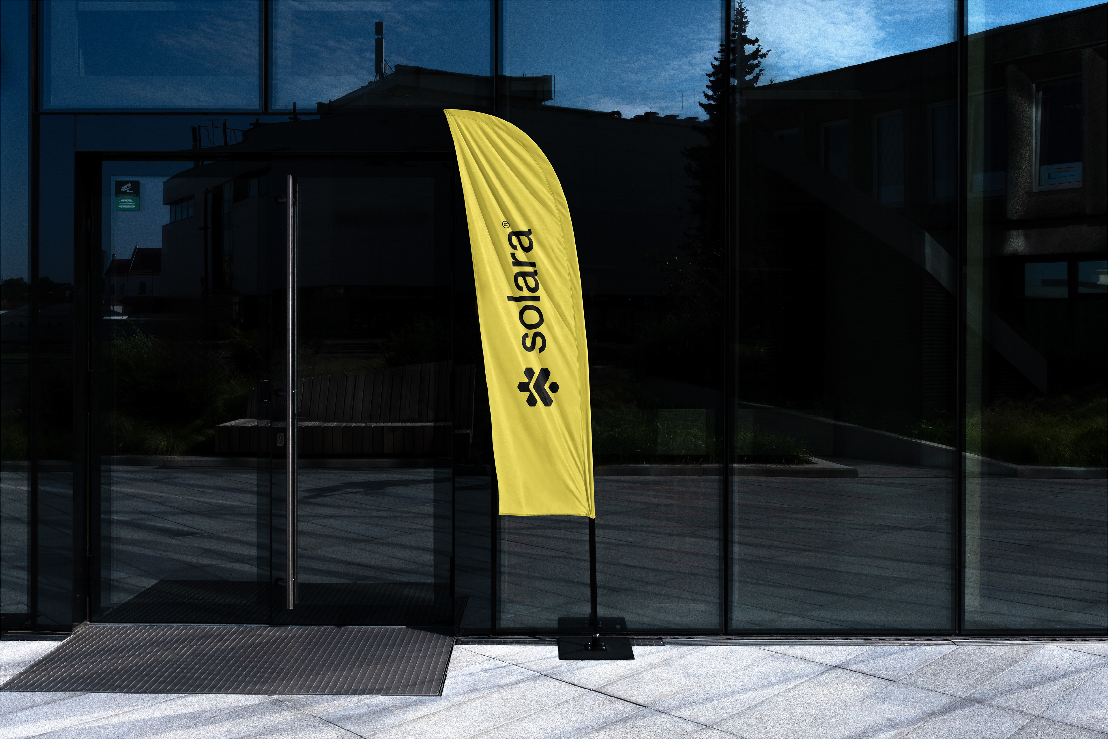
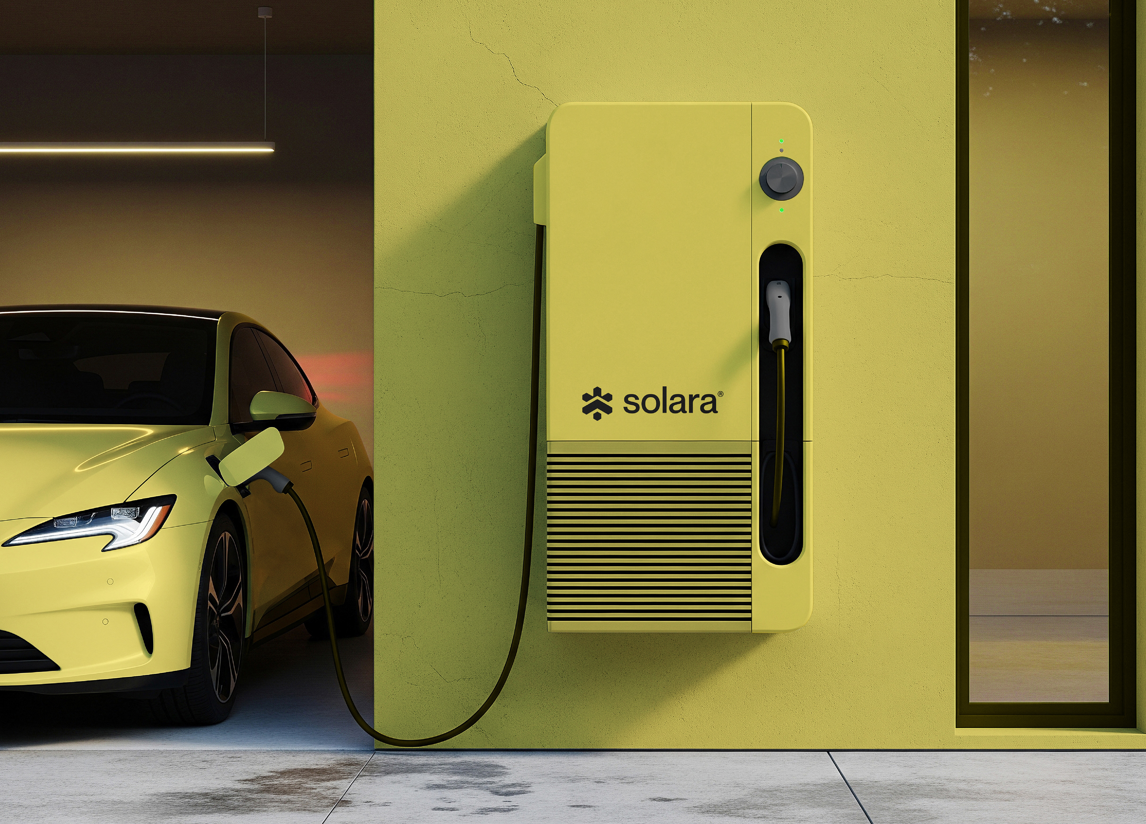
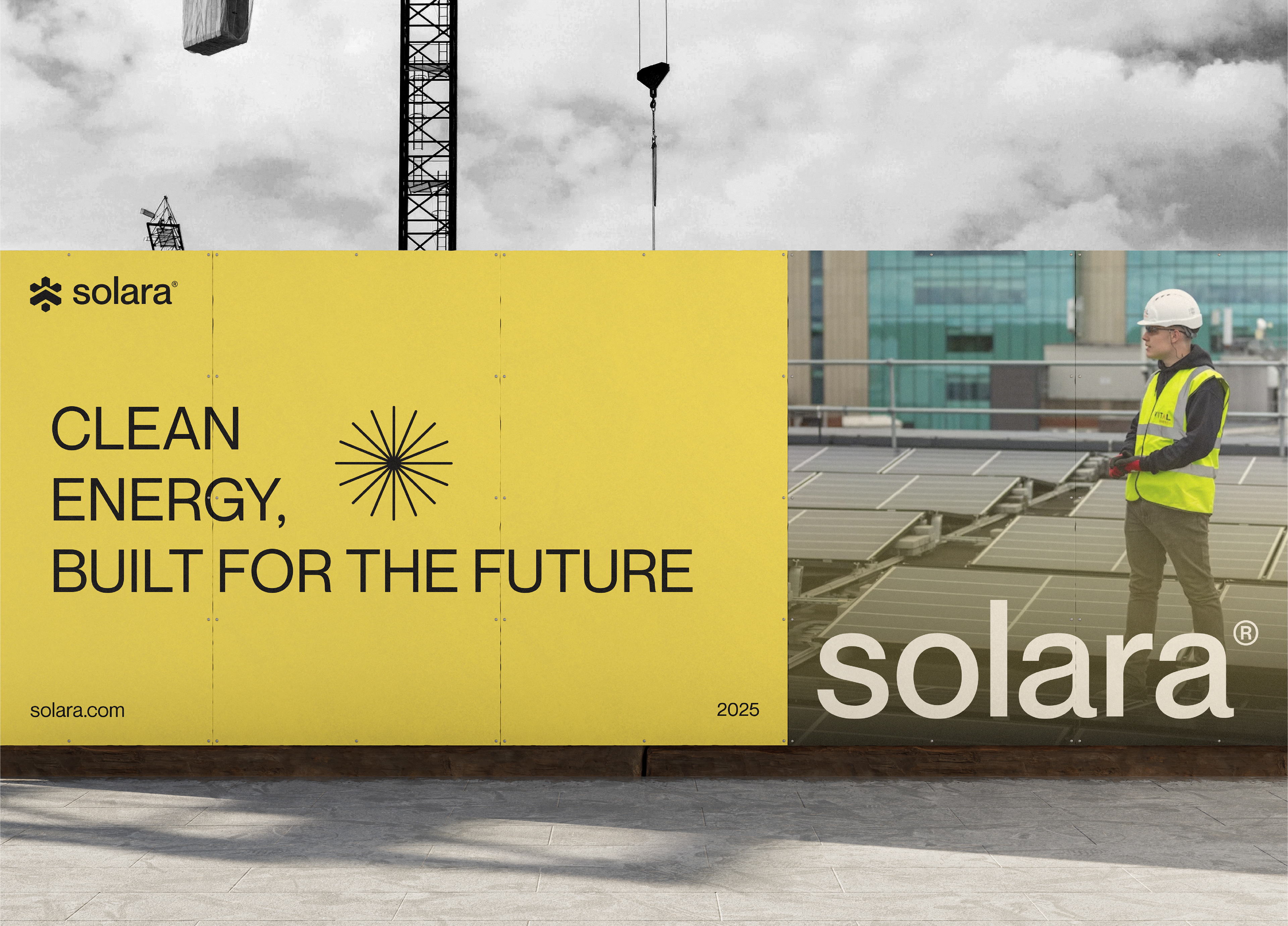
Solara is a modern solar energy brand focused on delivering clean, sustainable, and future-ready power solutions. The goal of this project was to create a bold yet minimal identity that communicates innovation, trust, and environmental responsibility.
Logo Meaning (Solar Energy Concept)
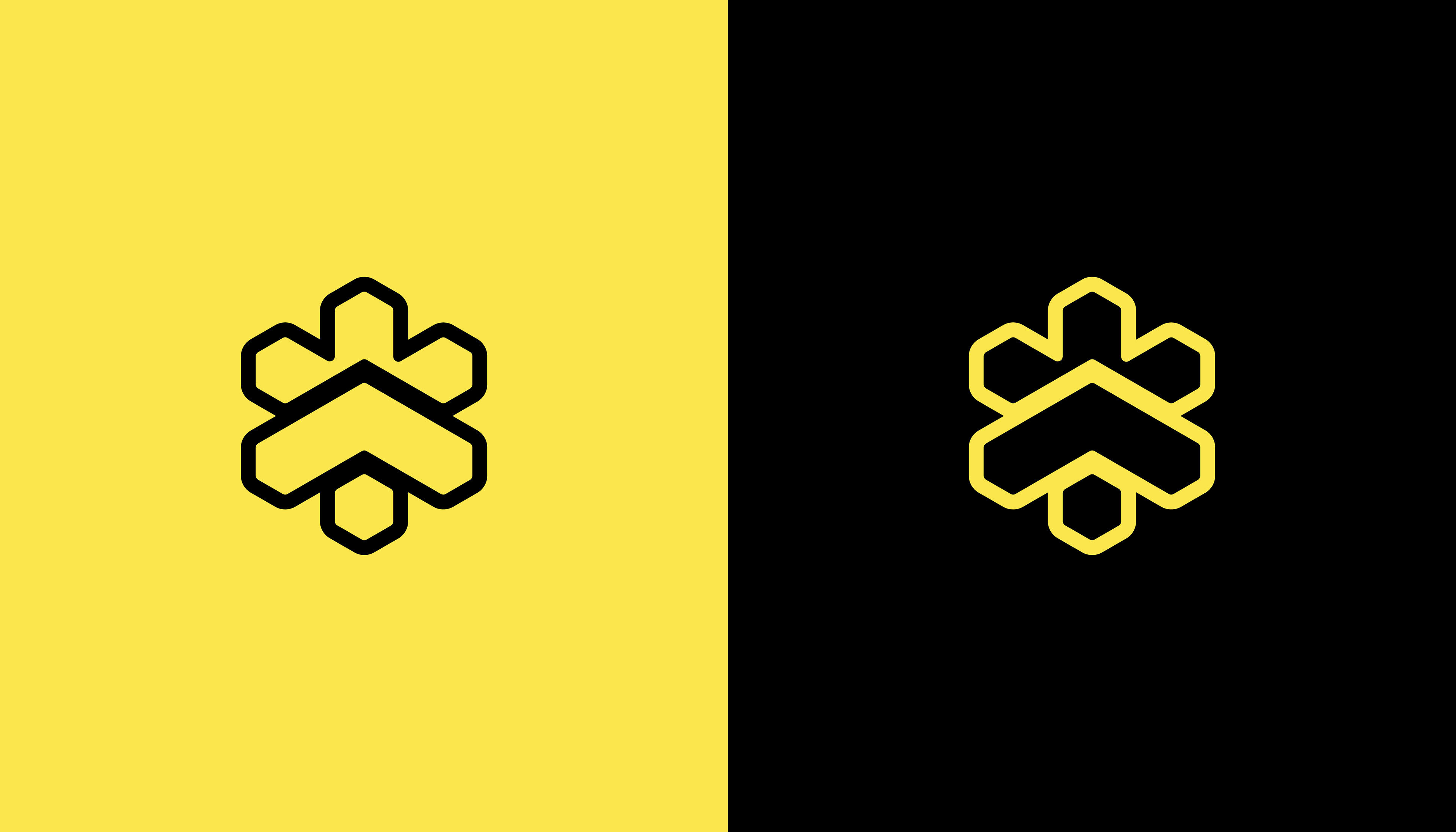
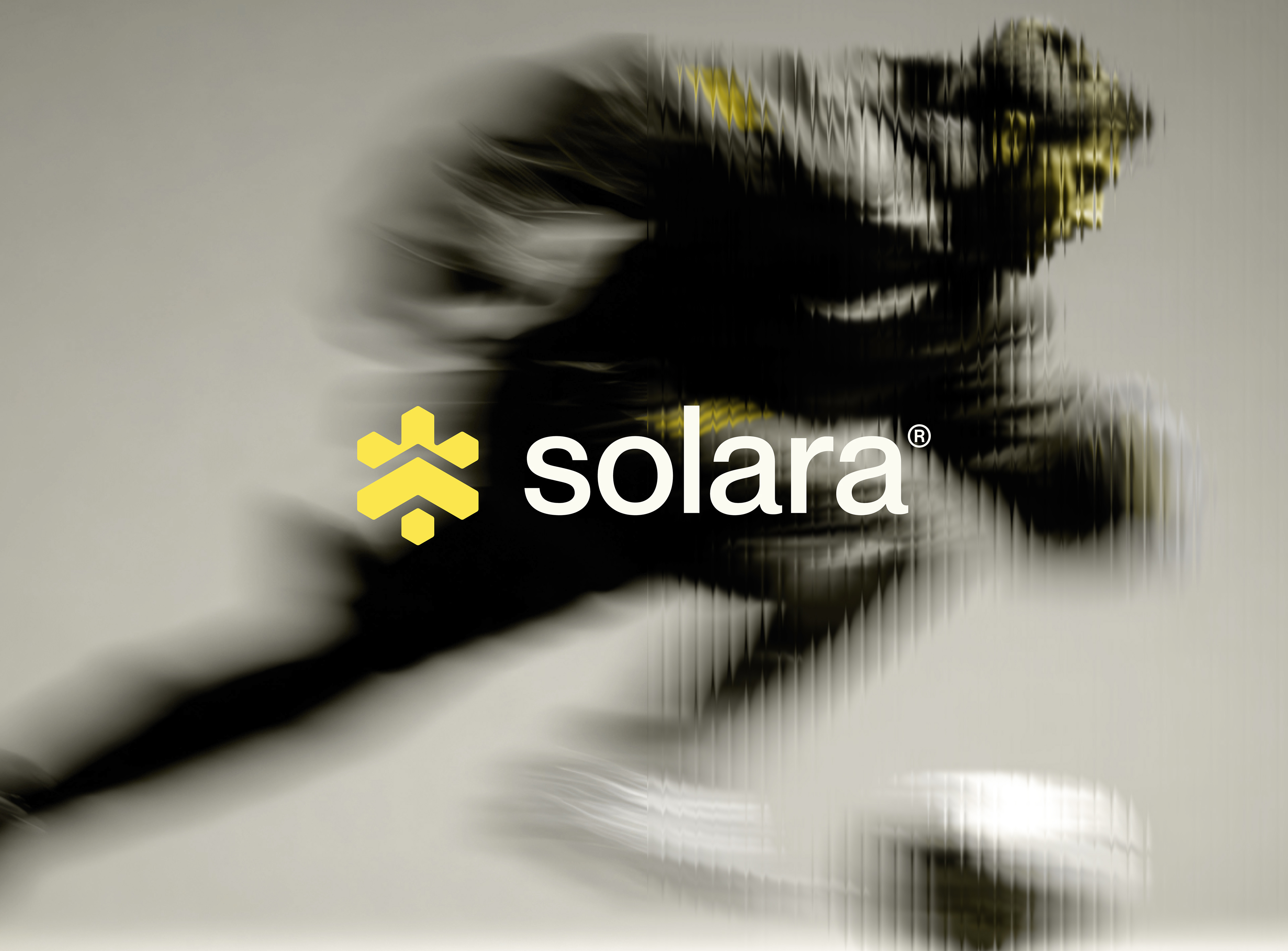
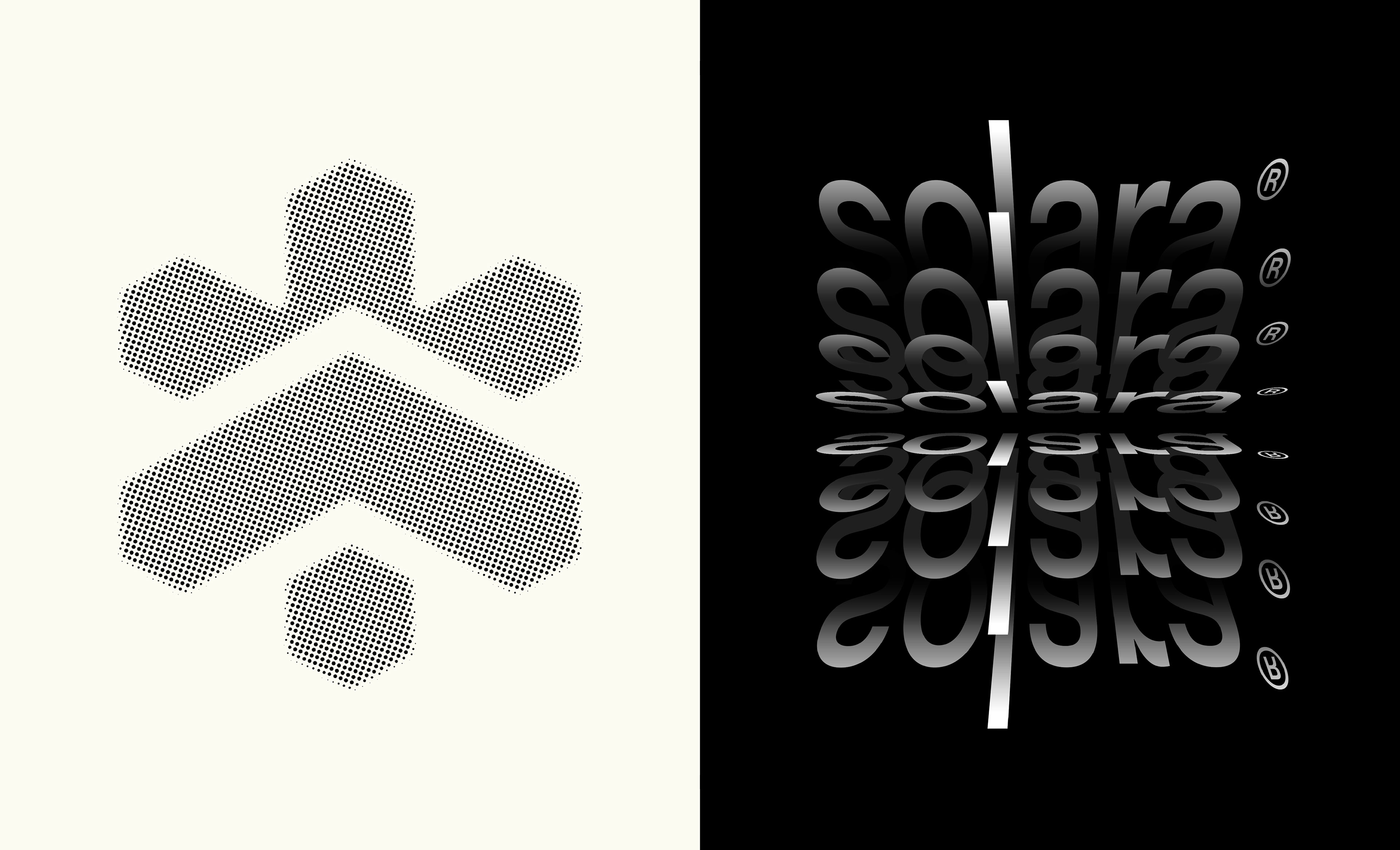
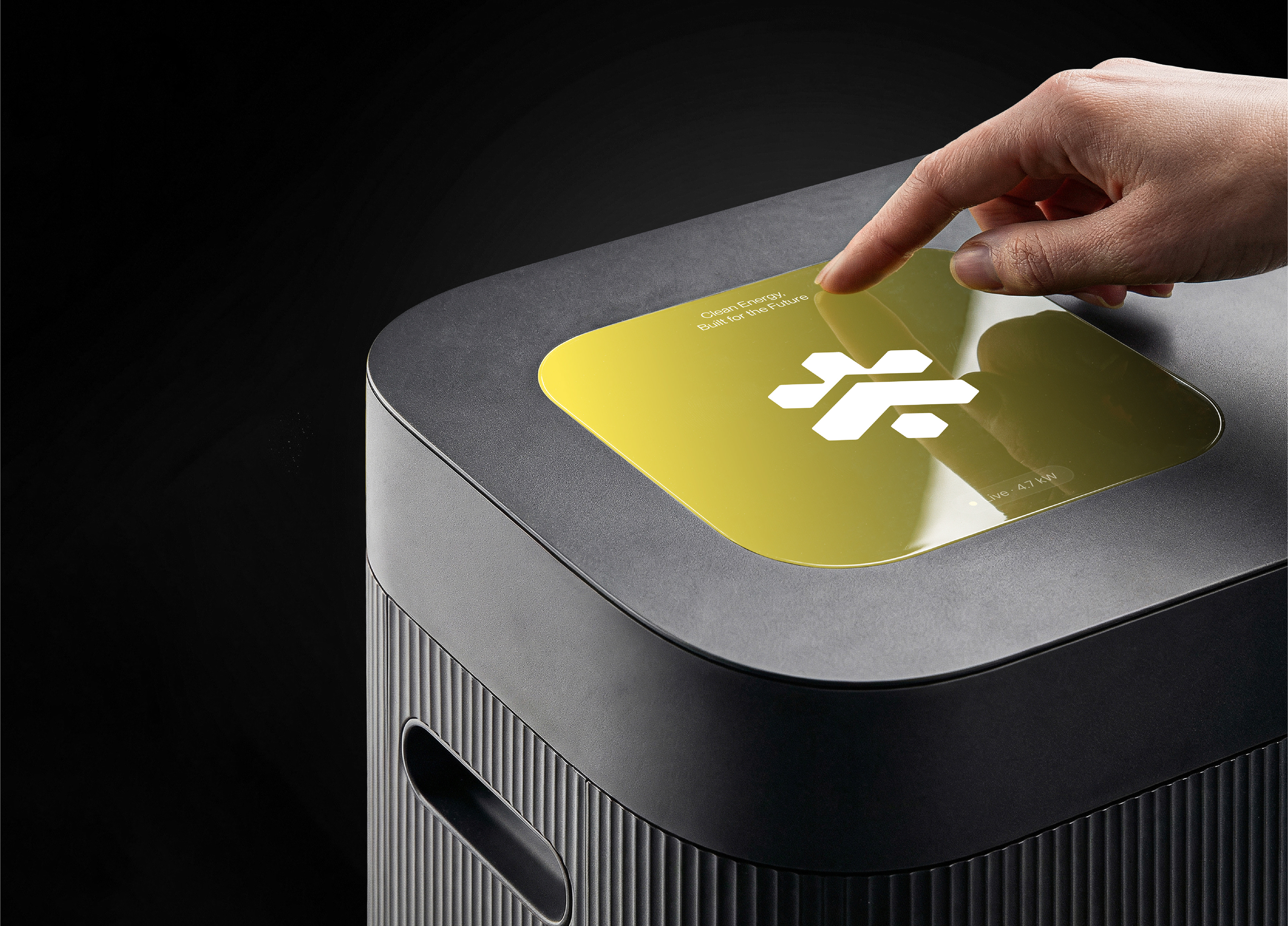
The Solara logo is built on a foundation of simple geometry to express clarity, efficiency, and forward-thinking energy solutions.
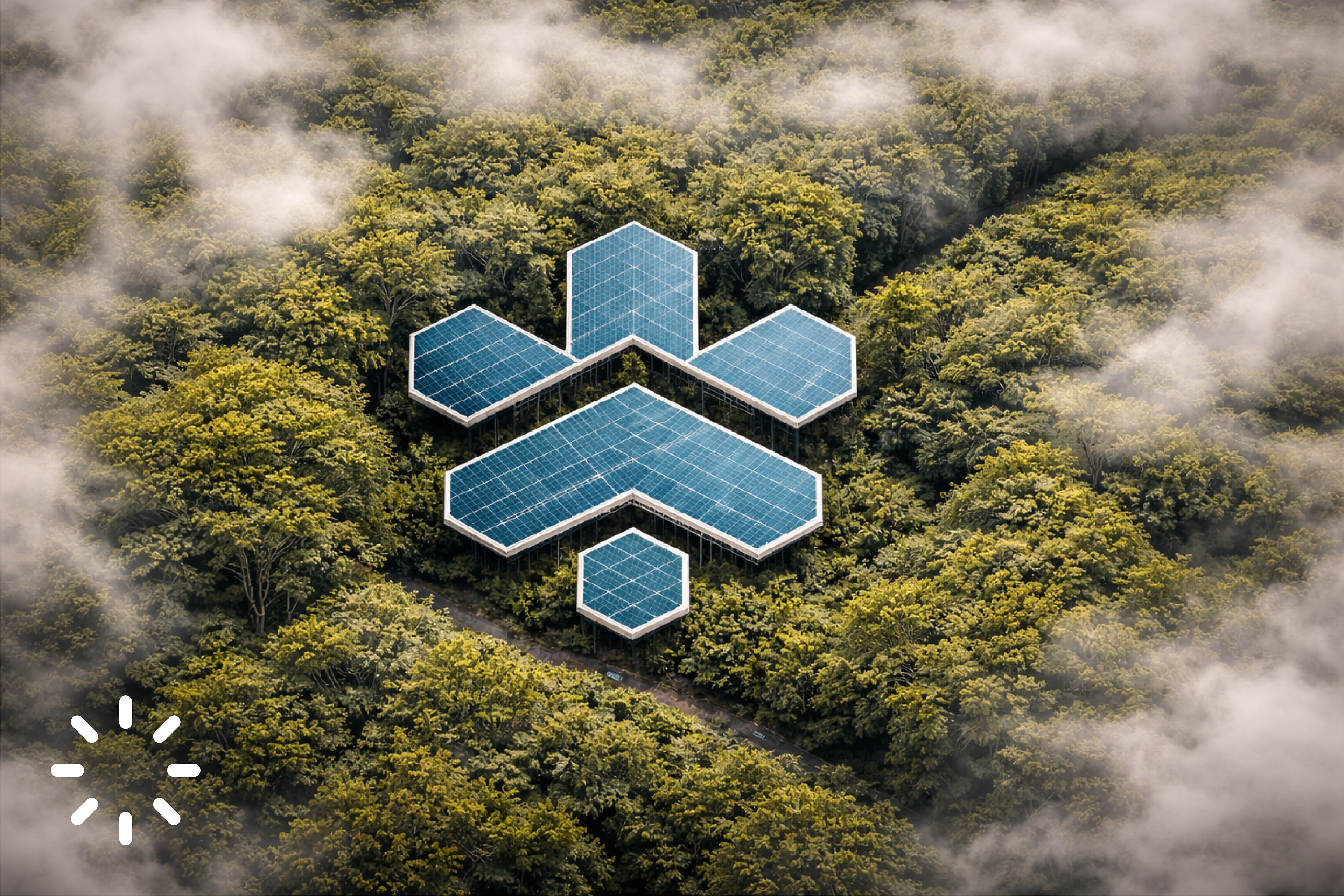
• Hexagonal Forms
Inspired by solar cell structures, the hexagon reflects efficiency, connection, and smart energy systems. It visually ties the brand to real-world solar technology.
Inspired by solar cell structures, the hexagon reflects efficiency, connection, and smart energy systems. It visually ties the brand to real-world solar technology.
• Upward Chevron Shape
The central form suggests an upward motion, symbolizing energy flow, growth, and continuous progress toward a sustainable future.
The central form suggests an upward motion, symbolizing energy flow, growth, and continuous progress toward a sustainable future.
• Symmetrical Composition
The balanced structure communicates stability, reliability, and engineering precision, reinforcing trust in the brand.
The balanced structure communicates stability, reliability, and engineering precision, reinforcing trust in the brand.
• Crown / Sun-Ray Element
The top extension represents the sun as the core energy source, radiating power and life—positioning Solara as a brand driven by clean, natural energy.
The top extension represents the sun as the core energy source, radiating power and life—positioning Solara as a brand driven by clean, natural energy.
Conclusion
Solara’s identity reflects a balance between technology and nature, combining geometric precision with vibrant energy. The result is a scalable and impactful brand ready to lead in the renewable energy space.
Credits
Branding & Visual Identity: Mehedi.H
Project Type: Concept / Solar Branding
Year: 2026
Project Type: Concept / Solar Branding
Year: 2026


Thank you for viewing my project!
If you enjoyed it, please consider clicking the Like button, leaving an appreciation, and following me for more work.
E-mail | Md.mehedihasan55330@gmail.com
WhatsApp For Inquiry: +8801624596892
Website: ⚡️ Sparkline Studio
© 2025 Mehedi Hasan