
TERRA – Finance Brand Identity Case Study
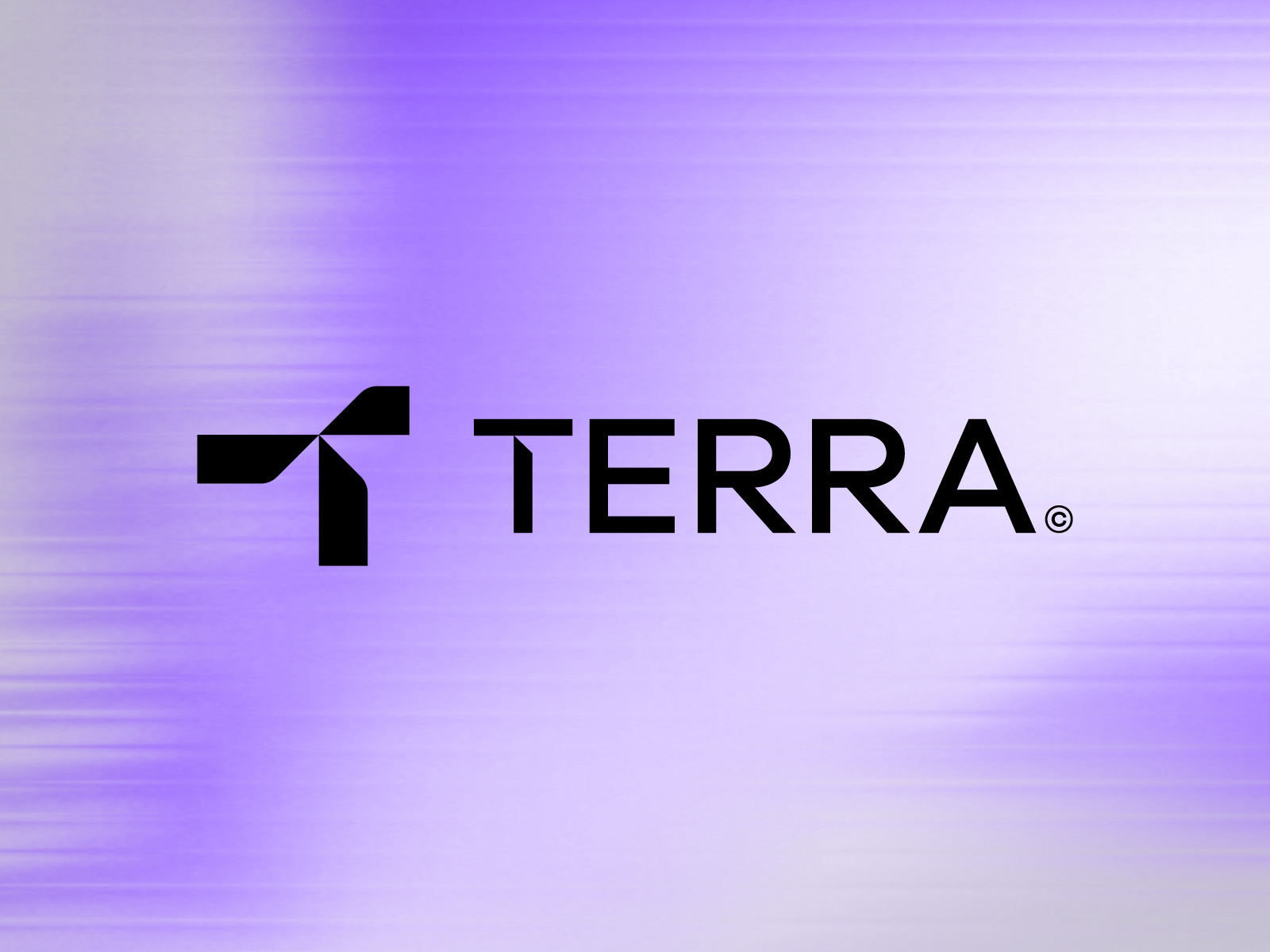
Logo Meaning
TERRA is a finance brand identity built to represent trust, stability, and sustainable growth. In the financial industry, credibility is everything, and the visual identity was carefully designed to reflect confidence, reliability, and long-term value.
The custom geometric “T” symbol represents structure, balance, and forward movement. Its strong form communicates stability and leadership, while the sharp, clean angles reflect precision, strategy, and professionalism.
The modern typography enhances clarity and transparency, creating a premium and corporate presence that helps the brand connect with clients and investors with confidence.
Problem Solving
Many finance businesses face a common challenge: their branding does not create immediate trust or professional recognition. Generic logos often fail to communicate authority, making it difficult to stand out in a competitive market.
TERRA was designed to solve this problem by creating a strong and memorable visual identity that delivers:
• Instant brand recognition
• Professional and premium market positioning
• Trust and credibility for clients and investors
• Consistent appearance across digital and print platforms
• A scalable identity system for future business growth
• Professional and premium market positioning
• Trust and credibility for clients and investors
• Consistent appearance across digital and print platforms
• A scalable identity system for future business growth
This branding solution helps the business establish a strong corporate presence while maintaining a modern and timeless visual language.
Challenge
The biggest challenge was designing a finance brand identity that feels modern, premium, and trustworthy at the same time.
Financial brands often become too traditional and forgettable, or too modern and lacking in credibility. The objective was to create the perfect balance between innovation and trust.
Another key challenge was developing a unique “T” symbol that could work as a standalone brand mark while remaining simple, recognizable, and highly functional across multiple applications such as websites, mobile apps, business stationery, and corporate presentations.
The final result is a clean, strategic, and client-focused identity that strengthens brand value and builds long-term trust.