

← Back to Case Studies

Trezio Fintech brand identity concept

Trezio is a self-initiated concept project by Sparkline Studio, created in 2026 for its portfolio rather than for a client. It is an original fintech brand identity that explores how financial technology branding can feel clear, confident and modern, through a logo, colour system, typography, pattern and brand applications.
Brand Guidelines title slide on blue with the Trezio logo and the year 2026
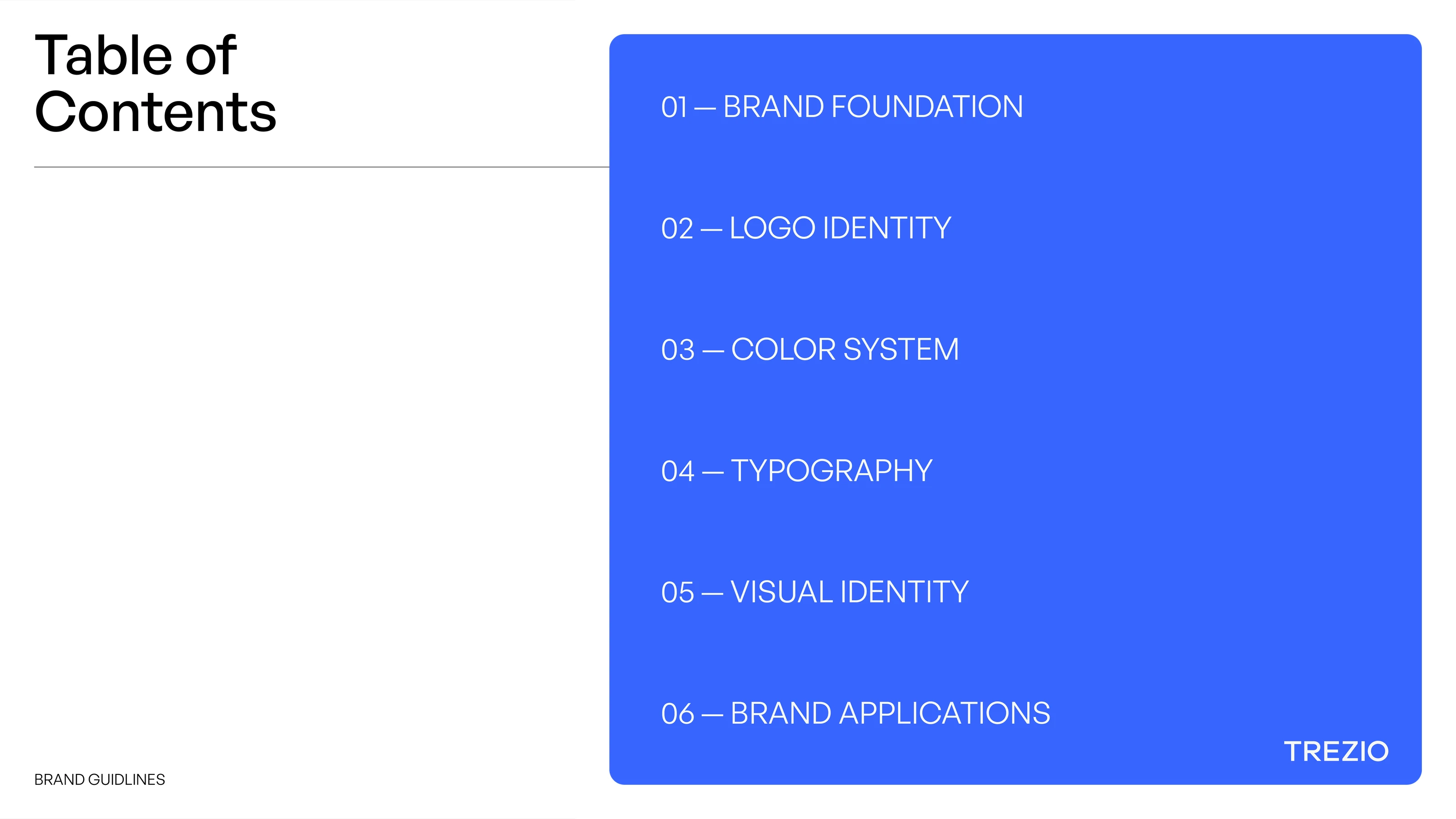
Table of contents listing Brand Foundation, Logo Identity, Colour System, Typography, Visual Identity and Brand Applications
Brand Foundation section divider on blue
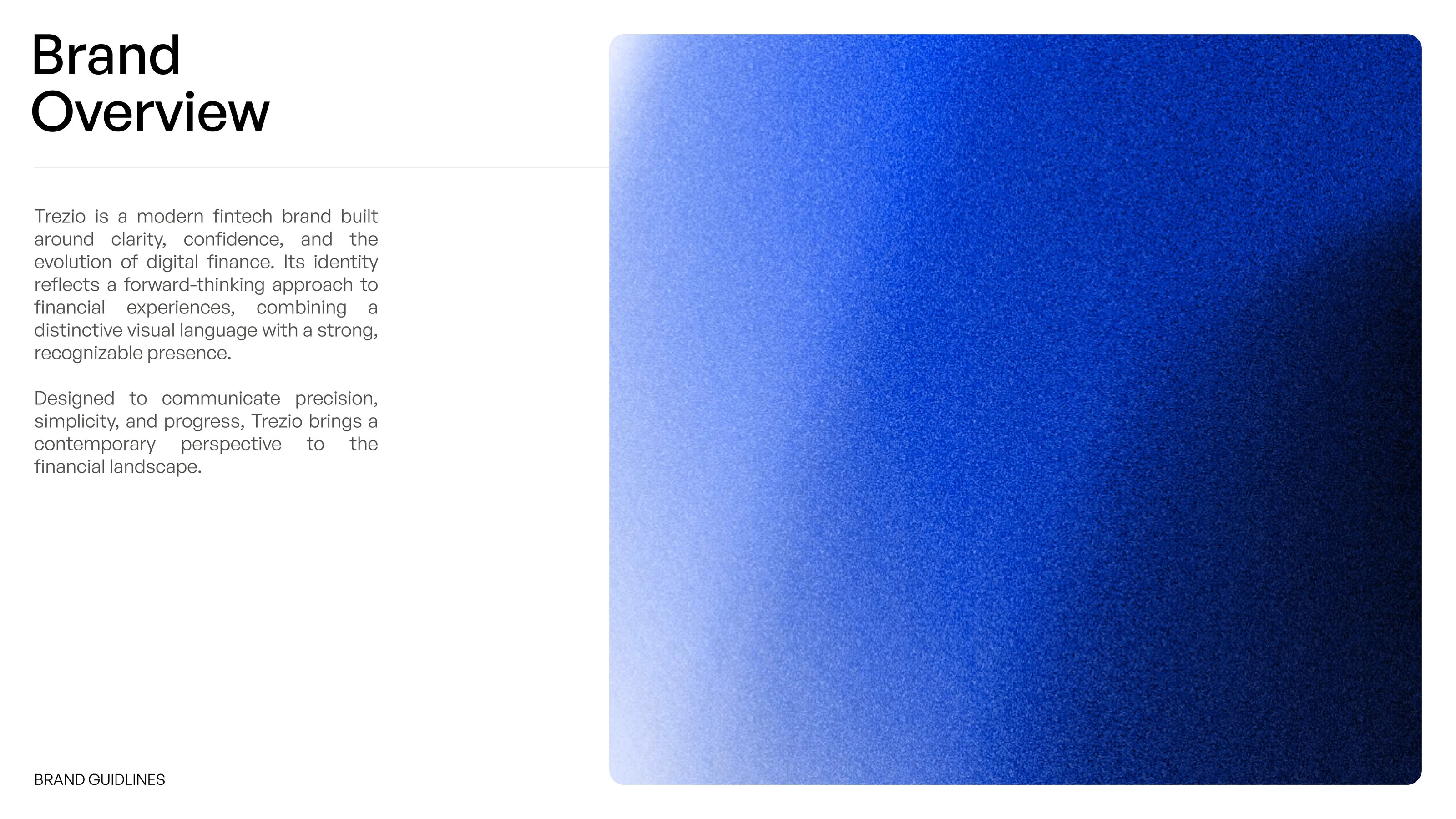
Brand Overview slide describing Trezio as a modern fintech brand, beside a blue gradient panel
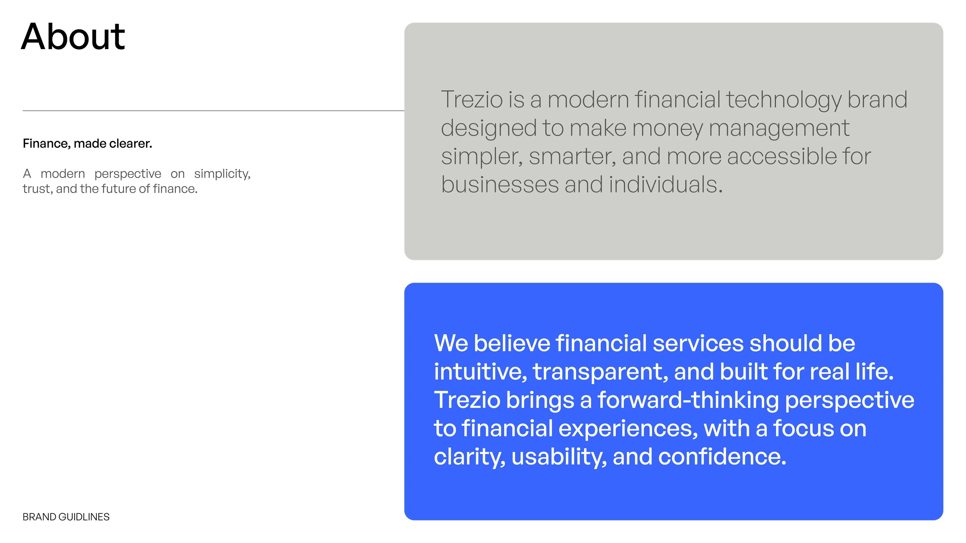
About slide with the line Finance, made clearer and two statements about Trezio
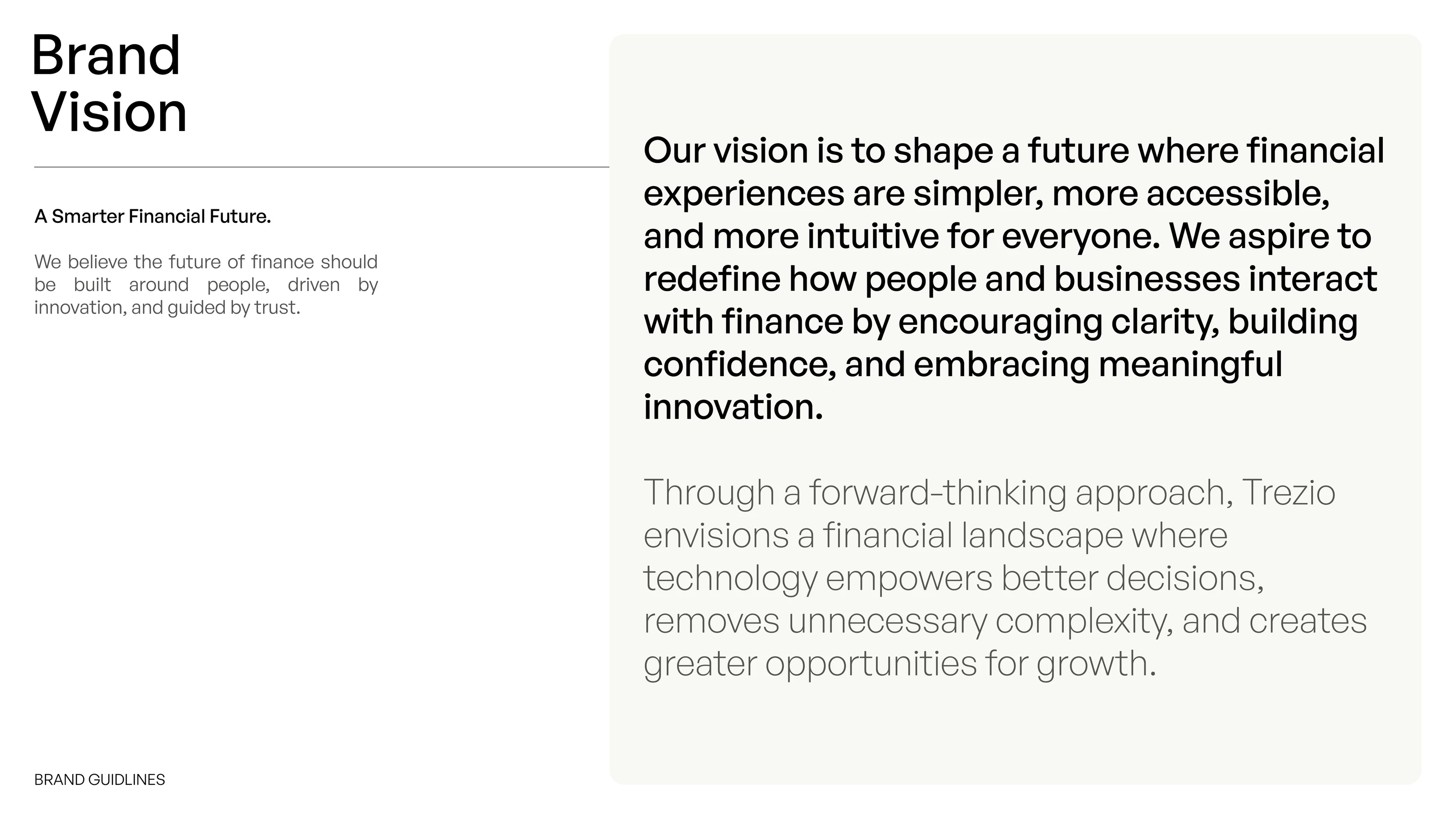
Brand Vision slide describing a smarter financial future
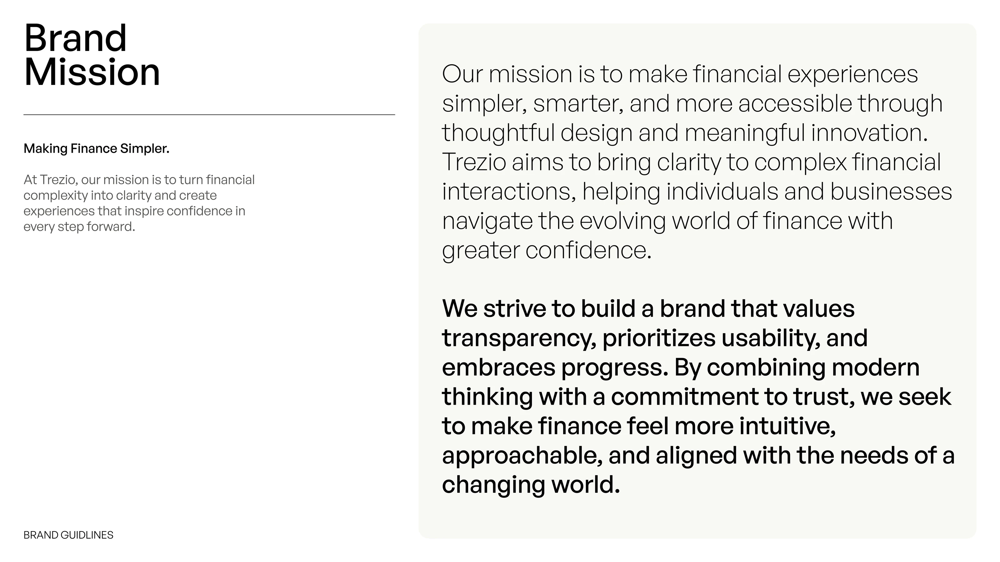
Brand Mission slide about making finance simpler

Creative direction

The Trezio concept is built around one line: finance, made clearer. It shaped a brand foundation of clarity, trust, simplicity and progress, a vision of more accessible financial experiences and a mission to make finance simpler. The logo, colour, type and imagery that follow all work to make financial technology feel clear, confident and approachable.

Logo Identity section divider on blue
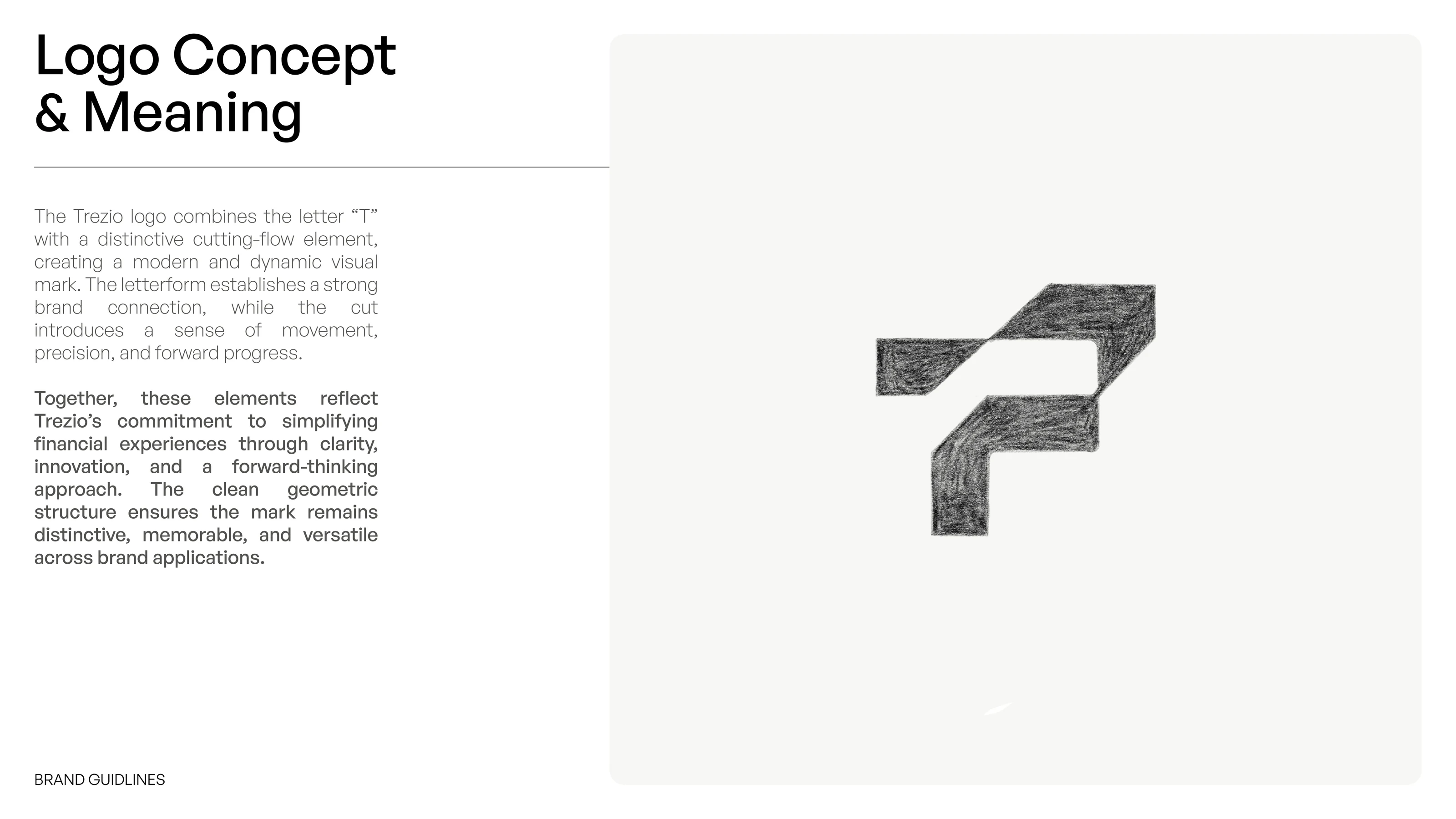
Trezio logo concept slide with a pencil sketch of the T symbol and its cutting-flow detail
Primary Logo slide showing the Trezio logo on blue and on black
Logo Mark slide showing the white Trezio symbol on blue
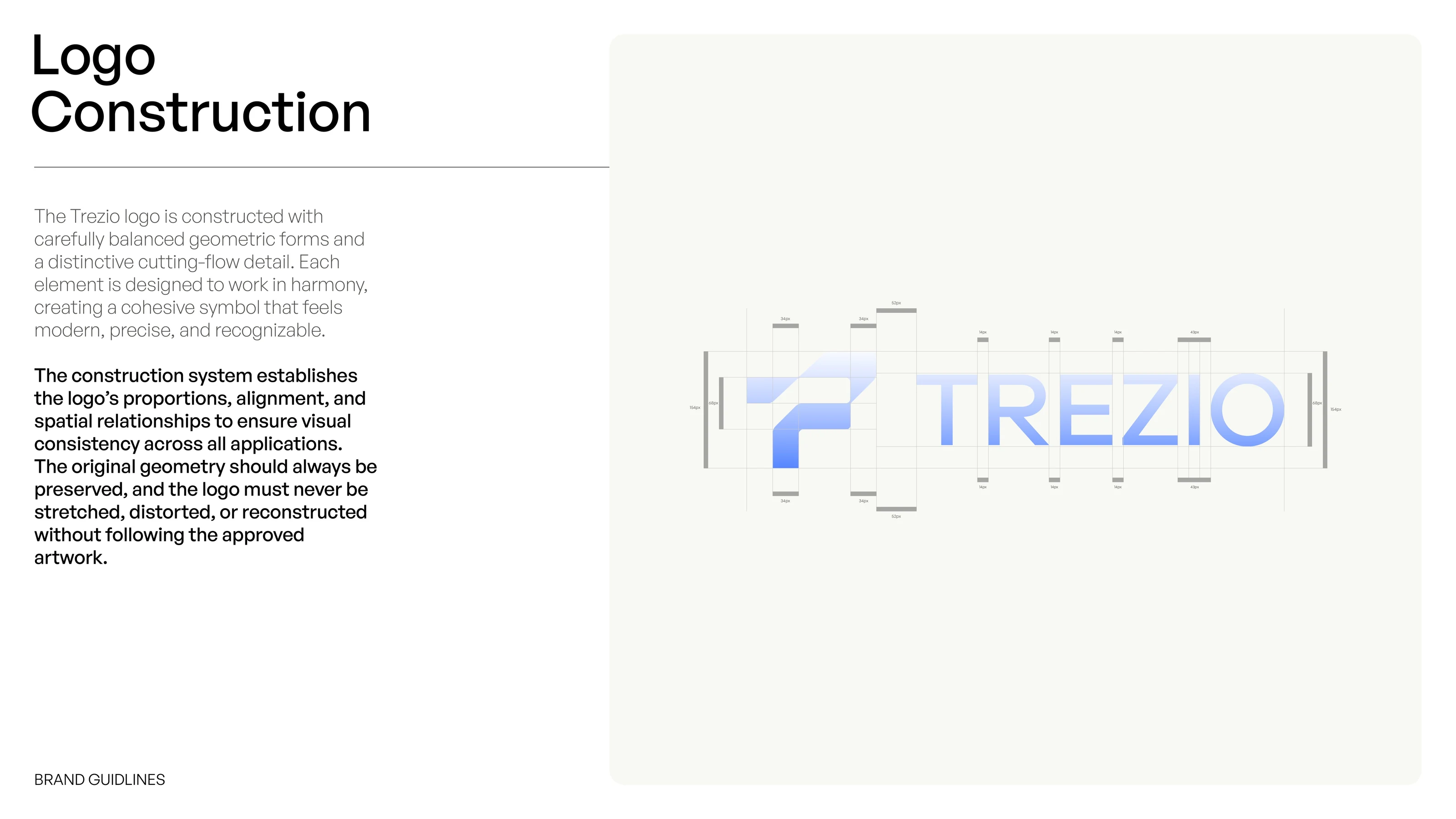
Trezio logo construction slide with measurement guides over the symbol and wordmark
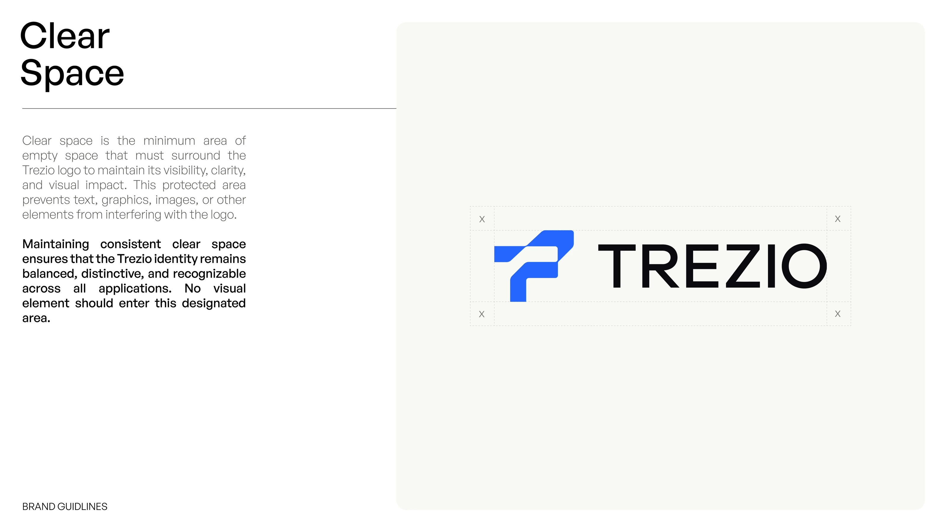
Clear Space slide showing the protected area around the Trezio logo
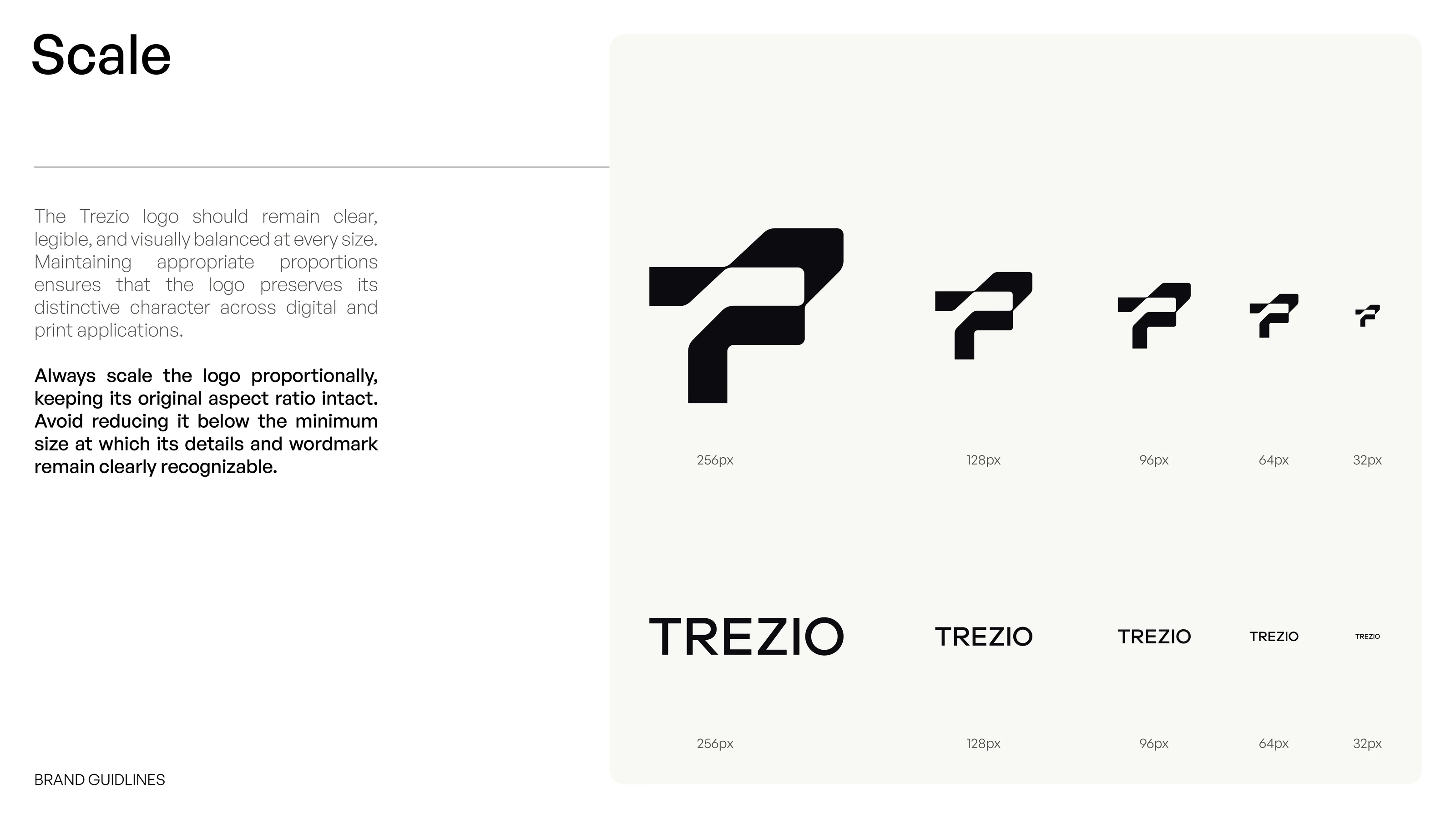
Scale slide showing the symbol and wordmark at 256, 128, 96, 64 and 32 pixels
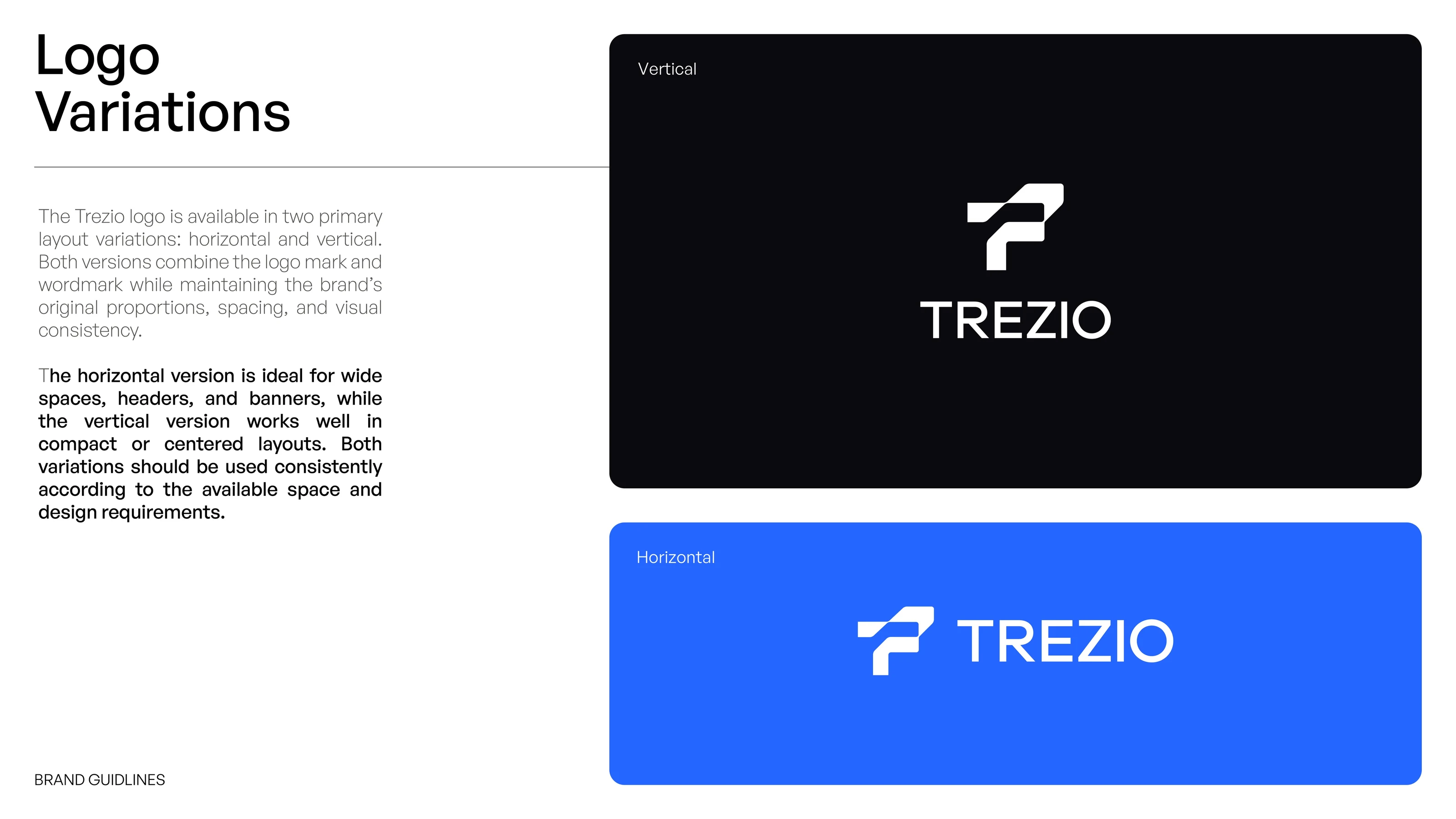
Logo Variations slide with vertical and horizontal logo layouts
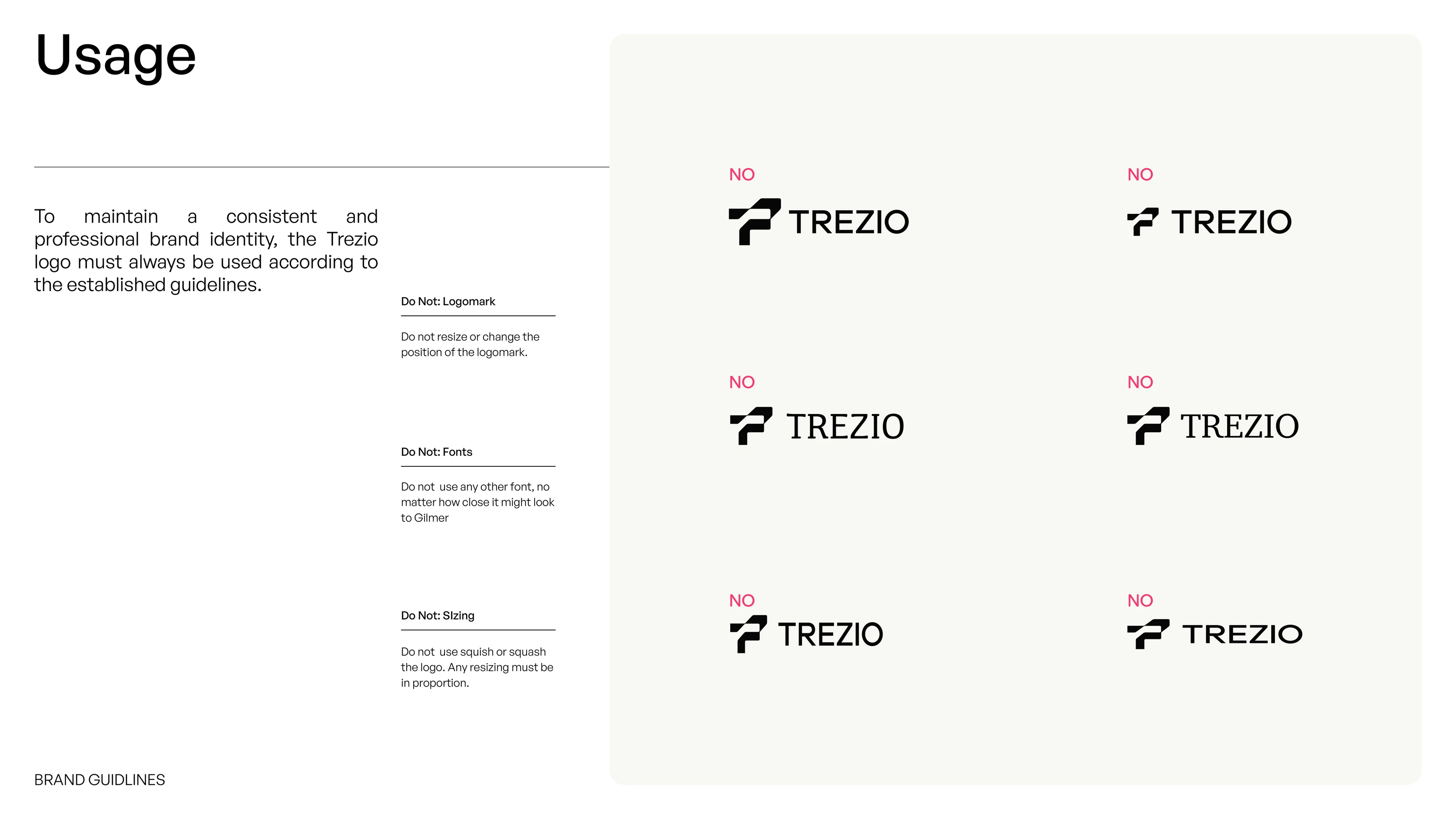
Six incorrect Trezio logo uses marked NO, with notes on logomark, fonts and sizing
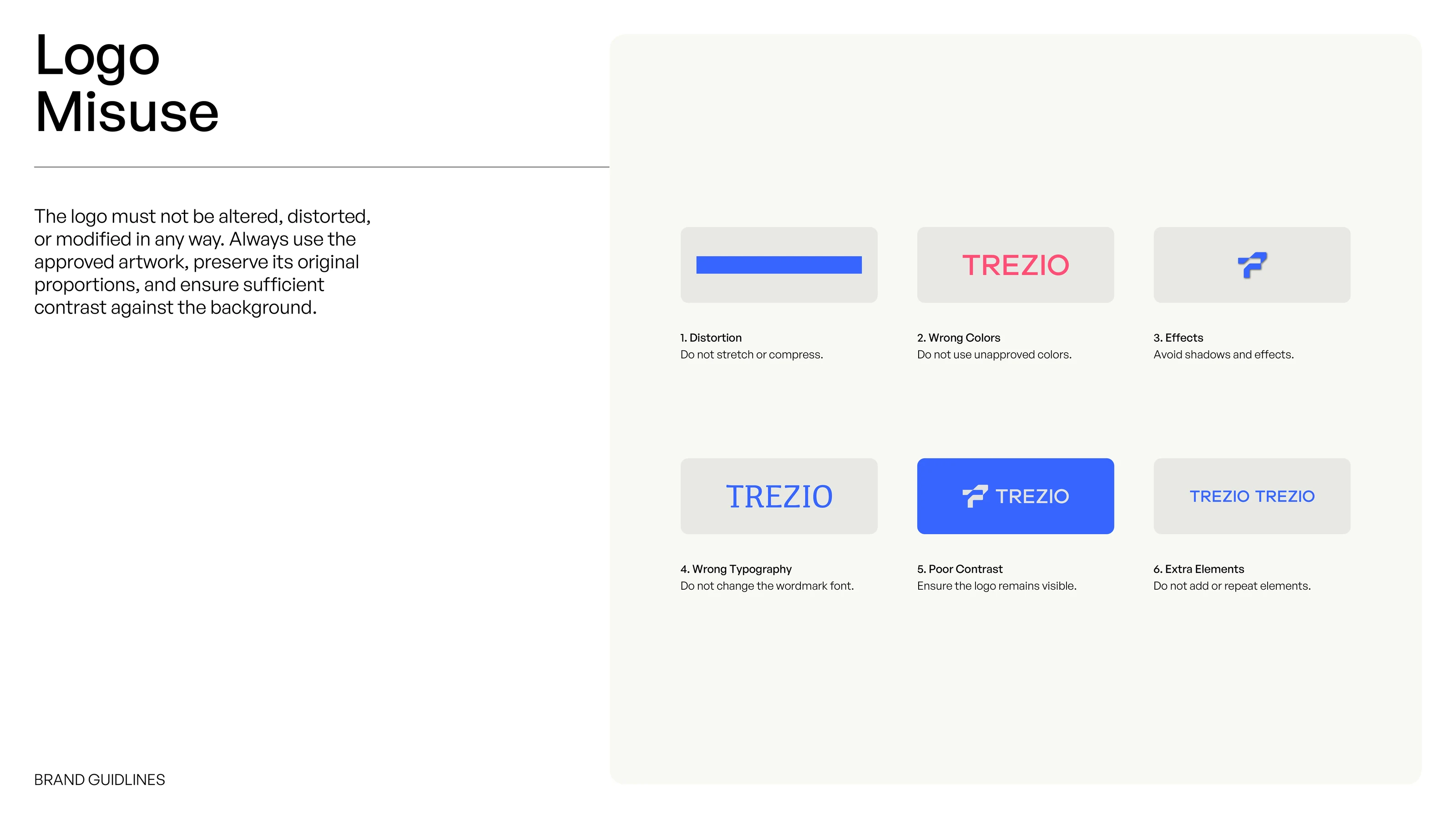
Logo Misuse slide listing distortion, wrong colours, effects, wrong typography, poor contrast and extra elements

Fintech logo design

The Trezio logo starts as a pencil sketch and resolves into a geometric T with a cutting-flow detail, paired with a clean wordmark. Construction, clear space, sizes from 256 to 32 pixels, horizontal and vertical layouts and misuse rules show how the mark is built to scale across fintech products.

Colour System section divider on blue
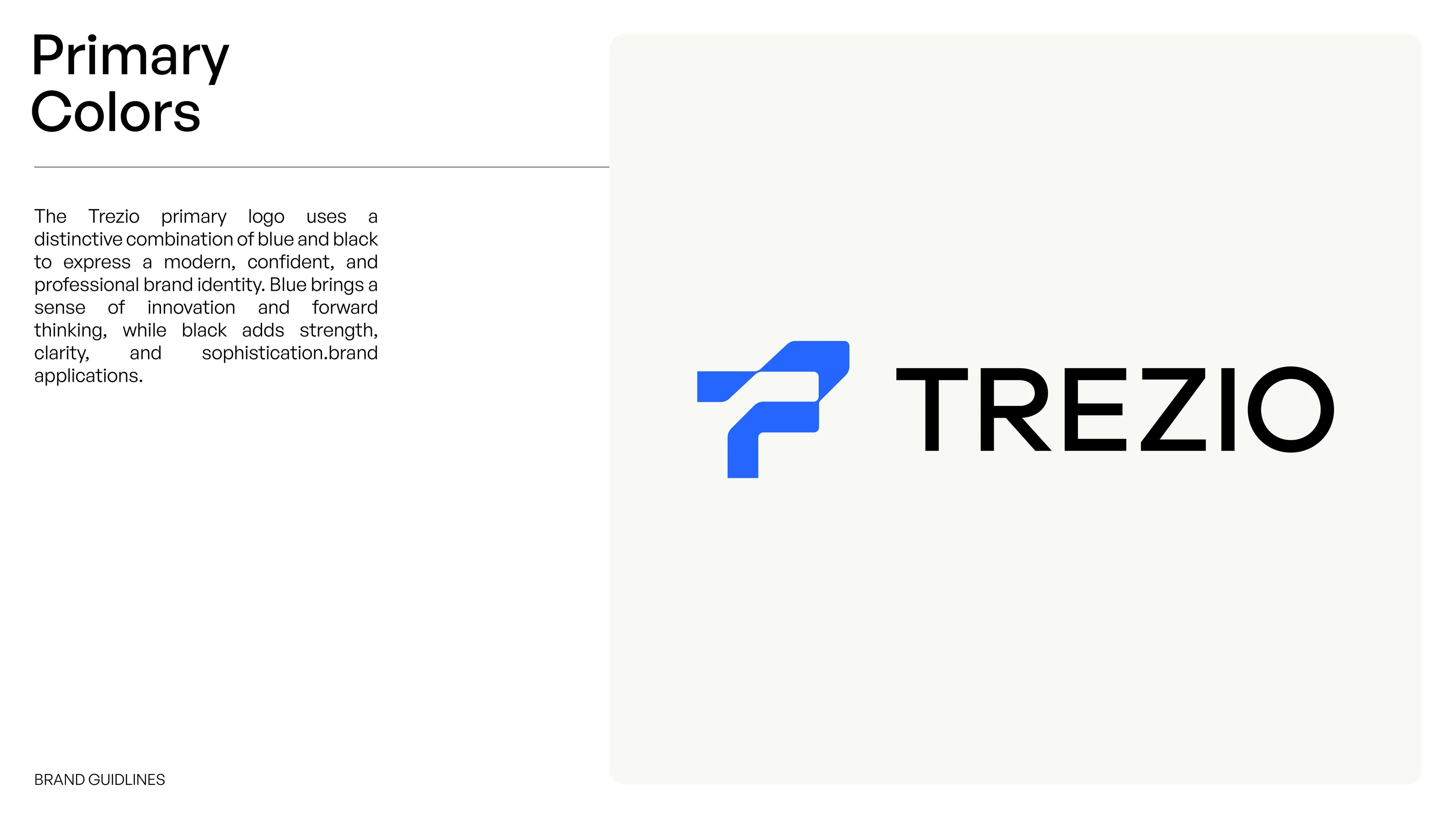
Trezio primary logo colours: blue symbol with black wordmark on a light background
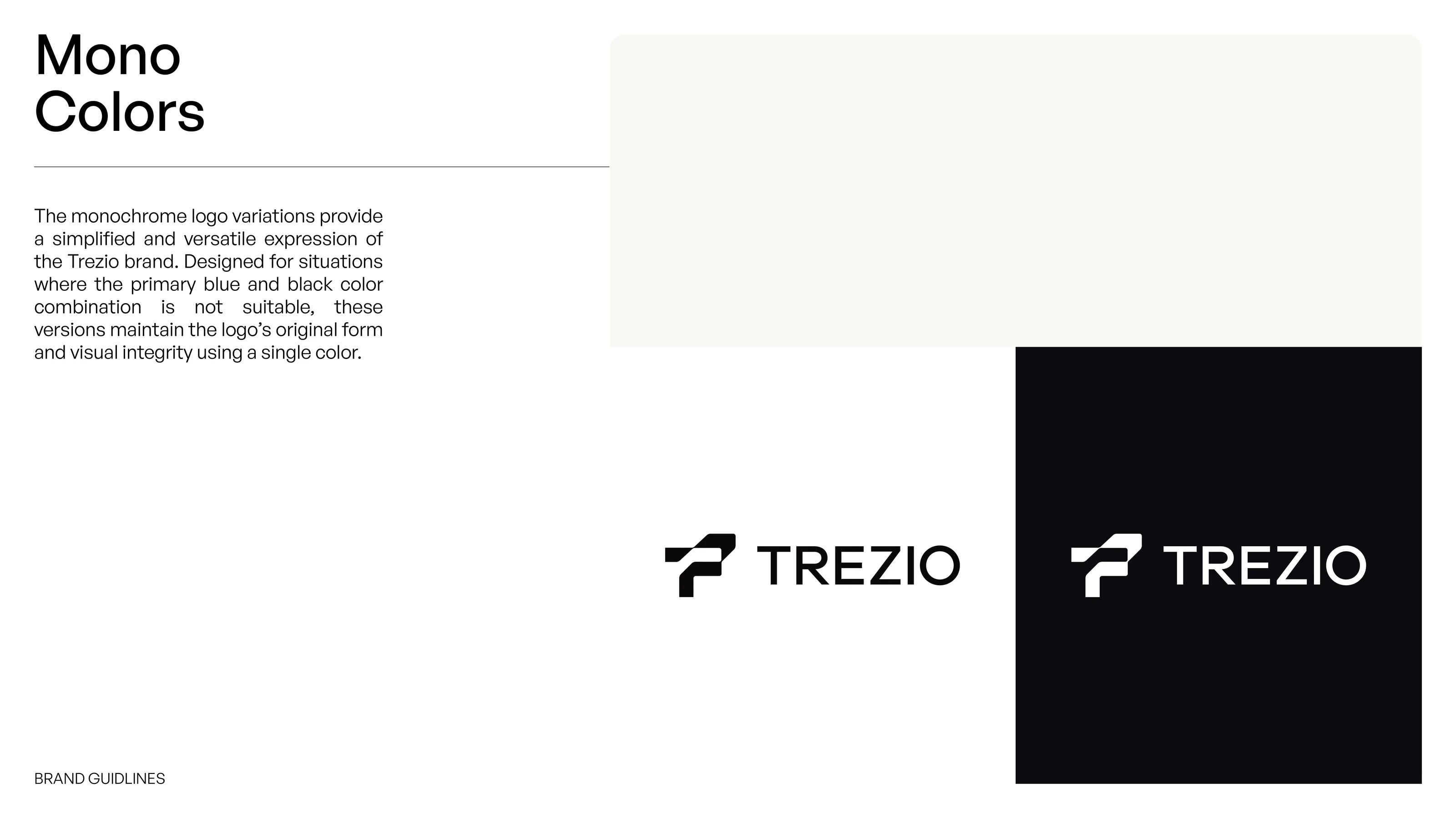
Trezio mono logo versions in black on light and white on black
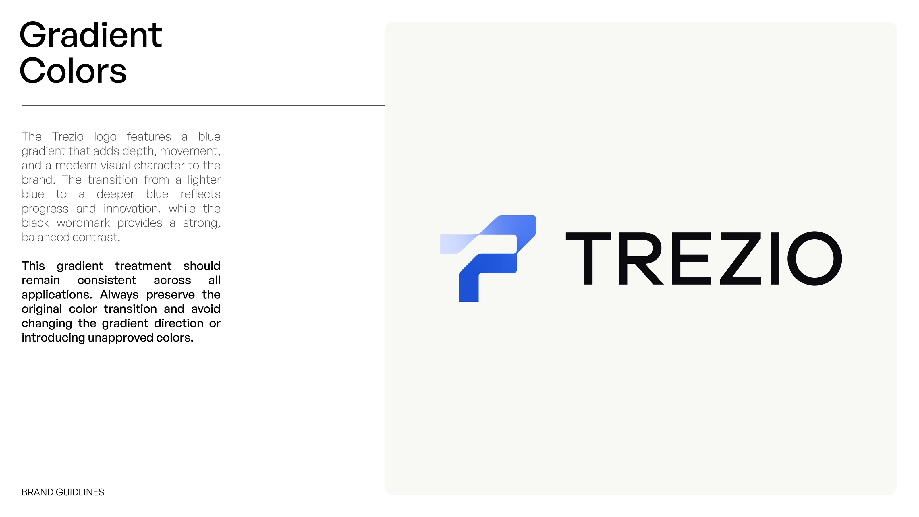
Trezio gradient logo with a blue gradient symbol and black wordmark
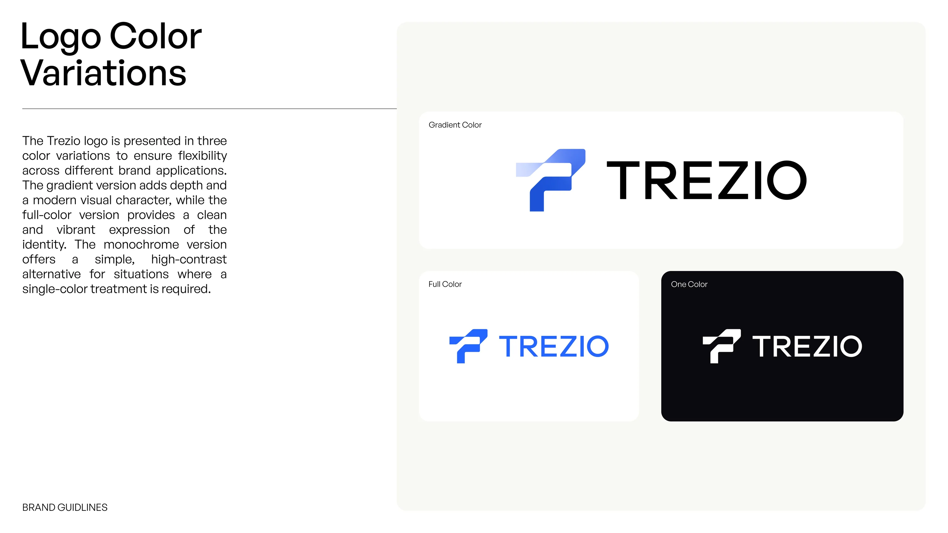
Trezio logo colour variations: gradient, full colour and one colour versions
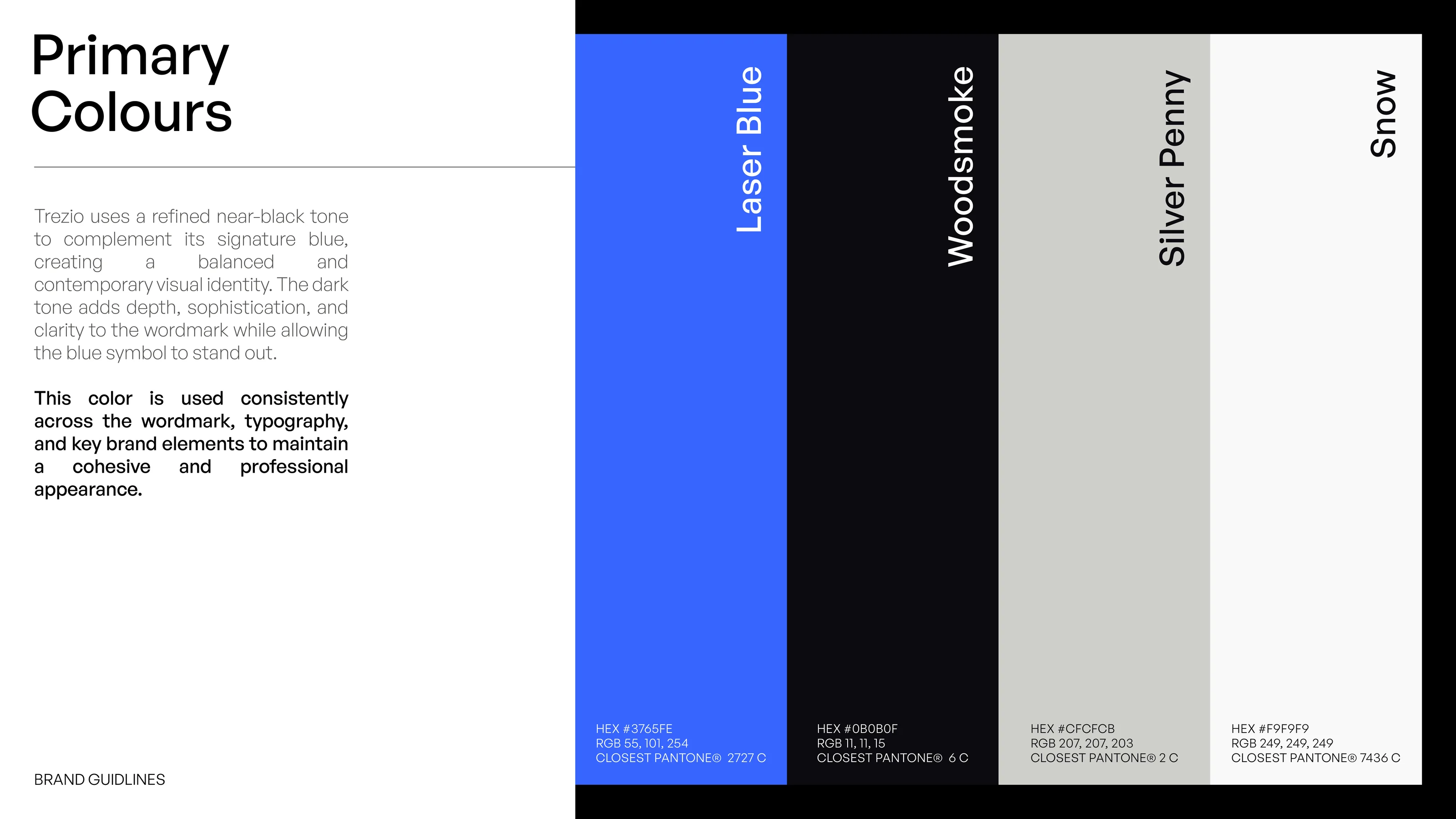
Trezio primary colour palette: Laser Blue, Woodsmoke, Silver Penny and Snow, with HEX and RGB values
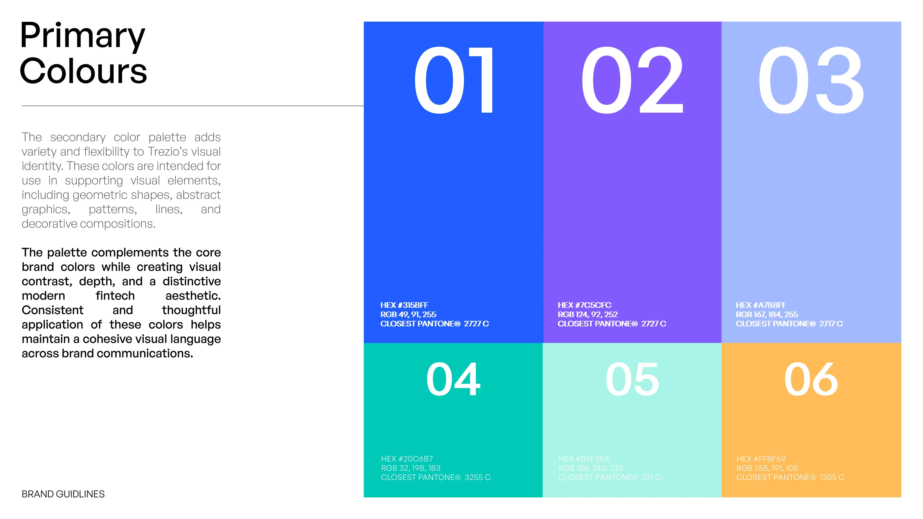
Trezio secondary colour palette of six swatches: blue, violet, light blue, teal, mint and orange
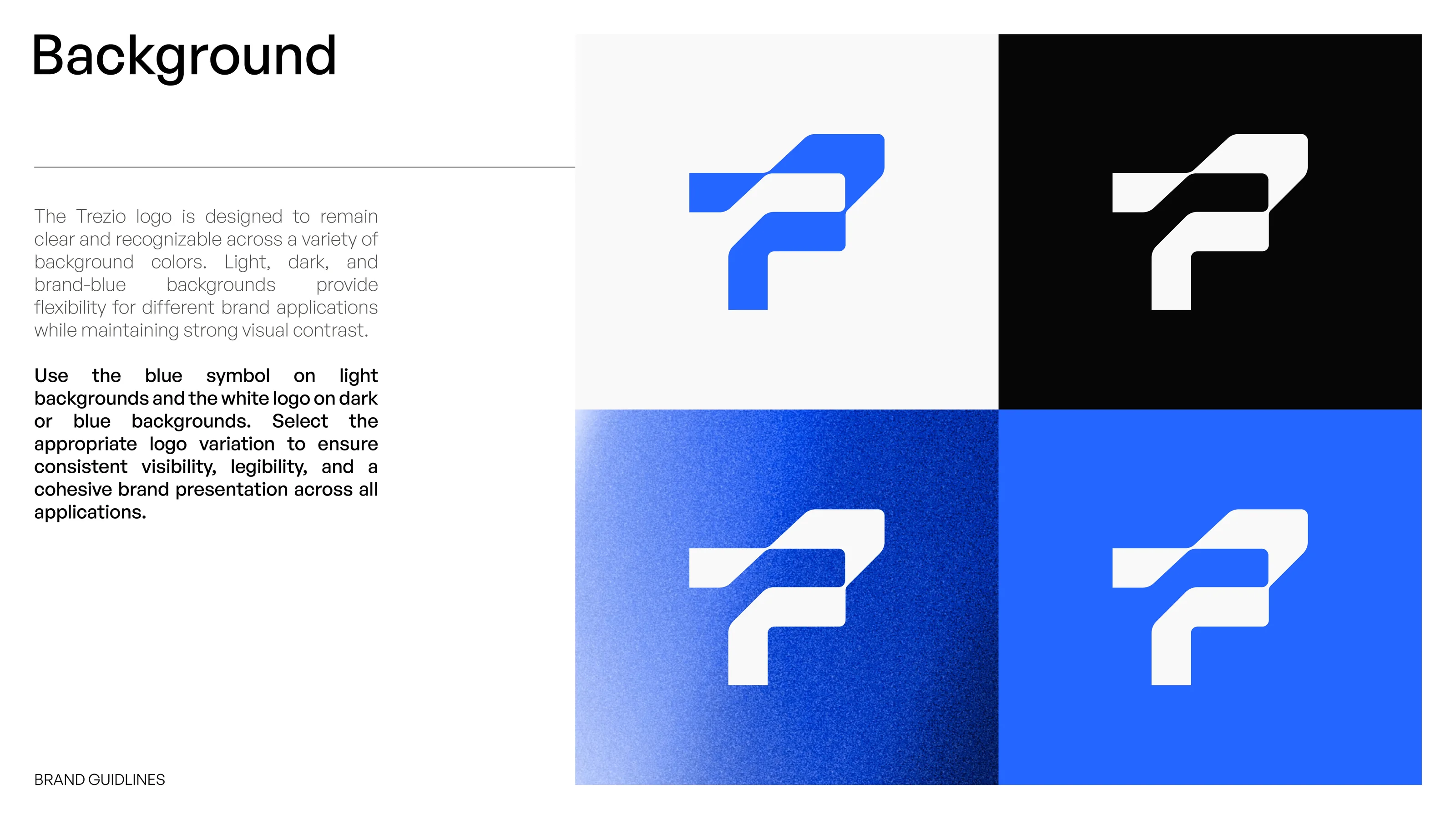
Background slide showing the Trezio symbol on light, dark, gradient blue and solid blue backgrounds
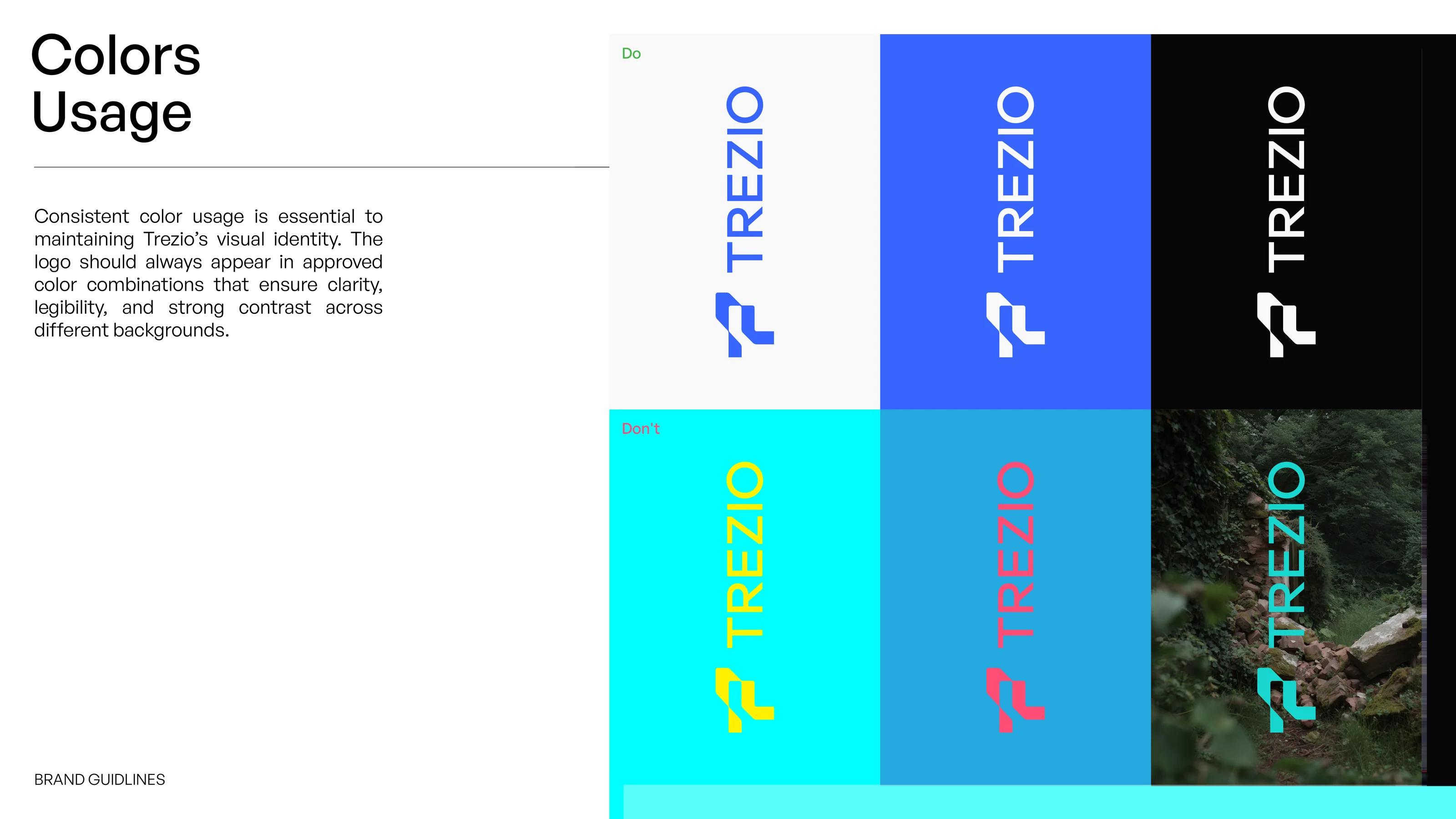
Trezio logo colour usage: approved colour combinations above incorrect ones

Colour system

Colour is led by Laser Blue and near-black Woodsmoke, supported by Silver Penny and Snow. Six secondary hues add range for graphics and patterns, and the logo is specified for light, dark, gradient and solid blue backgrounds, with approved and incorrect combinations shown.

Typography section divider on blue
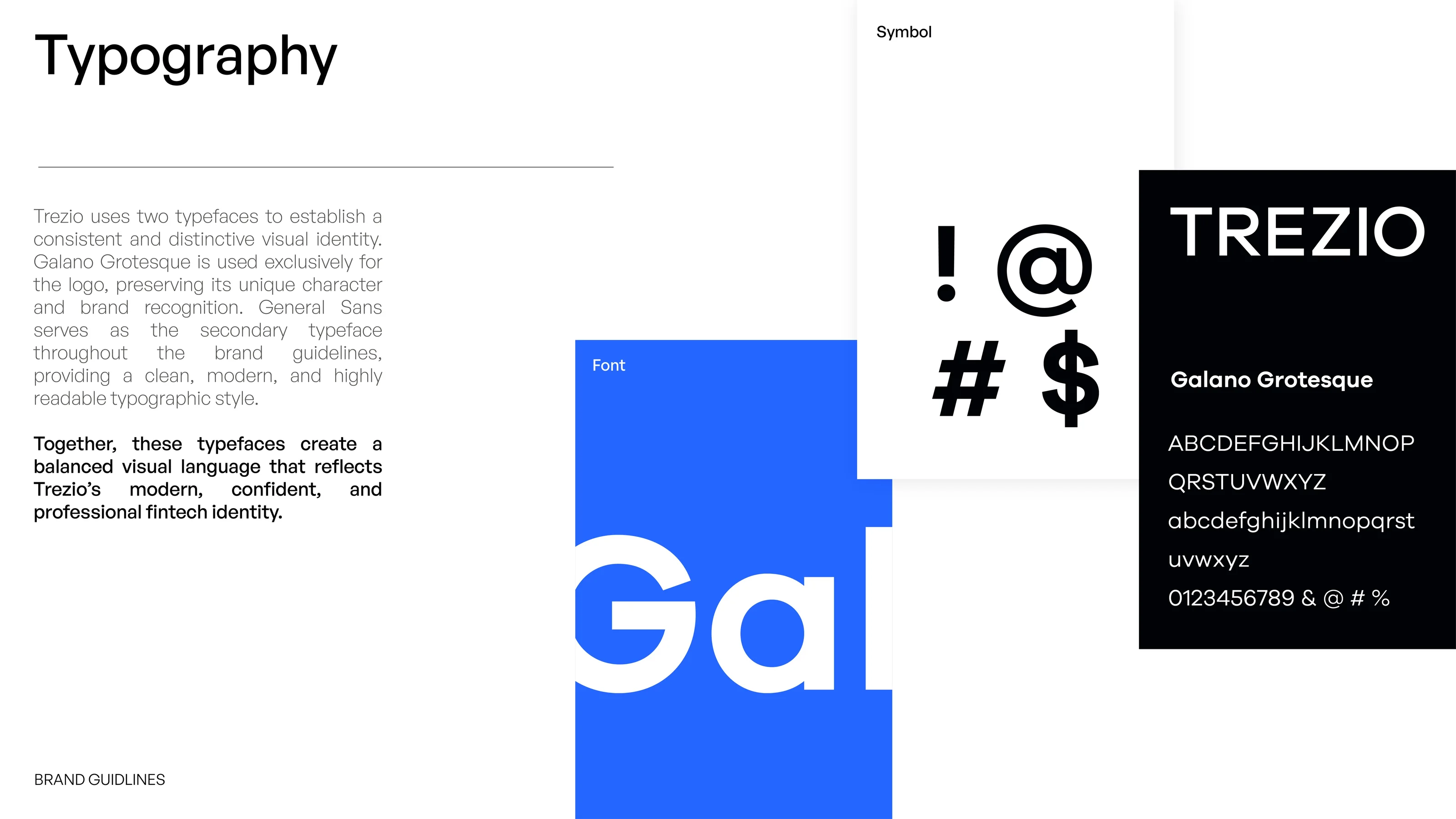
Typography overview pairing Galano Grotesque with General Sans for the Trezio brand guidelines
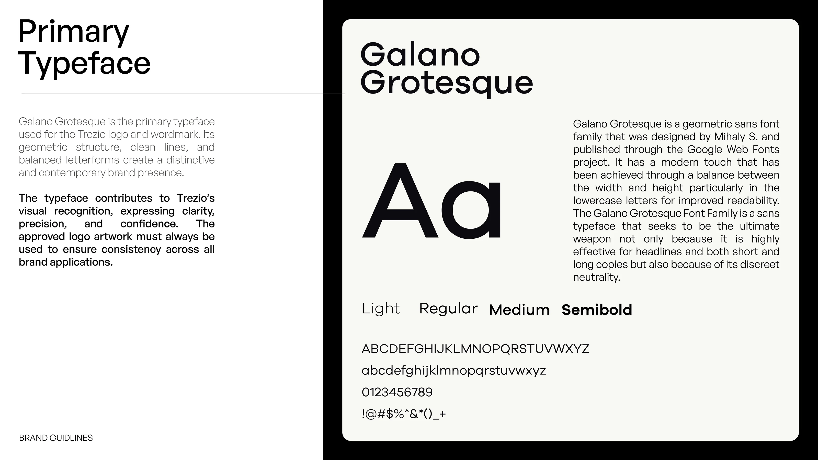
Primary Typeface slide presenting Galano Grotesque with weights, alphabet and numerals
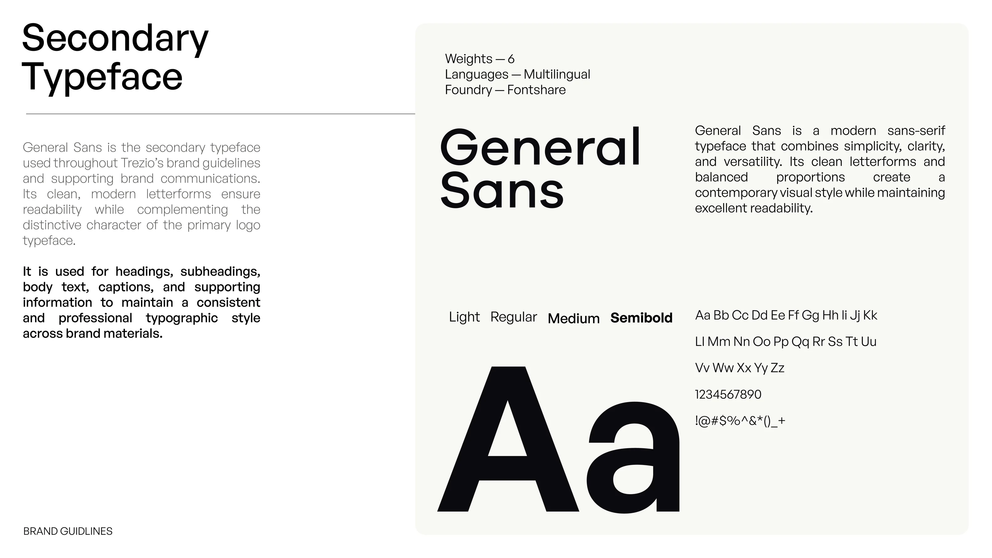
Secondary Typeface slide presenting General Sans with weights, alphabet and numerals
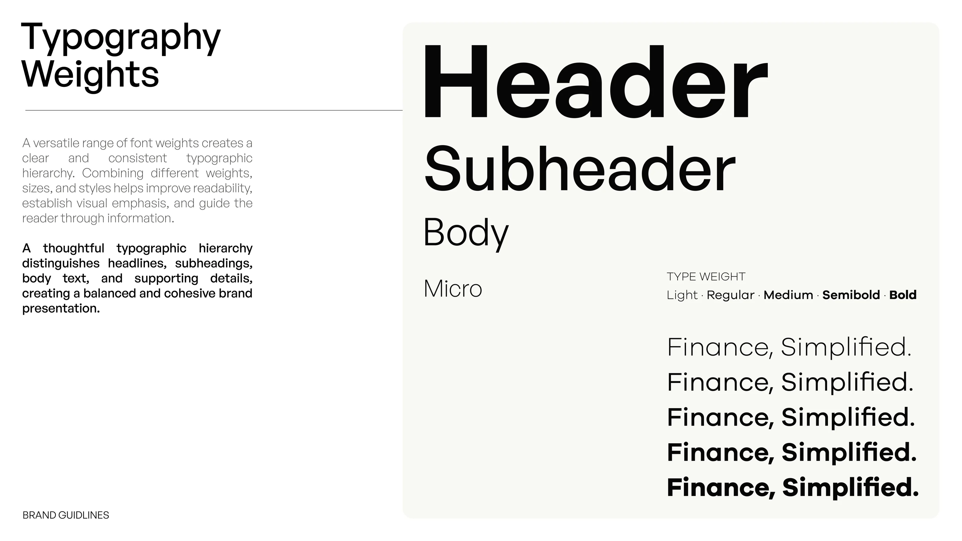
Typography Weights slide showing header, subheader, body and micro styles and the type weight range
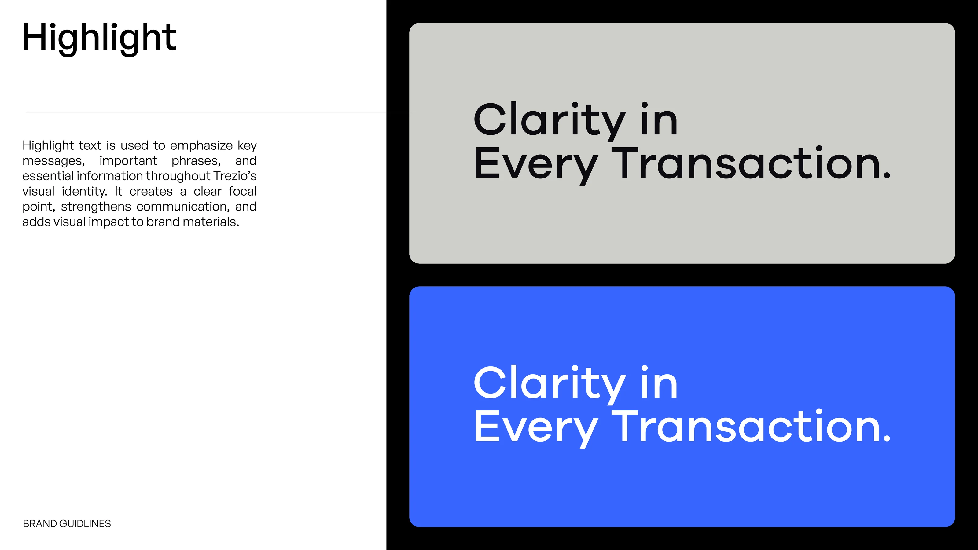
Highlight slide showing the line Clarity in Every Transaction on grey and on blue
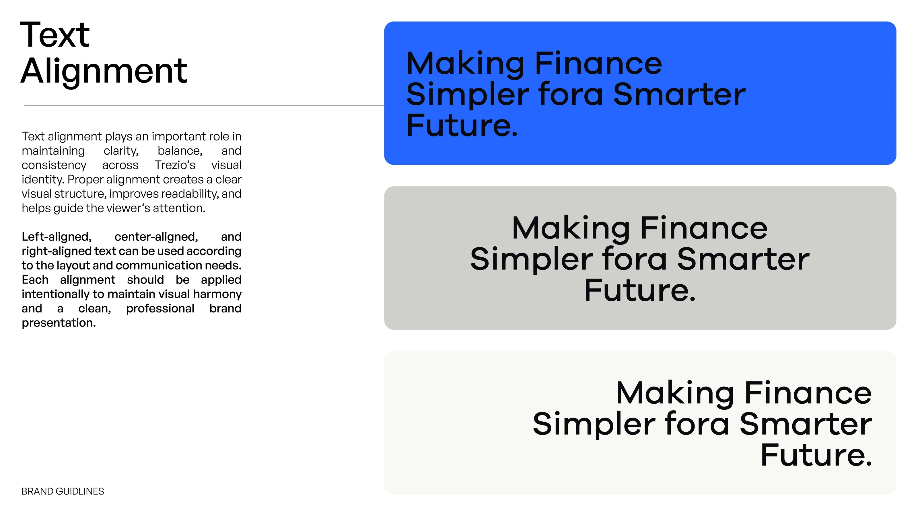
Text Alignment slide showing left, centre and right aligned text on blue, grey and off-white panels

Typography

Typography pairs Galano Grotesque, used for the logo and wordmark, with General Sans for headings, body text, captions and supporting information. The guidelines set out weights, a type hierarchy, highlight lines and text alignment, so layouts stay consistent across materials.

Visual Identity section divider on blue
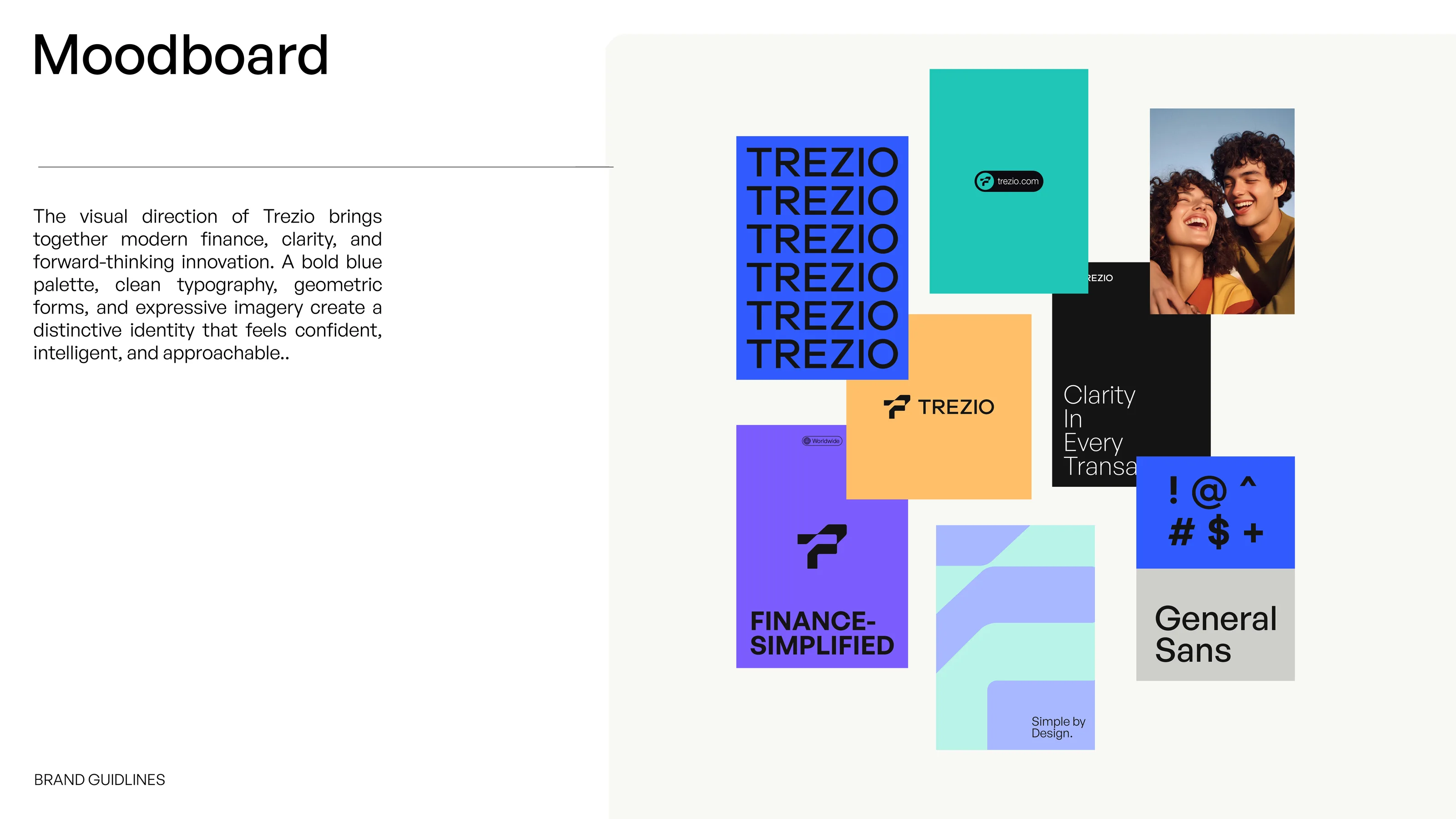
Moodboard slide with a collage of Trezio posters, colour blocks, typography and photography
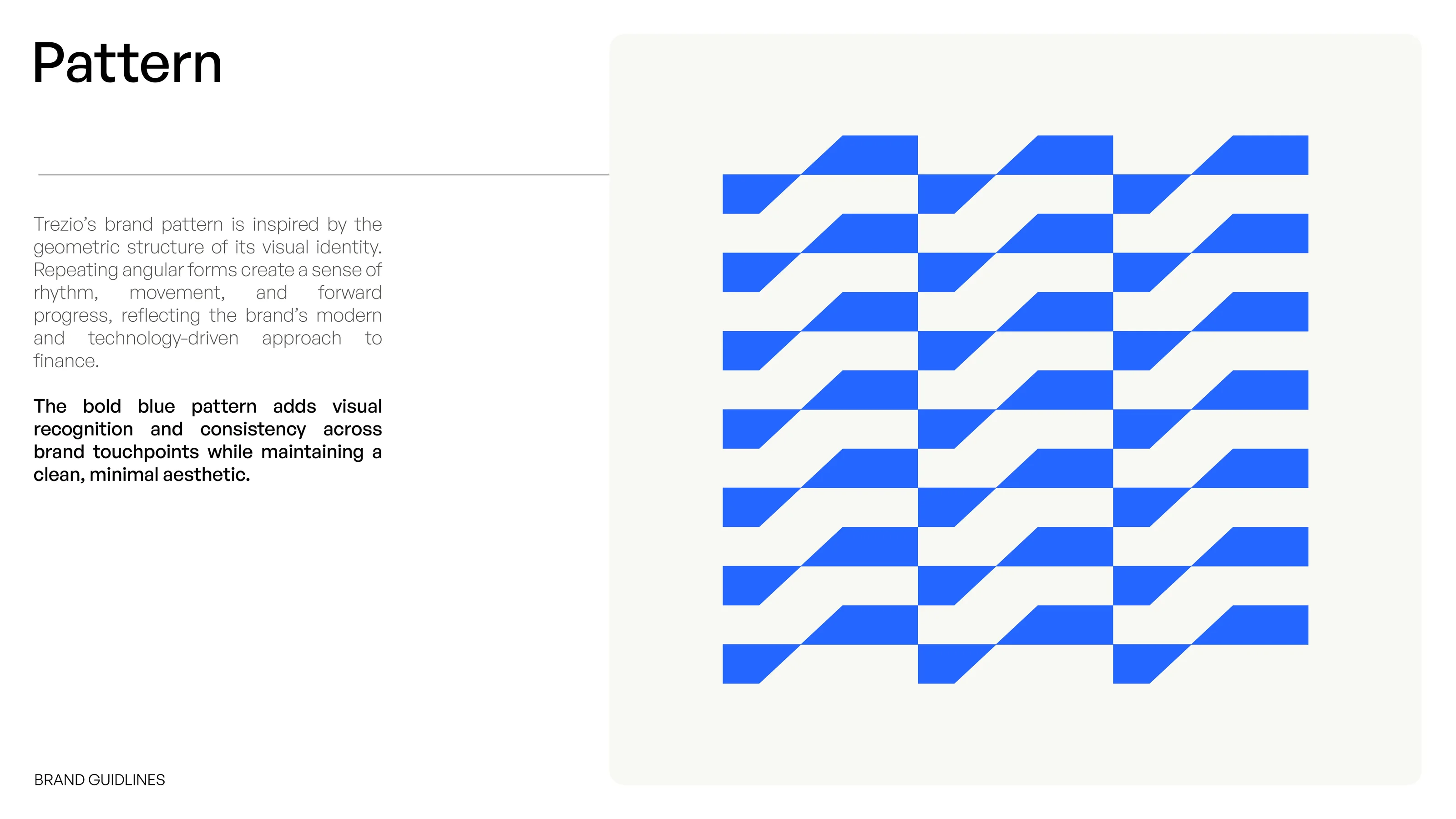
Repeating blue angular pattern for Trezio, derived from the logo geometry
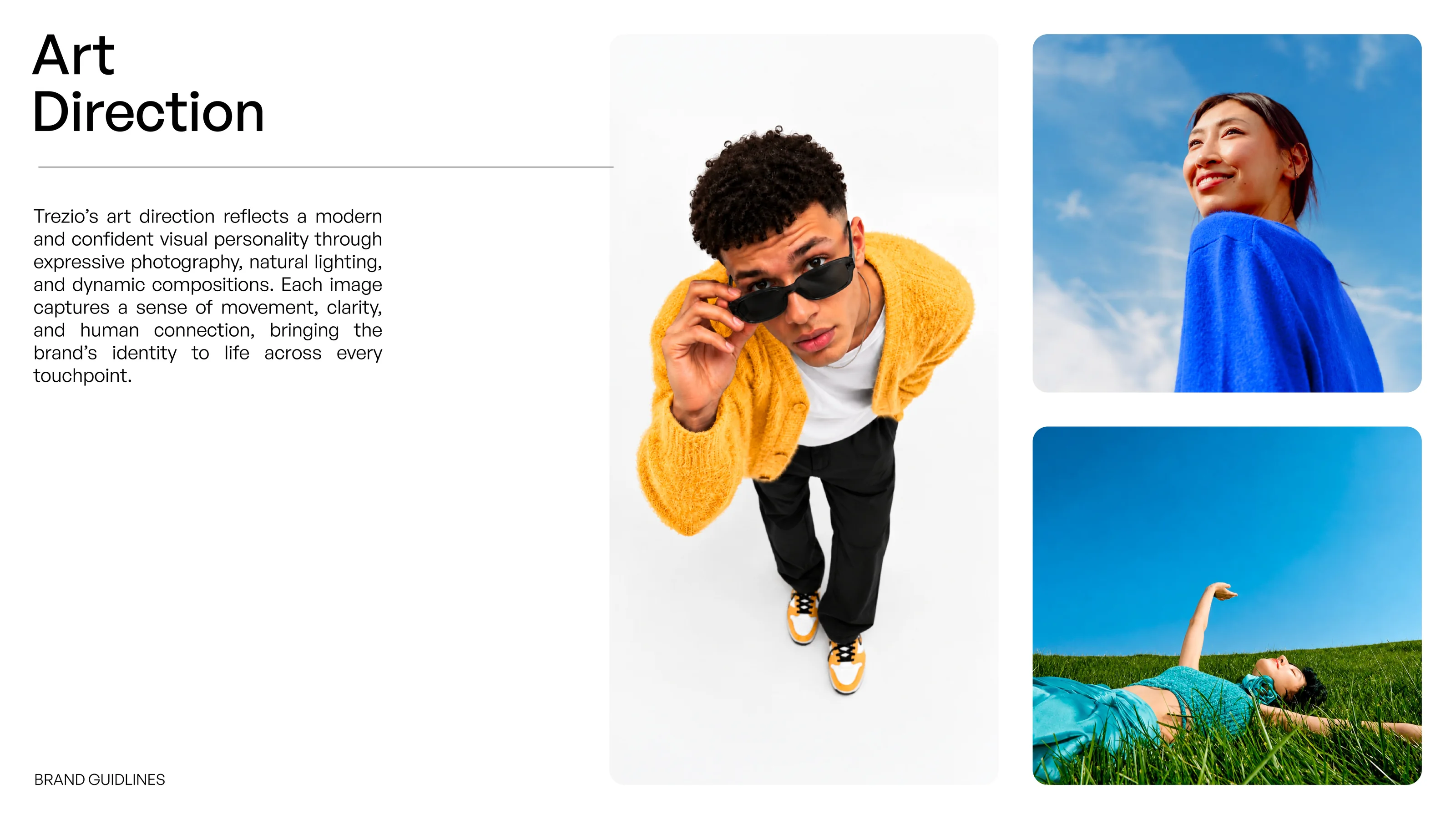
Art Direction slide showing three expressive photographs in blue, yellow and sky tones
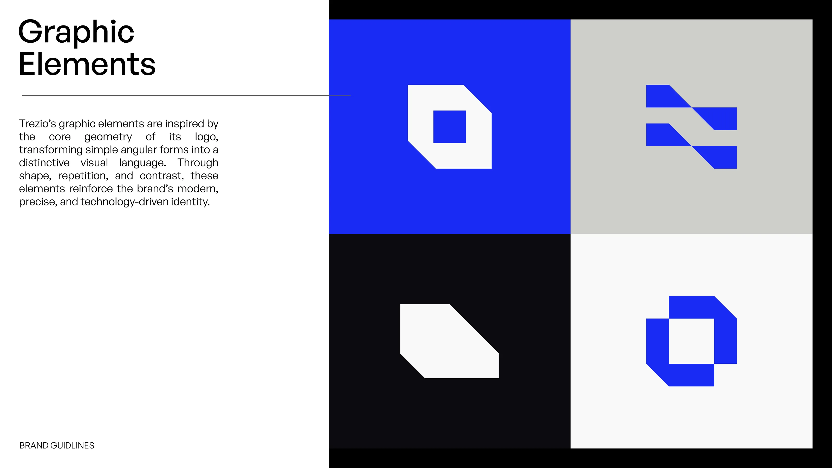
Graphic Elements slide showing four angular graphic shapes in blue, grey, black and off-white

Visual identity

The identity extends the logo's geometry into a repeating angular pattern and a set of graphic shapes, supported by bright, human photography and a moodboard that brings colour, type and imagery together. The result is a minimal look that works beyond the logo itself.

Brand Applications section divider on blue
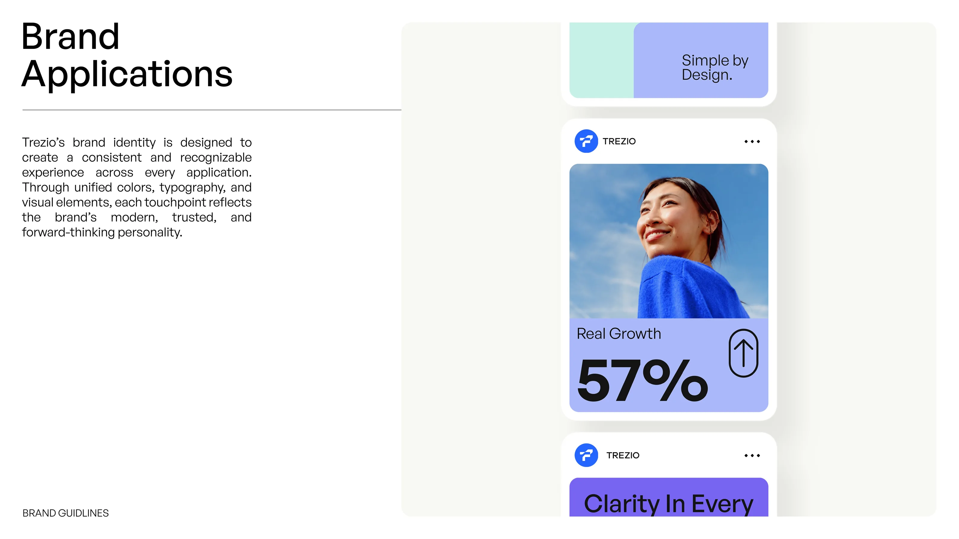
Brand Applications slide showing Trezio social media posts in a phone-style feed
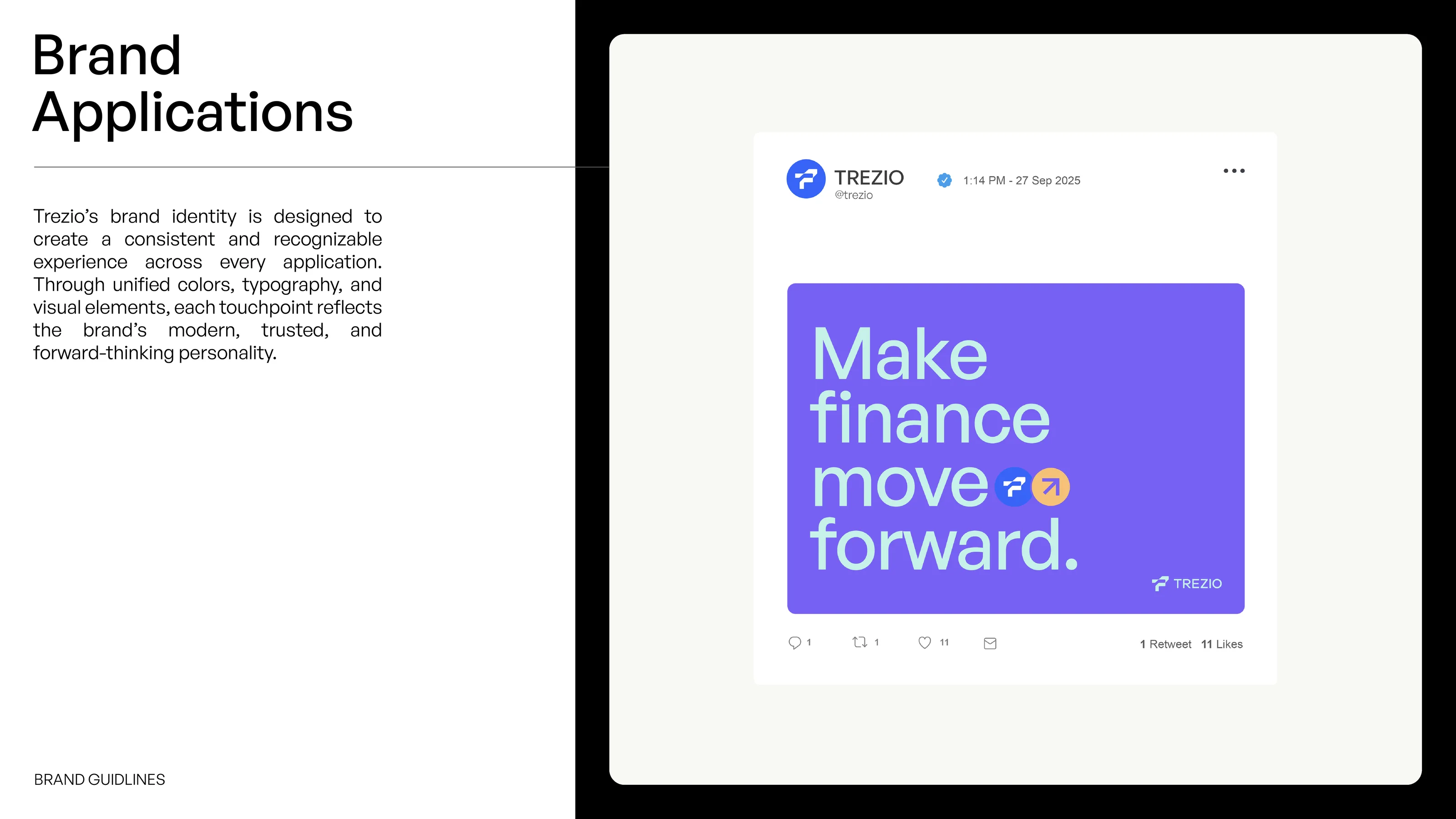
Brand Applications slide showing a Trezio social media post reading Make finance move forward on violet
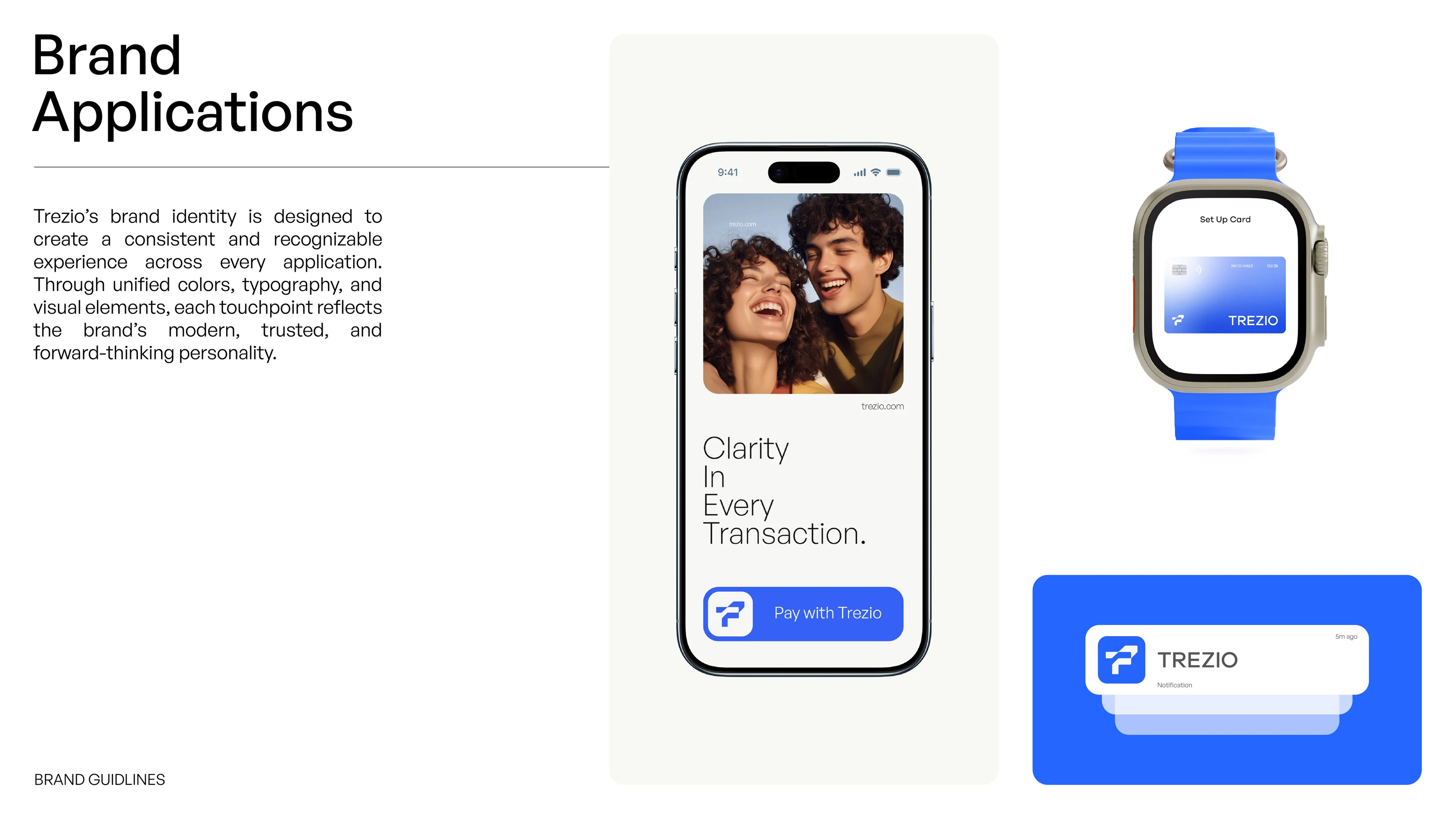
Trezio app on a phone, a smartwatch card and a notification, shown as concept mockups
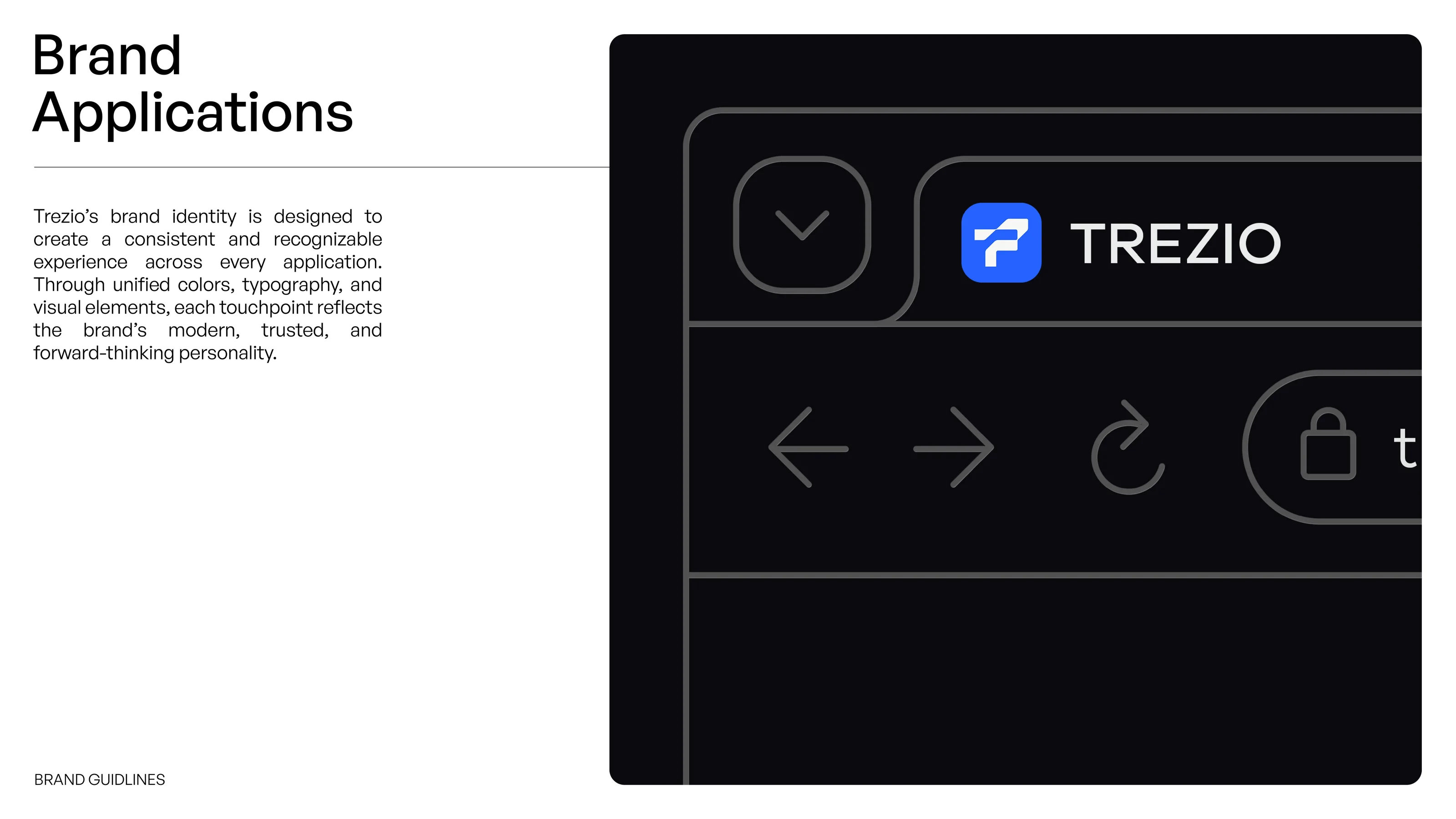
Brand Applications slide showing a dark browser window with the Trezio tab and logo
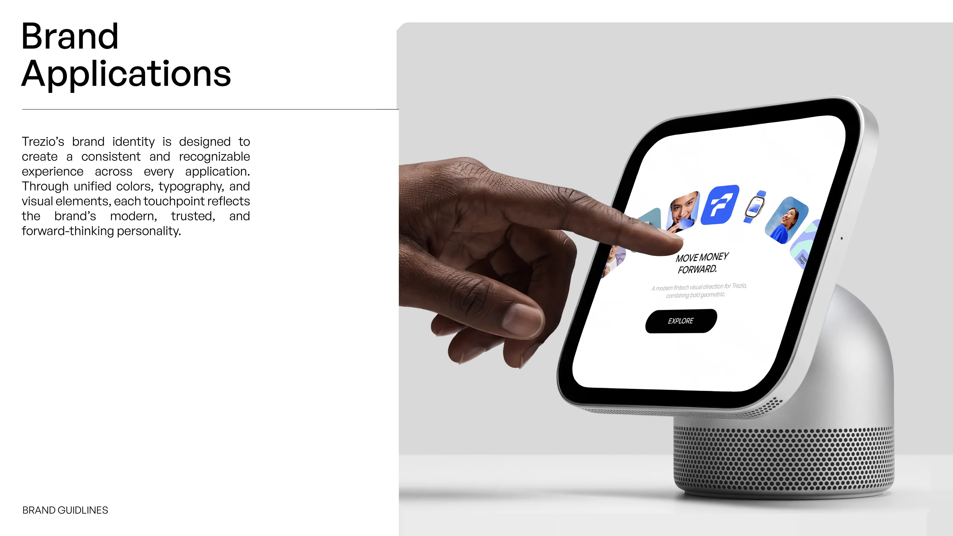
Brand Applications slide showing a hand touching a smart display with the Trezio interface
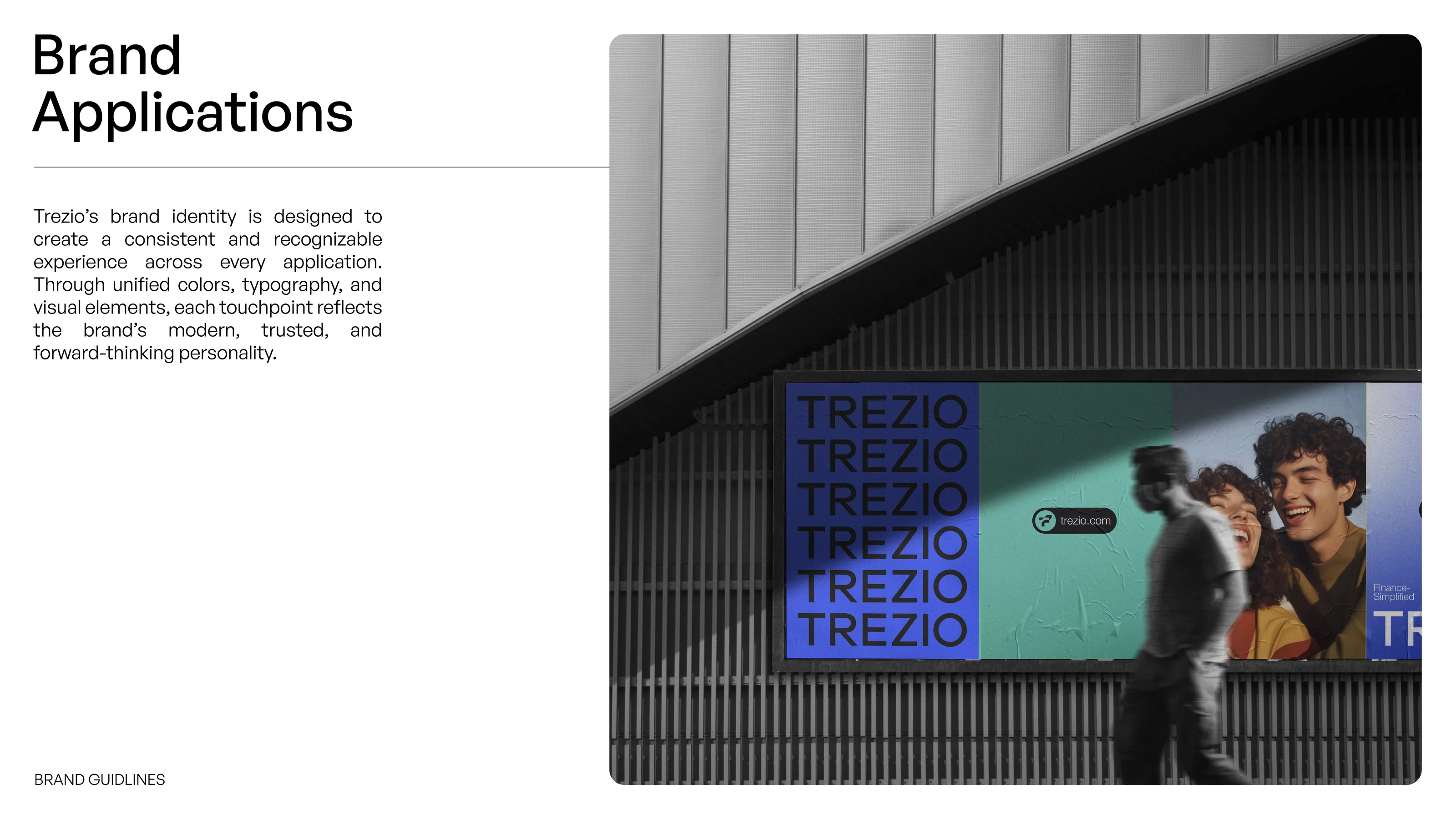
Trezio billboard concept mockup beside a modern building, showing blue and teal brand posters
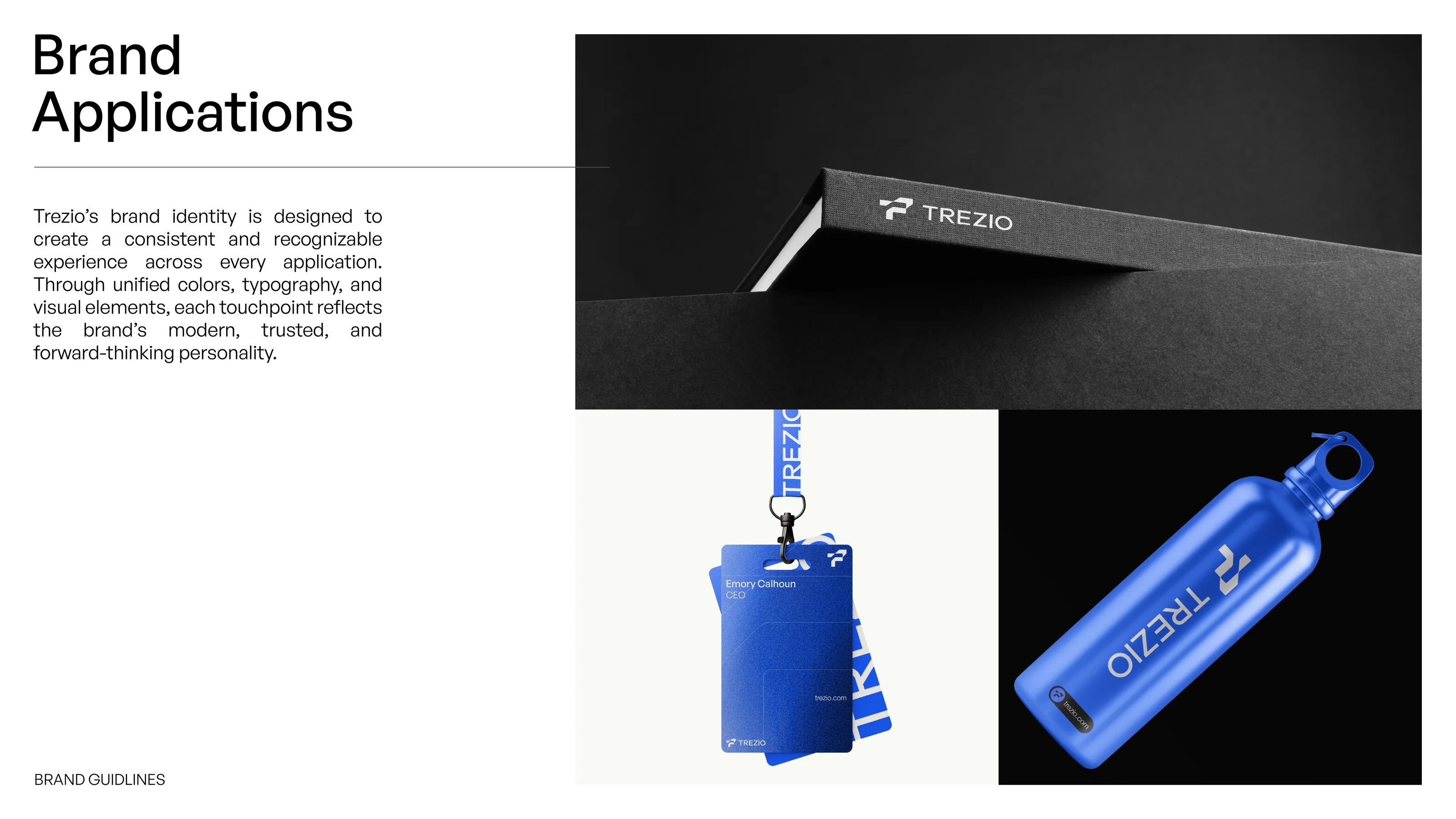
Trezio merchandise concept mockup: black hardcover book, lanyard badge and blue water bottle
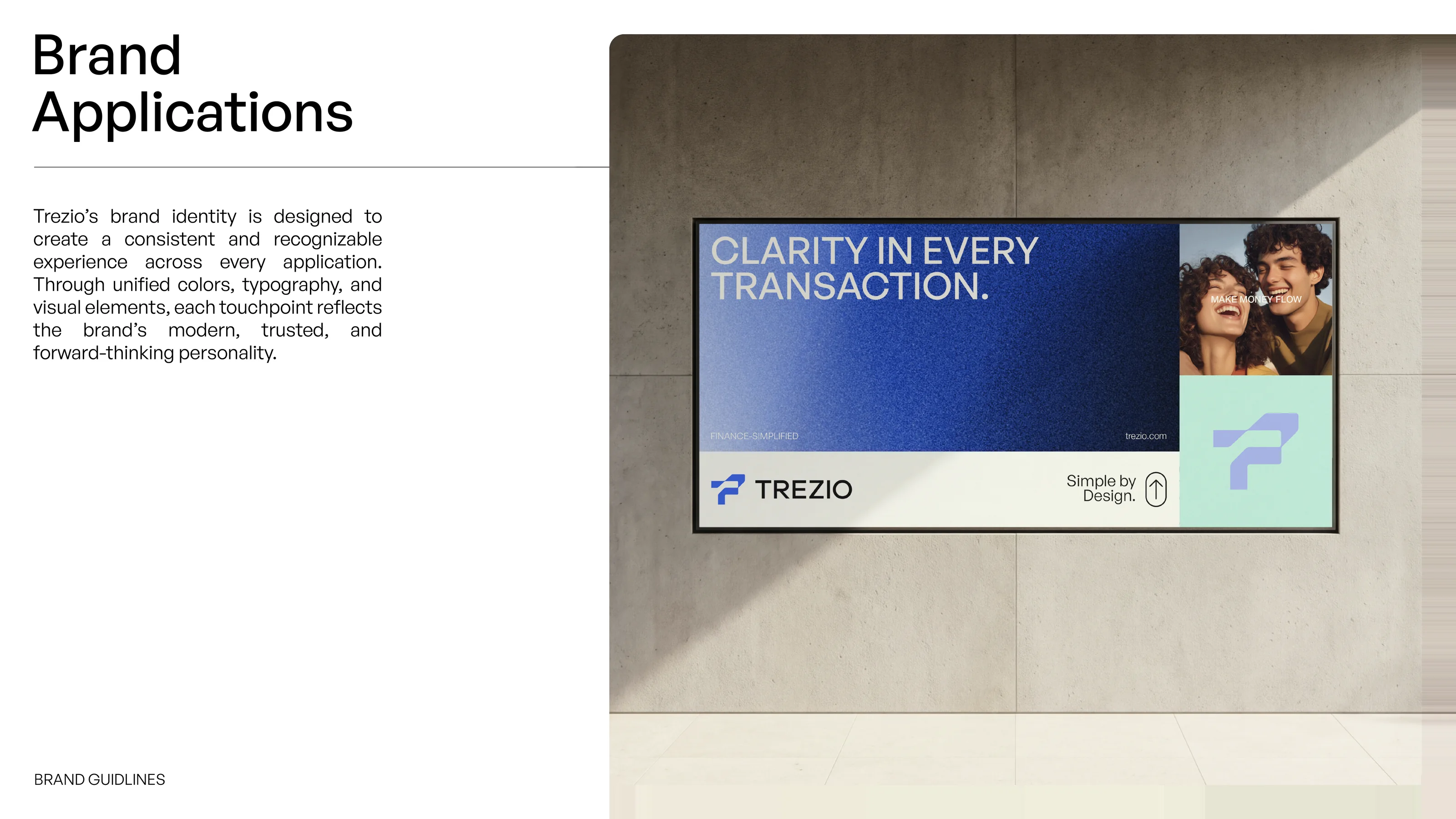
Trezio advertisement concept mockup on a wall-mounted display, reading Clarity in every transaction
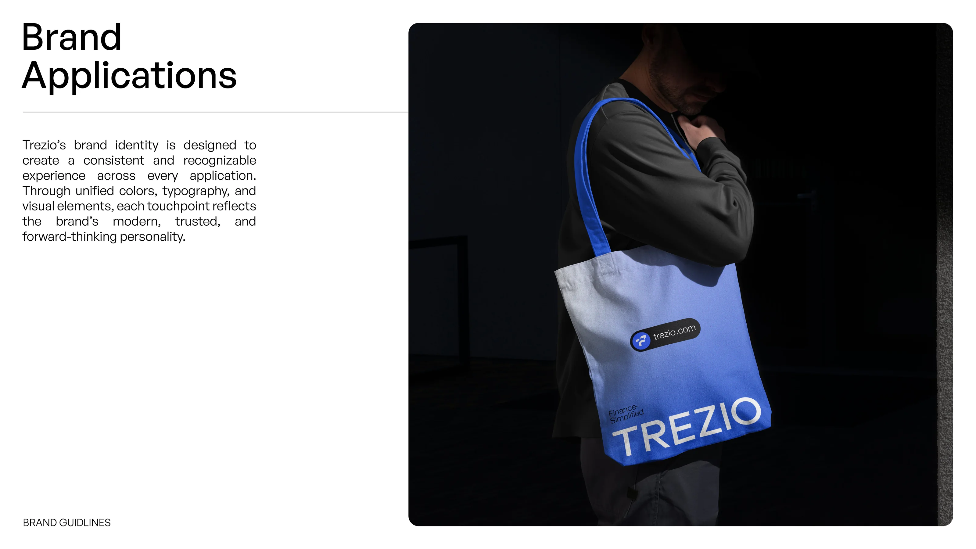
Trezio blue tote bag concept mockup carried by a person against a dark background
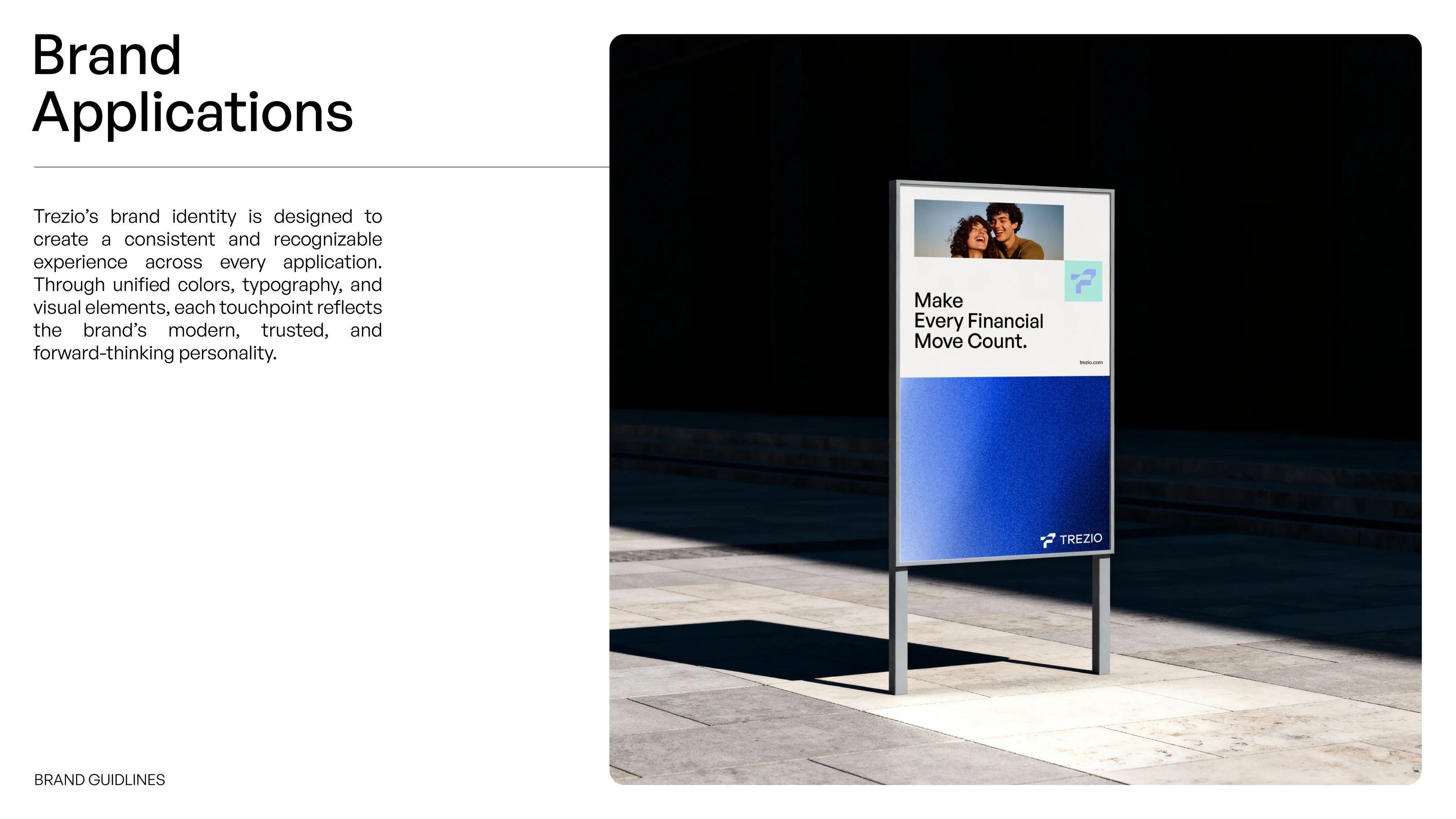
Trezio street poster concept mockup on a freestanding sign, reading Make every financial move count
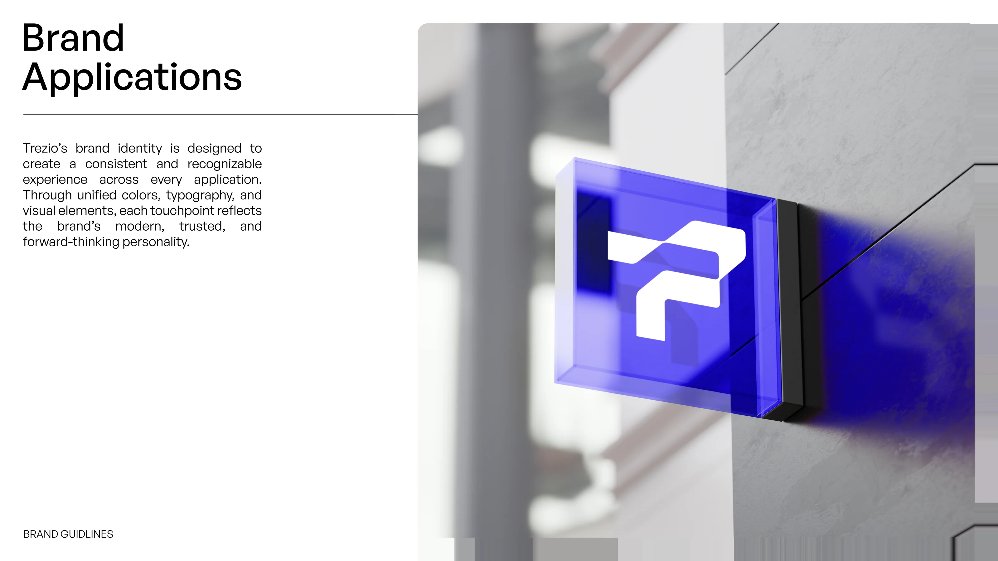
Trezio symbol on an illuminated blue sign mounted on a building wall, shown as a concept mockup

Brand applications

The final slides present visual concept mockups of Trezio in use: social posts, a mobile app and smartwatch, a browser tab, a smart display, outdoor posters, an illuminated sign, a book, lanyard, bottle and tote bag. None is a launched product. Together they show how Sparkline Studio approaches fintech branding, carrying one clear idea from logo to product to environment.

Building a fintech or financial technology brand? Start a project with Sparkline Studio for logo design and brand identity.

Start a project